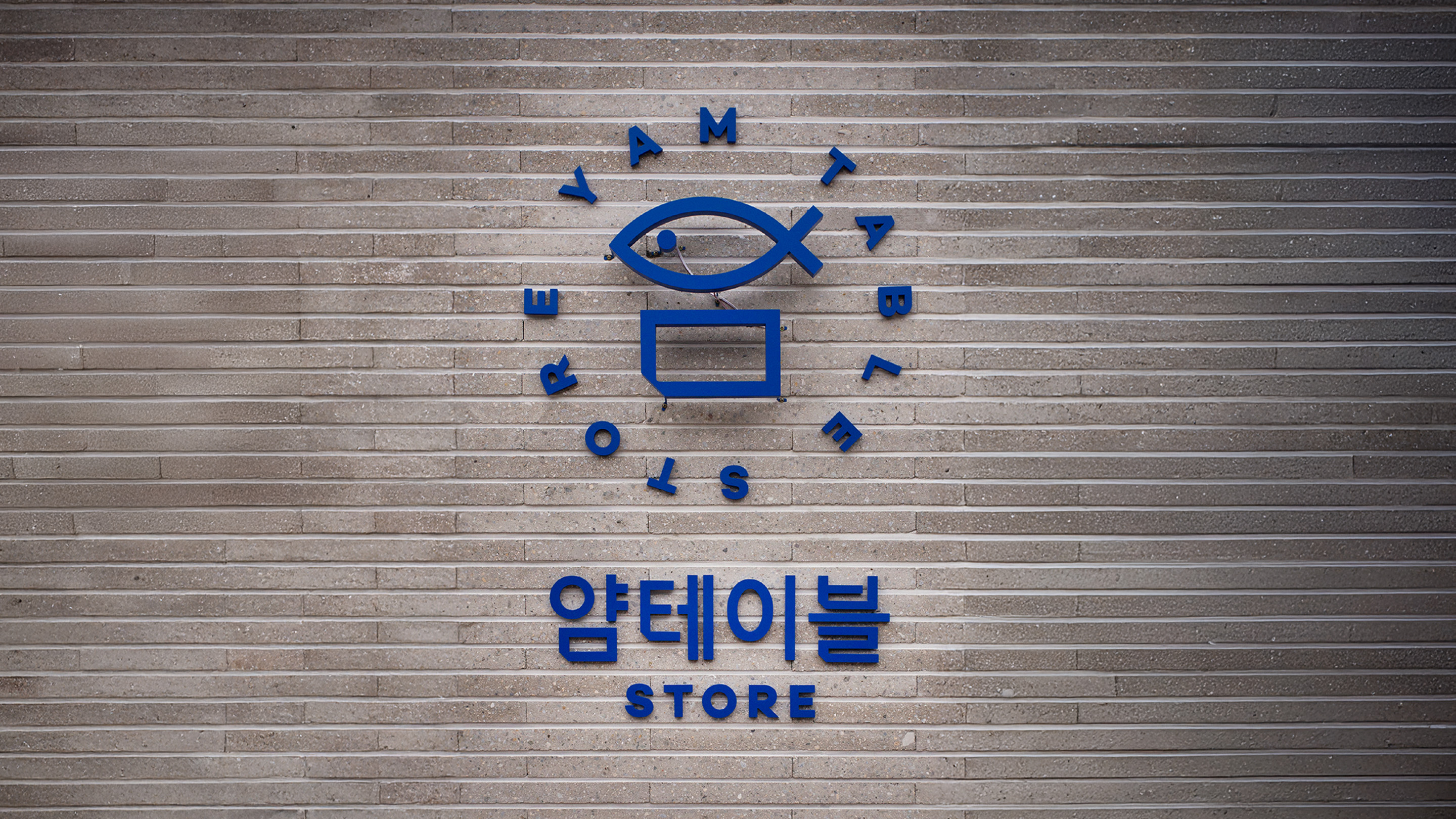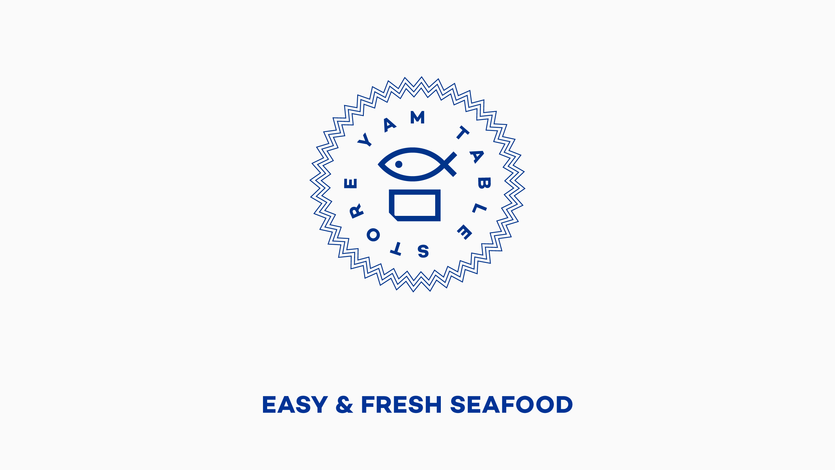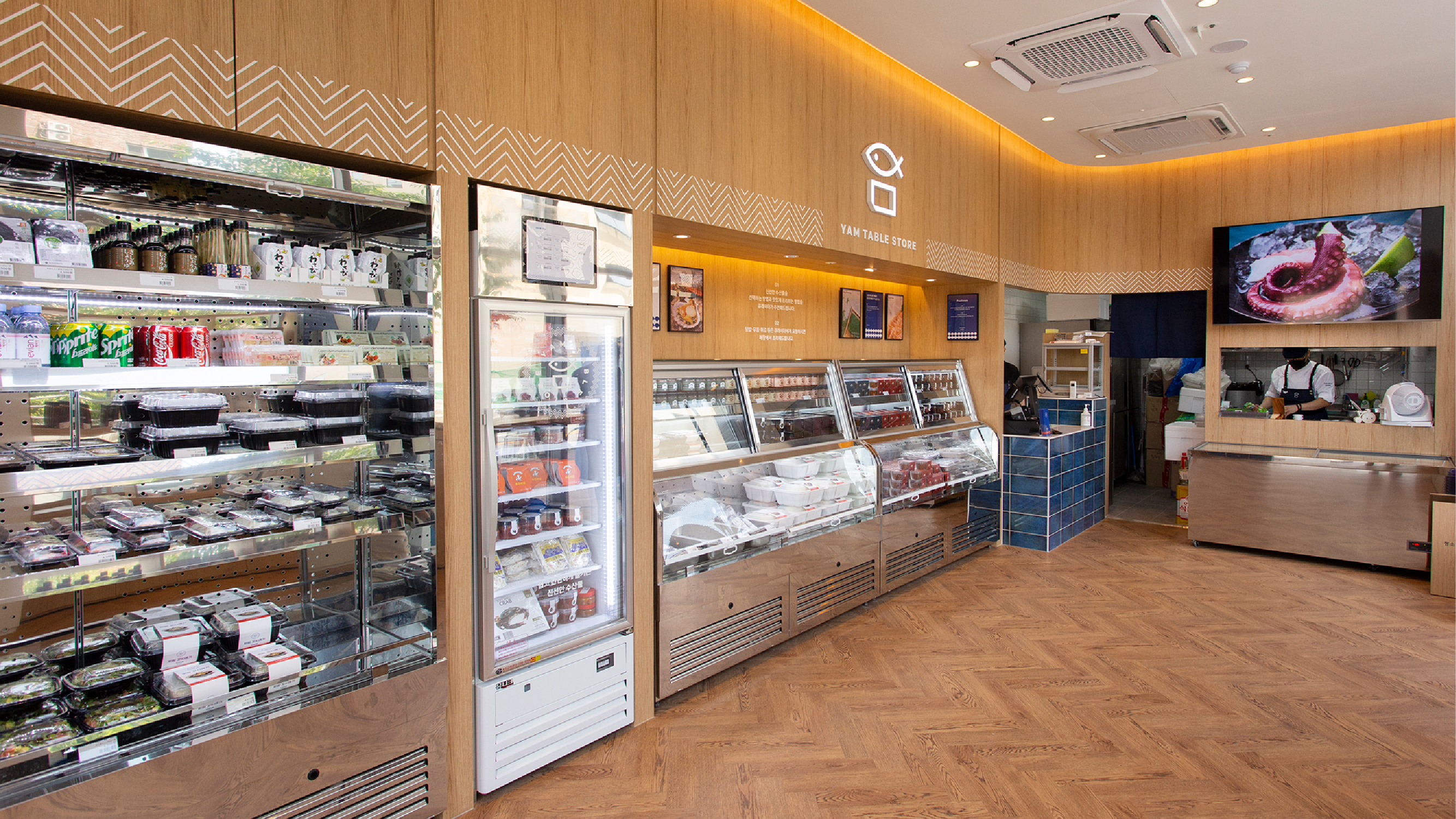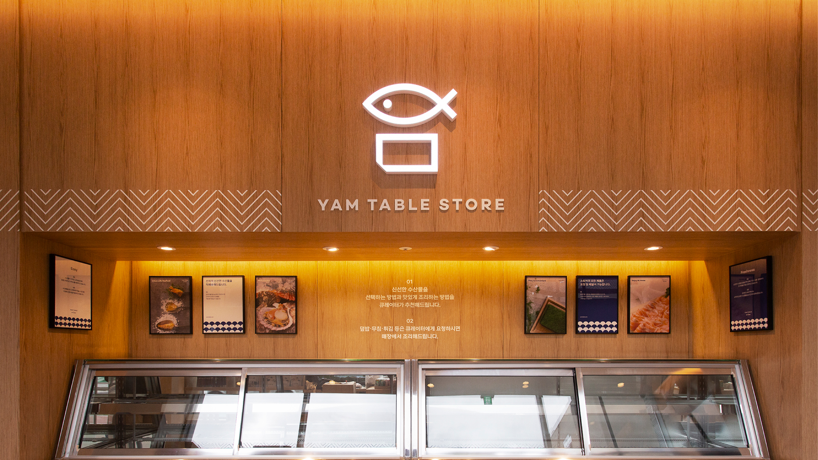


얌테이블 스토어는 고객이 수산물을 언제 어디서나 쉽고 간편하게 즐길 수 있도록 '편리함'과 '신선함'을 브랜드의 핵심가치로 하며 이를 위한 '큐레이션'을 미션으로 하고 있습니다. 폼앤펑션은 이러한 가치를 오프라인 매장에서 느낄 수 있도록 보다 직관적인 형태로 브랜드의 심벌마크를 리뉴얼 했습니다. 심벌마크의 리뉴얼과 함께 'Take the freshness to your place'라는 디자인 컨셉으로 심벌마크를 구성하는 생선과 직사각형에 각각 의미를 부여하여 얌테이블이 추구하는 브랜드의 가치를 의미적으로도 보완하였습니다.
Yam Table Store has "convenience" and "freshness" as the core values of the brand so that customers can easily and easily enjoy seafood anytime, anywhere, and is carrying out "curation" for this purpose. We has renewed the brand's symbol mark in a more intuitive form so that you can feel this value in offline stores. Along with the intuitive symbol mark renewal, the design concept of Take the freshness to your place has given meaning to each fish and rectangle that make up the symbol mark, meaningfully supplementing the brand value pursued by Yum Table.