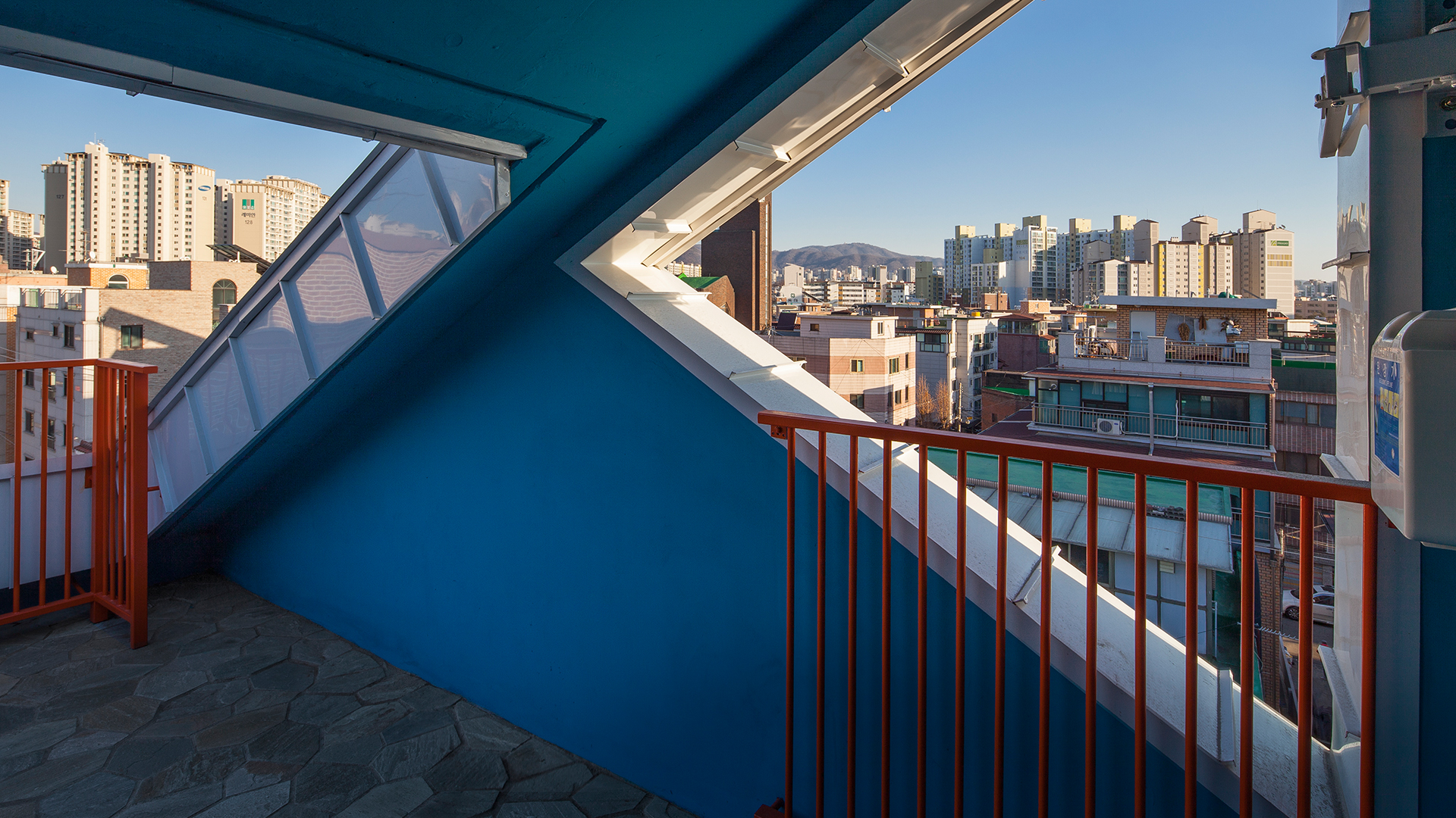
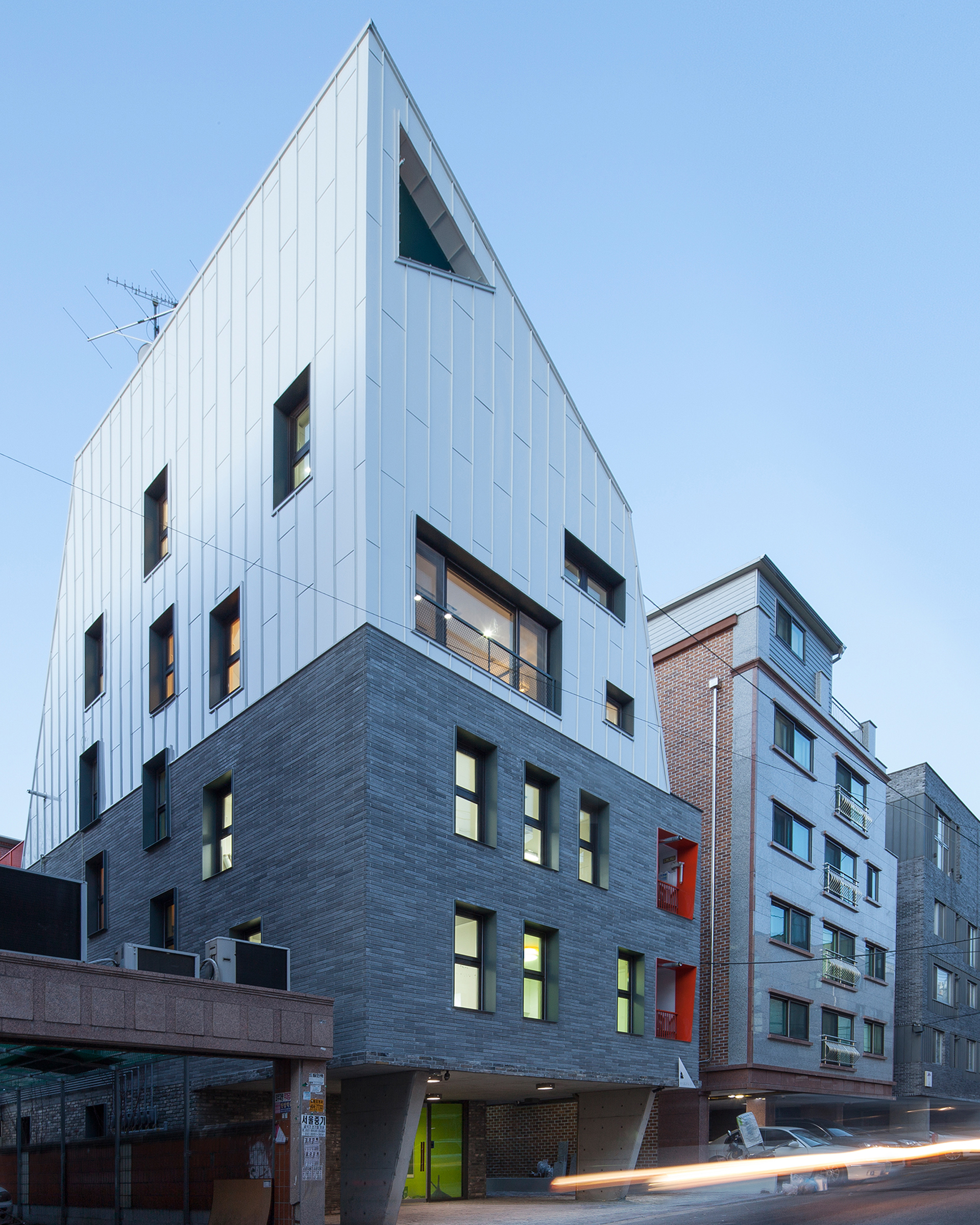
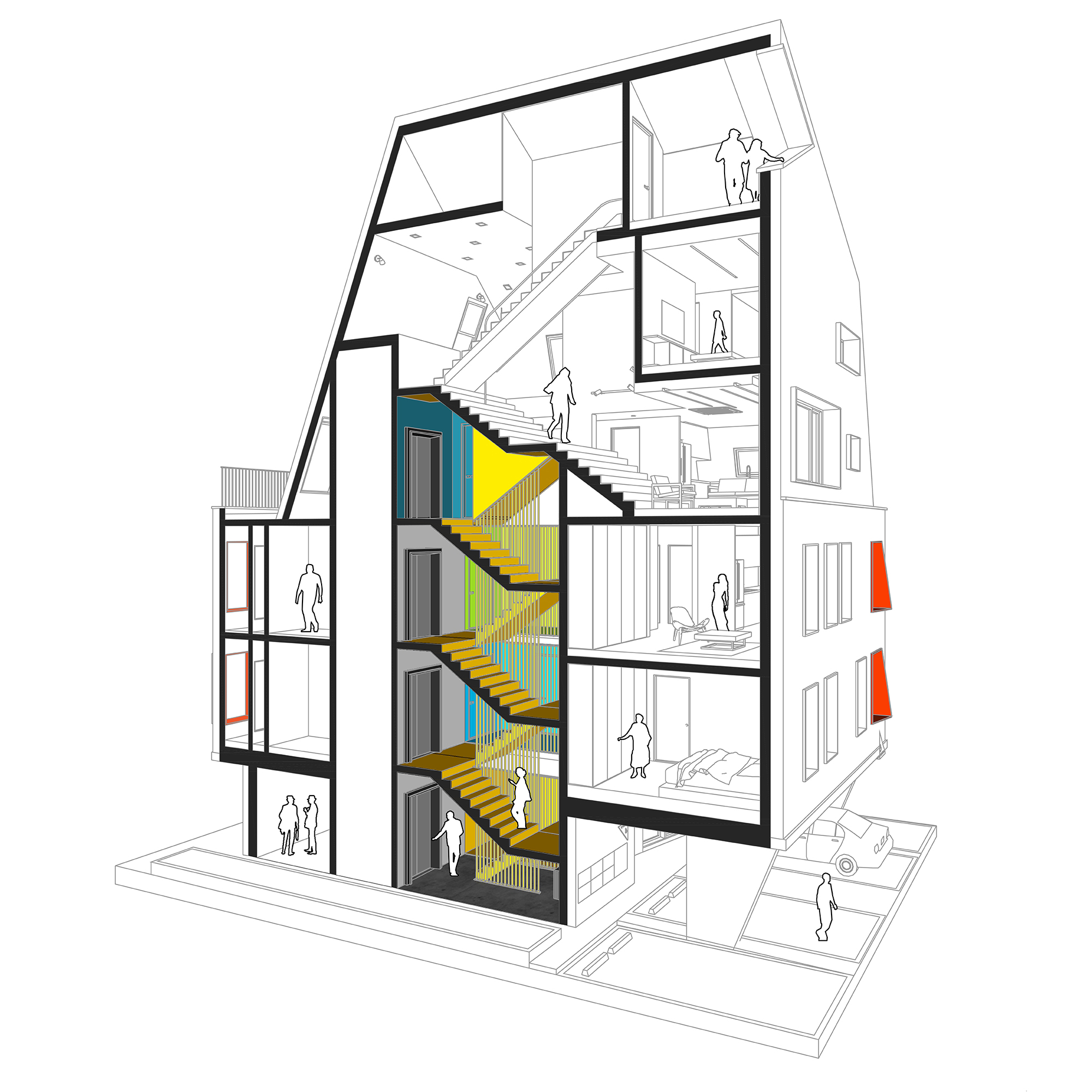
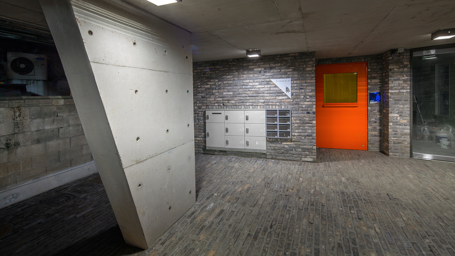
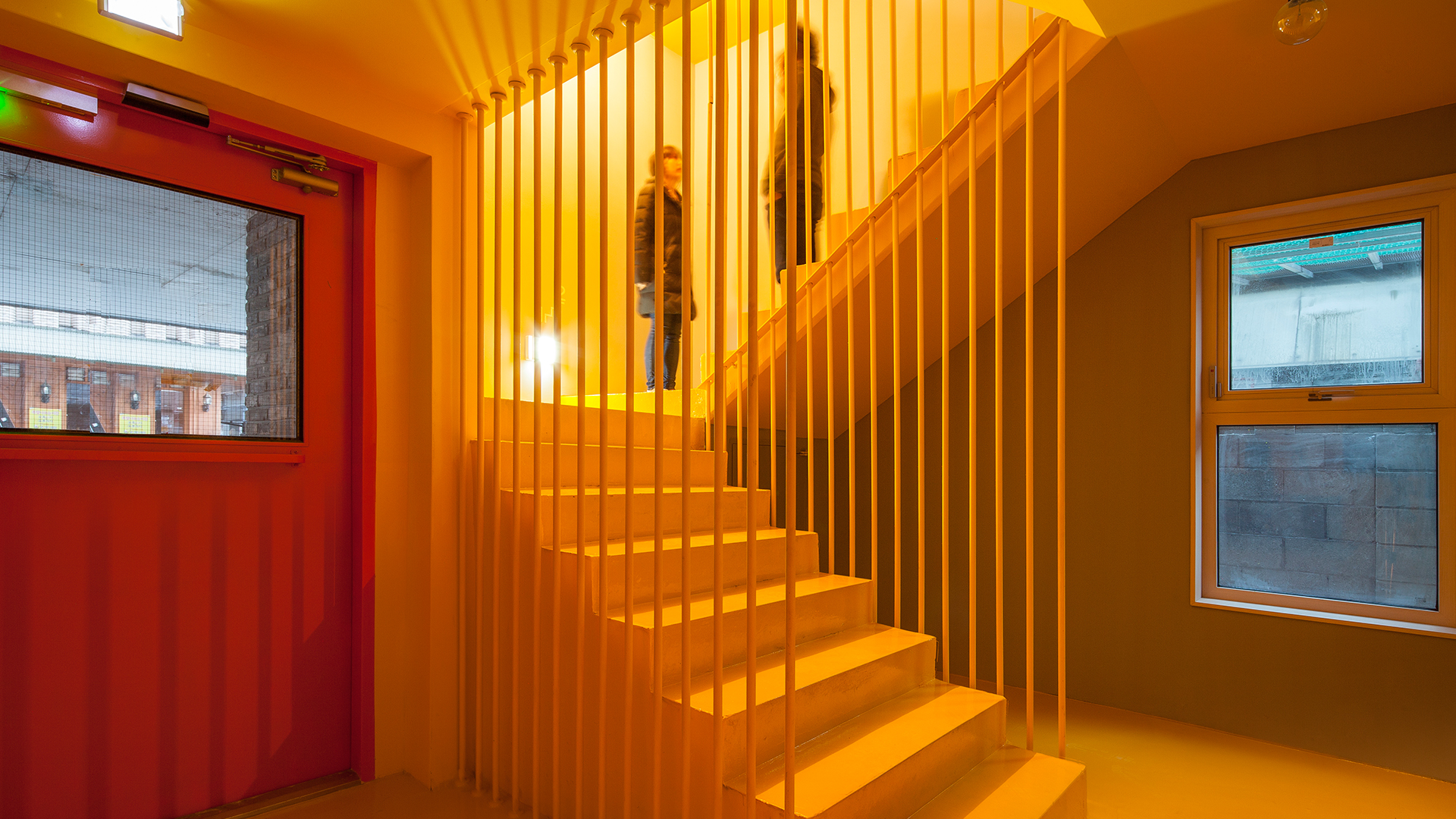
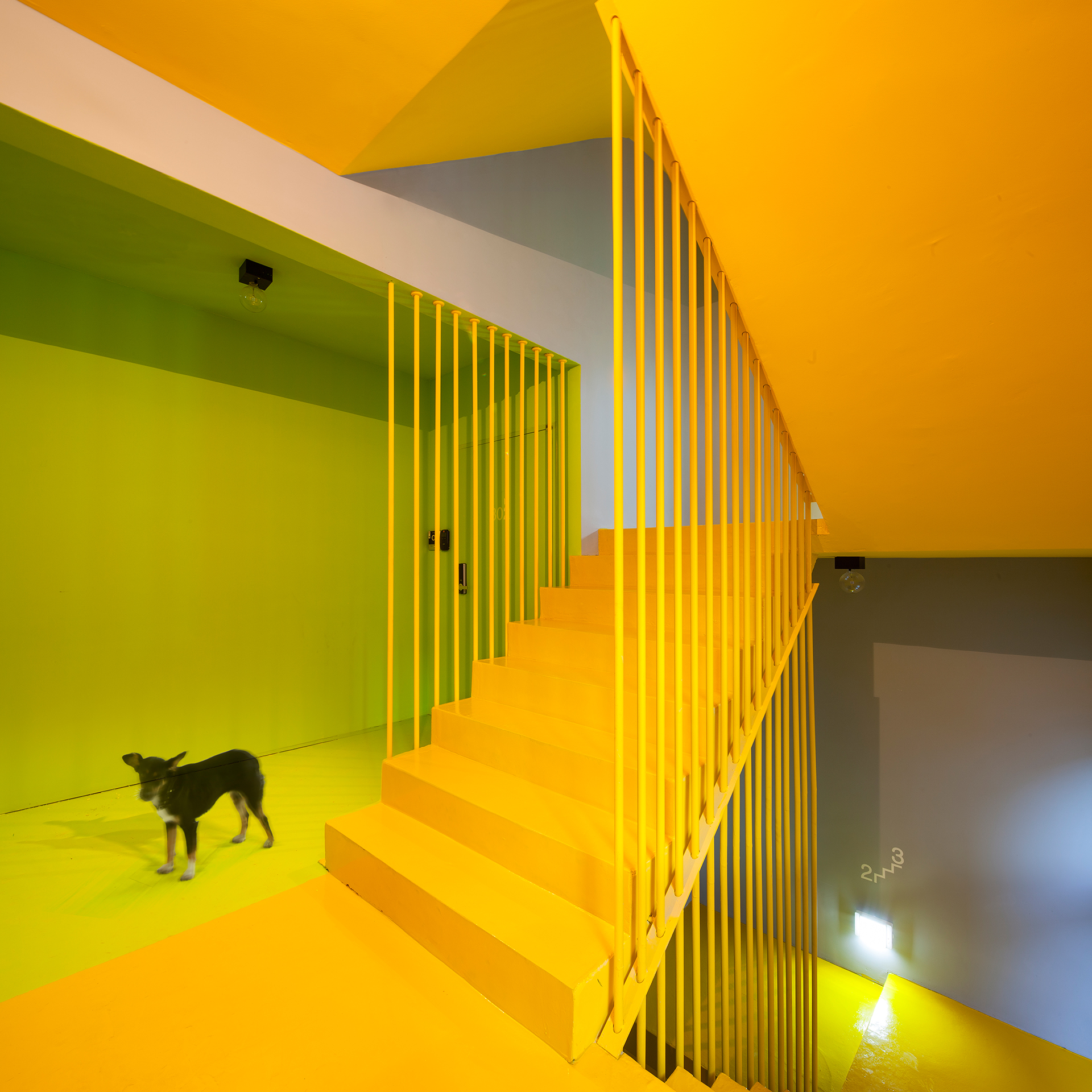
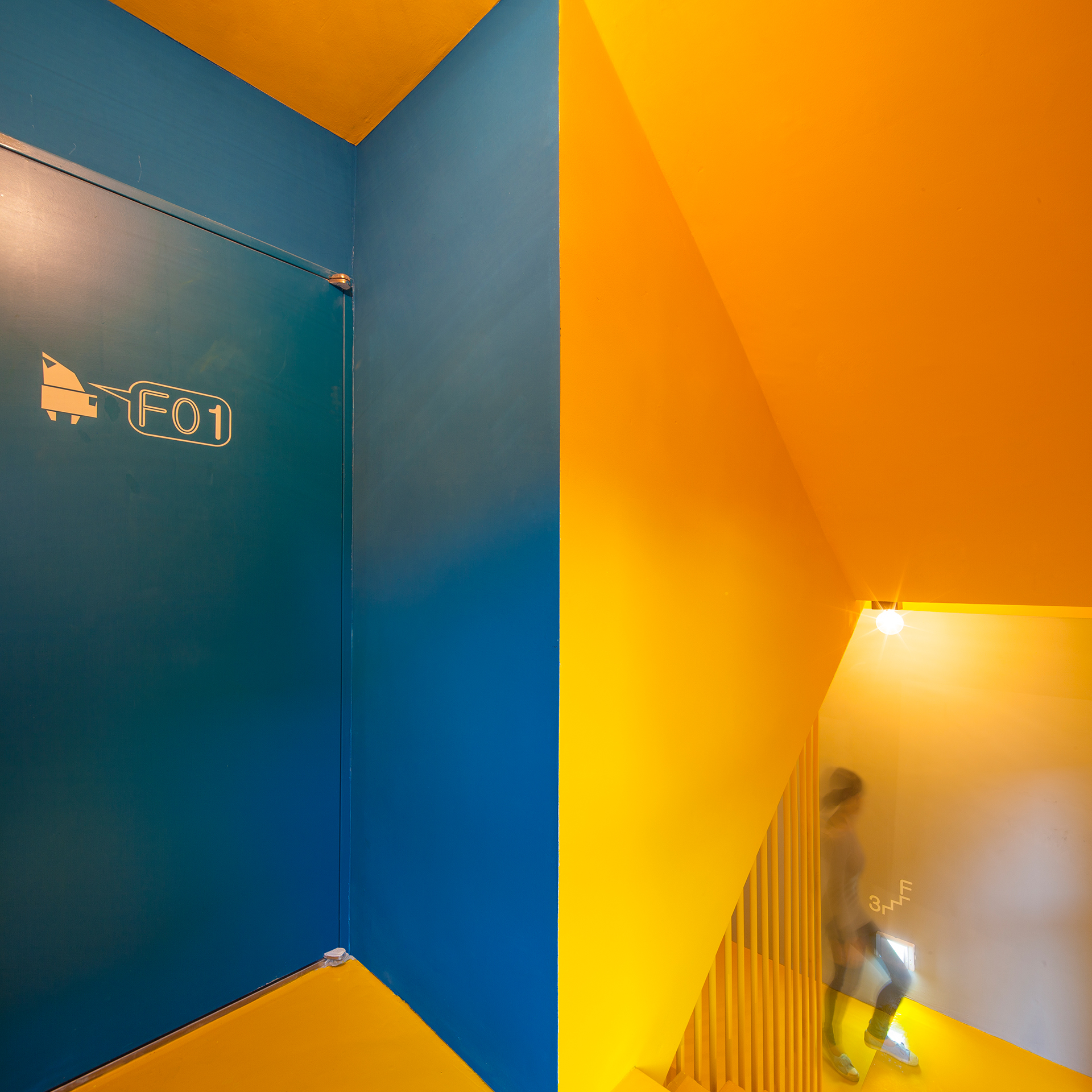
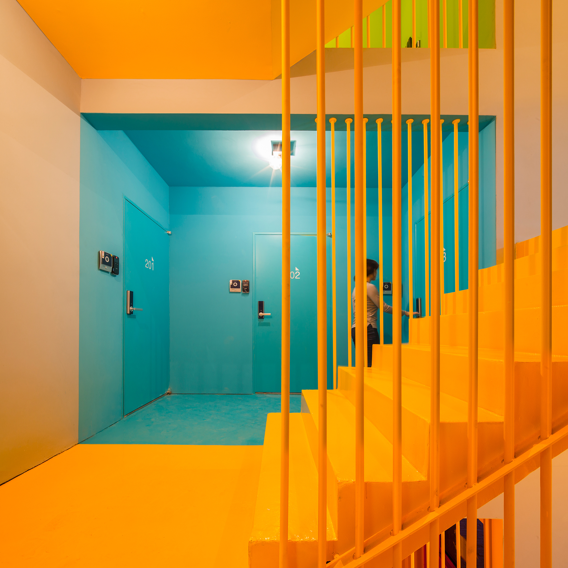
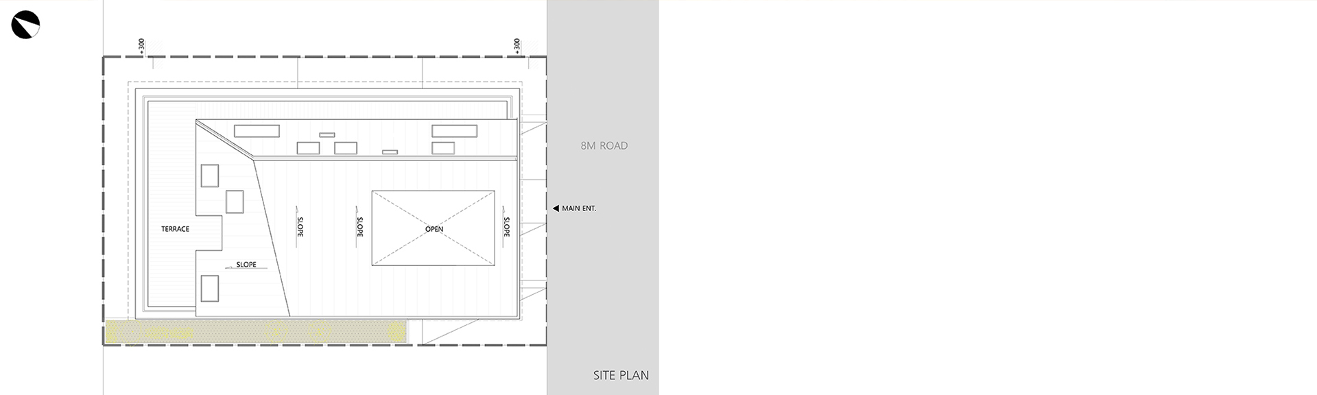
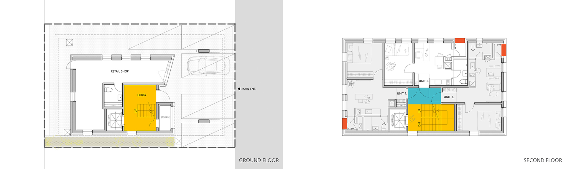
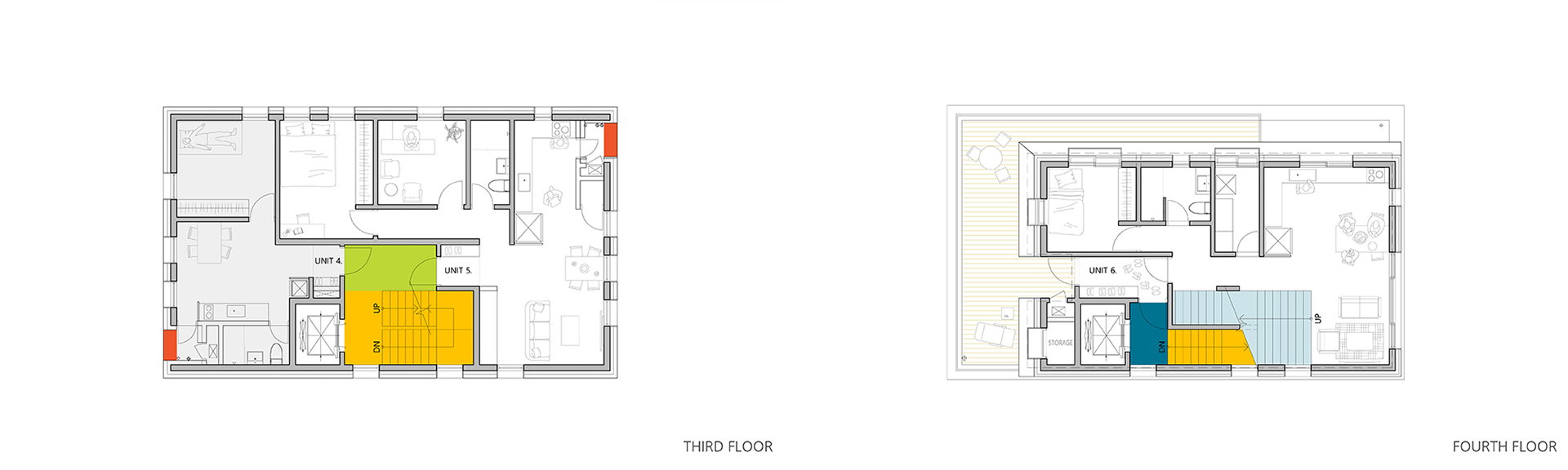
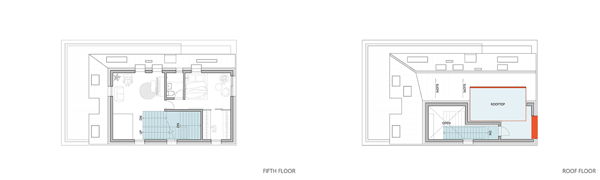
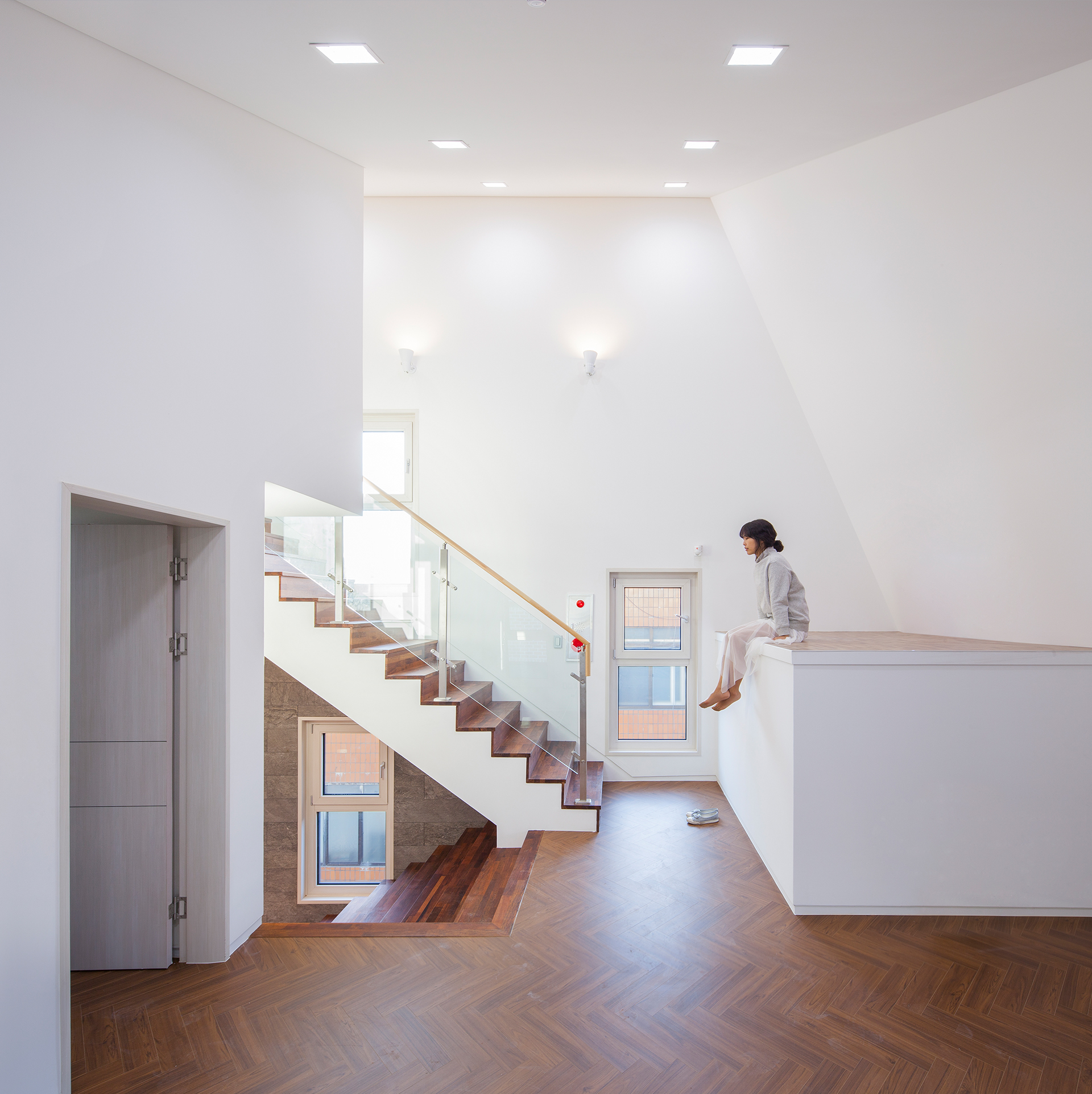
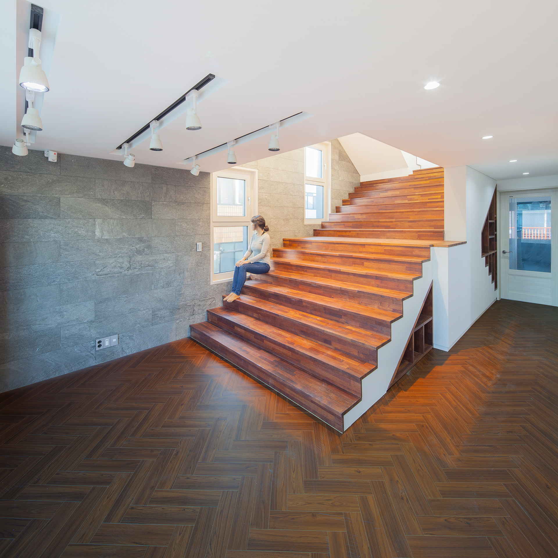
지상층의 근생공간은 변화하고 있는 가로(송이로)의 상업공간과의 연결을 고려하였습니다. 그리고 주거세대 정문과 근생공간 내부에 눈에 띄는 색을 배치함으로써 건물의 활기를 전달하고자 하였습니다. 이 건물의 내부계단은 층에 따라 다양한 색을 마주합니다. 사람들은 색에 따라 그들이 몇 층에 있는지 인지할 뿐 아니라, 로비, 복도, 계단 등의 공용공간에서 낯선 장면을 맞닥뜨리게 됩니다. 이 익숙치 않은 경험은 공용공간을 더욱 생경하게 만들어 유쾌한 기억을 만듭니다.
The pilotis and retail space are designed by considering active connection and expandability towards other retail places on the street. The main gate and interior space of the ground floor are colored with vivid colors – red and lime, which helps the building to deliver its attractiveness to its neighbors. The yellow staircase meets up with diverse colors according to the floor. People would not only recognize which floor they are on by the colors but also find unaccustomed scene in common space – lobby, hallway, and stairs. This unfamiliar experience allows core spaces to be more unexpected and enjoyable.

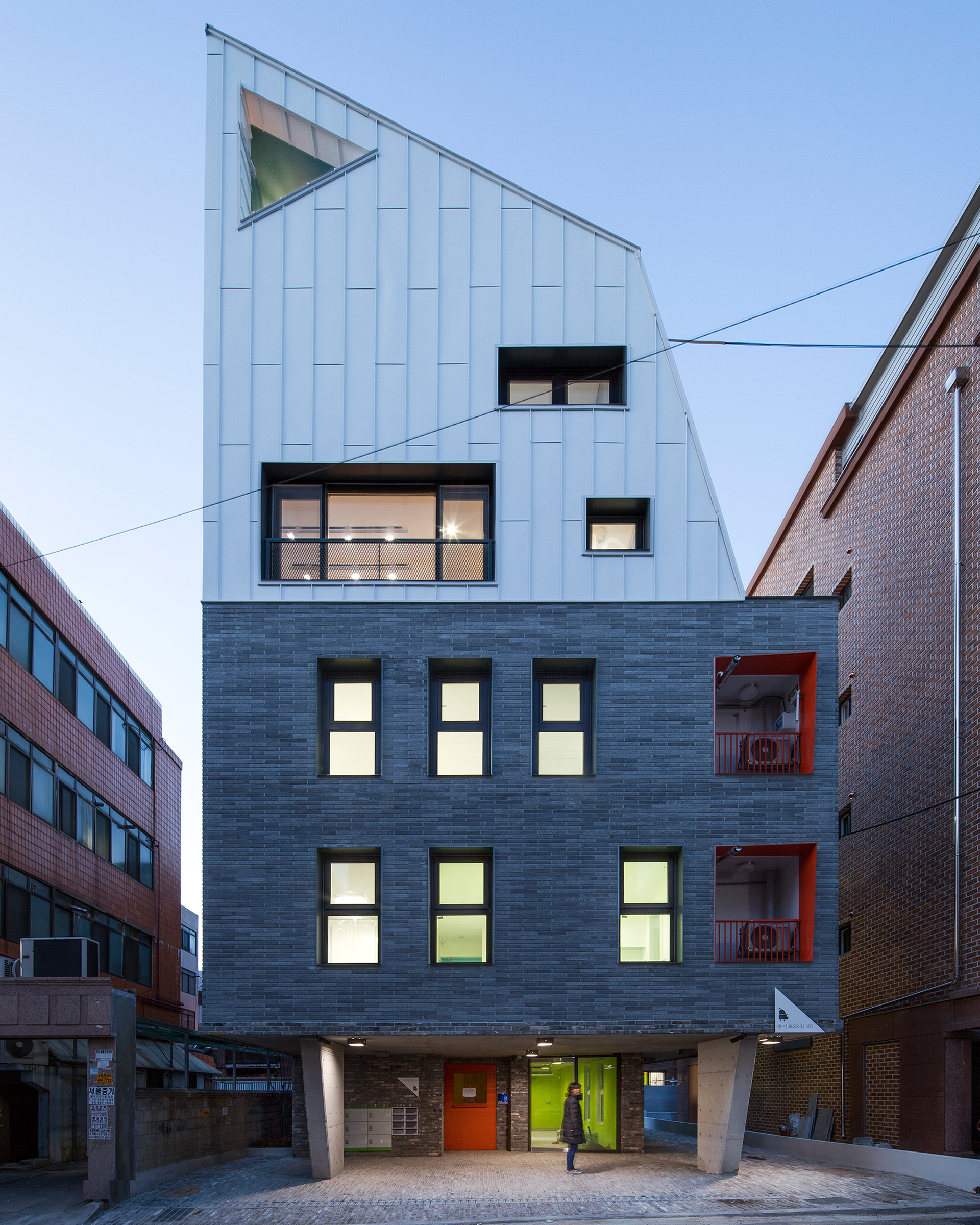
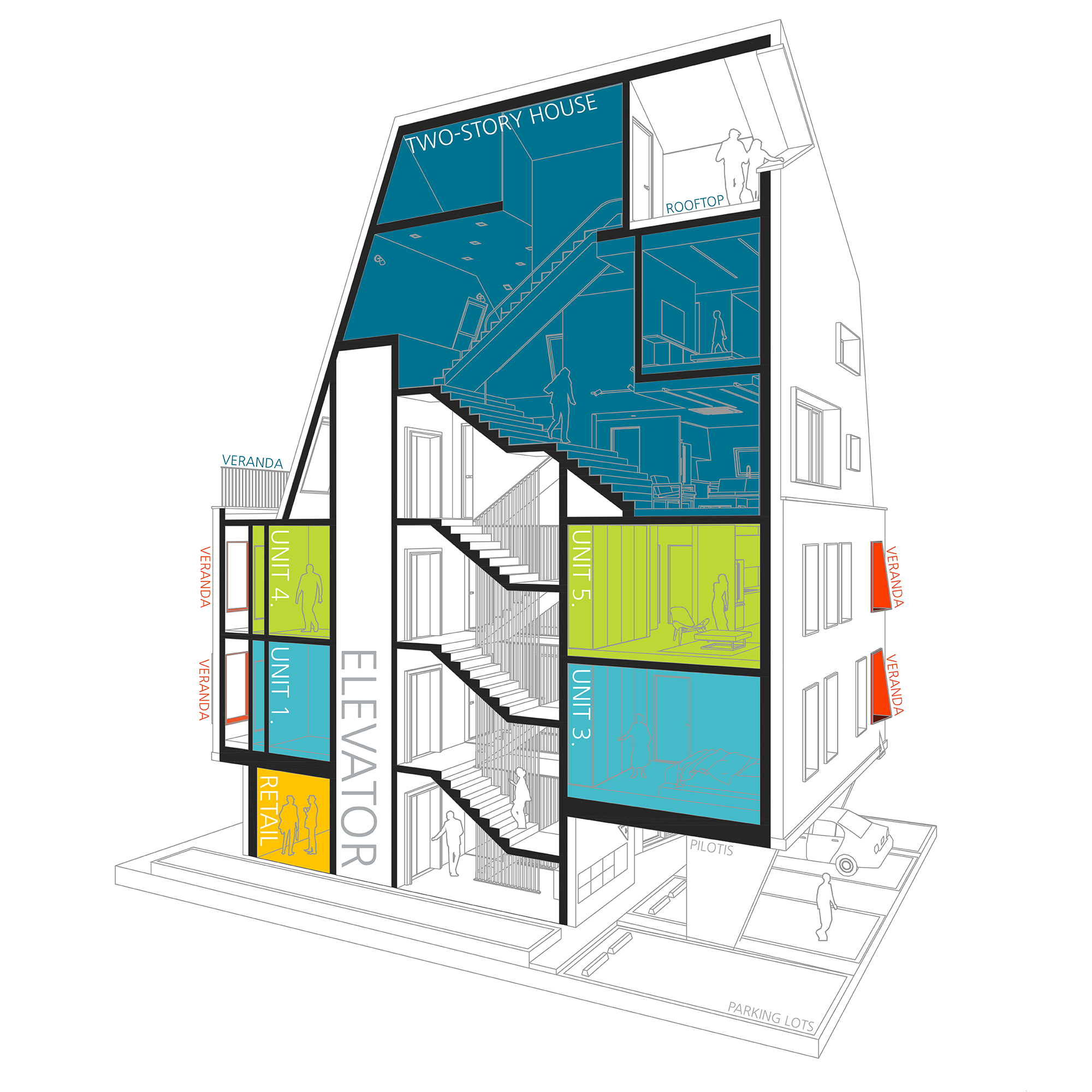
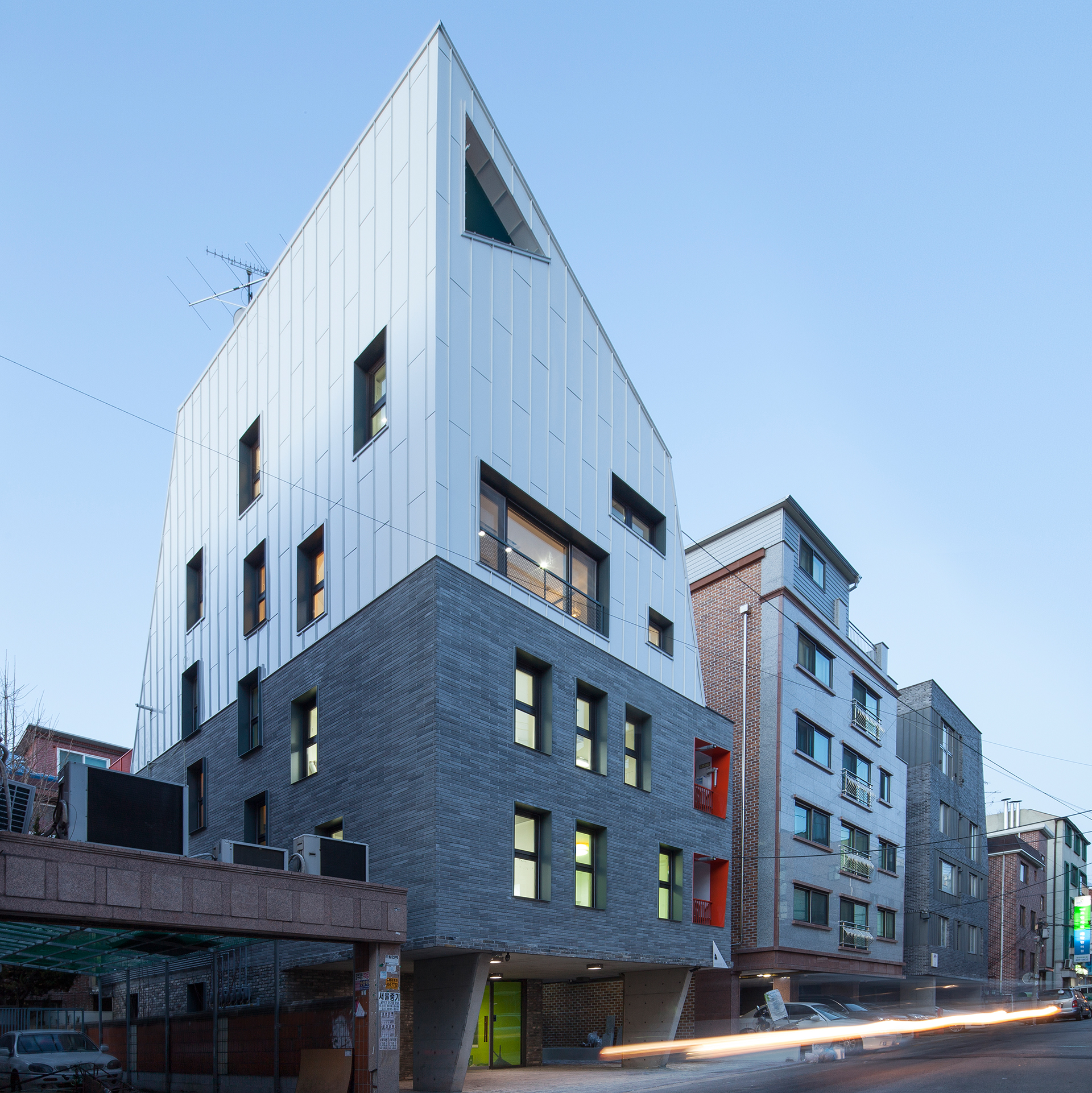
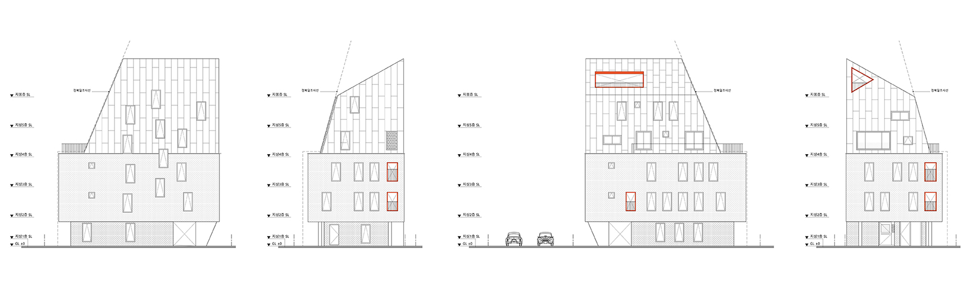
모든 임대주택은 각자의 외부공간을 가집니다. 각 유닛의 이 공간은 붉은 프레임으로 둘러싸여 내외부에서부터 강조됩니다. 그리고 모든 창문의 철 프레임은 파사드를 강조할 뿐 아니라, 건물의 단열과 방수기능 또한 보완하도록 설계되었습니다.
Every rental housing has its own veranda which is the only exterior space in the unit. The red frame of the space highlights its uniqueness from both inside and outside of the building. Additionally, all window steel frames emphasize overall windows and façade clearly and strengthen insulation and waterproof function.
Location
Songpa-gu, Seoul
Principle Use
Housing
Floor Area
123.37㎡
Photography
YOAP Architects
Construction
Sungsil Construction