
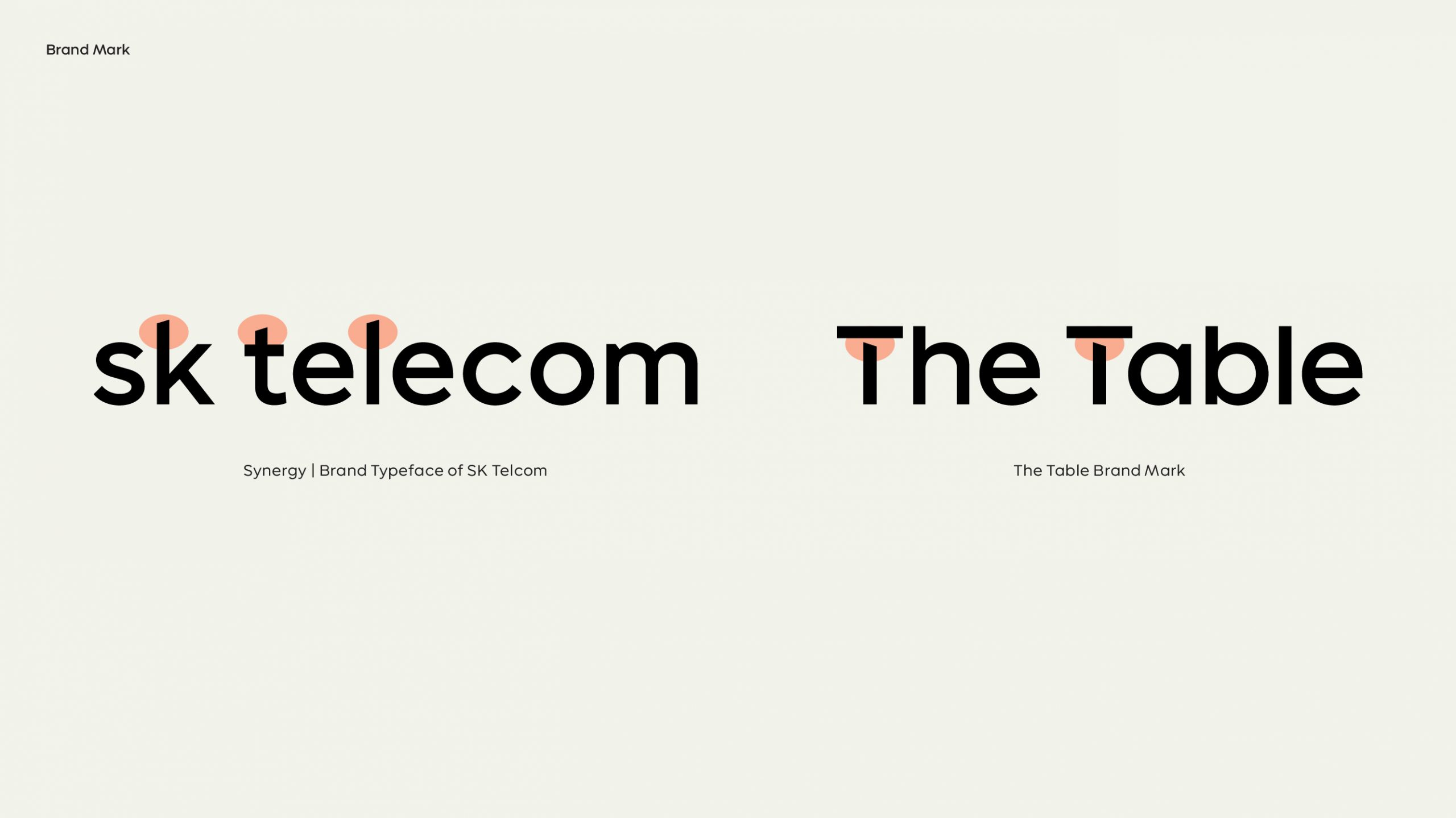
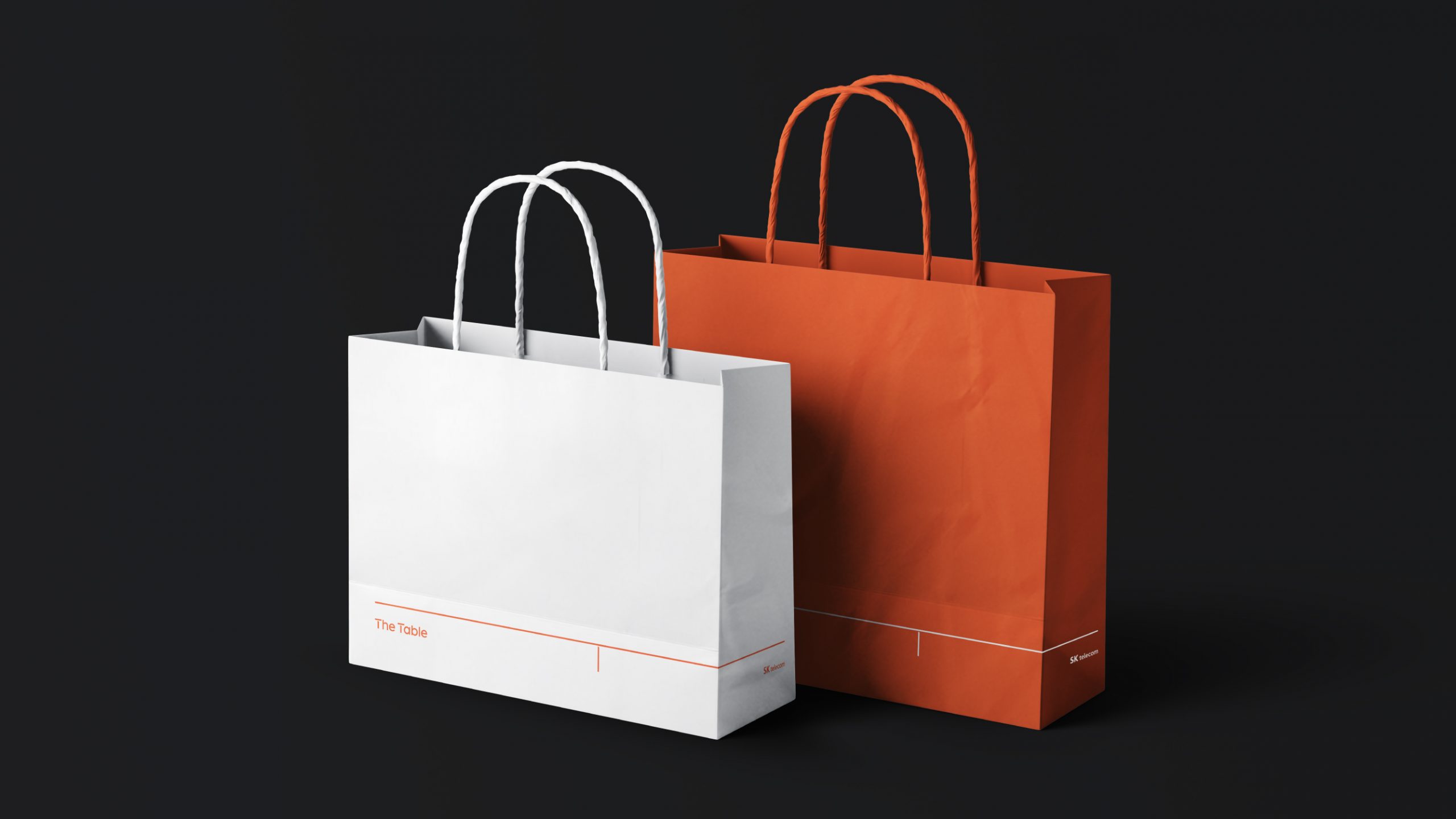
Degree of SKT, Degree of Innovation
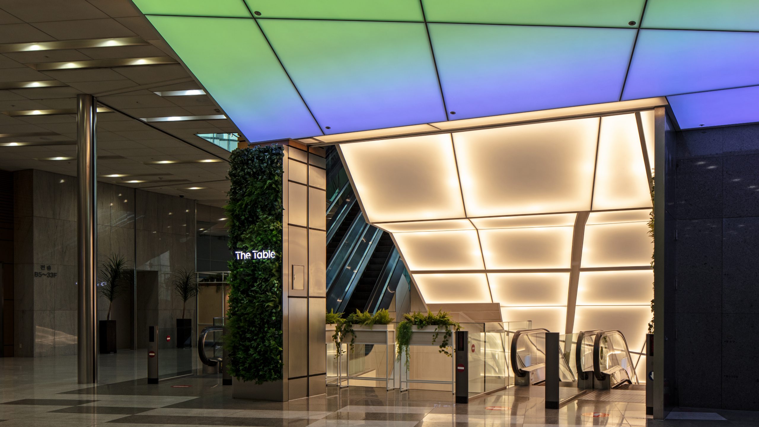
‘Table’의 구조적 특징과 브랜드 서체의 사선 요소를 T에 담아냈습니다. 이 사선은 SKT와 The Table을 연결하는 시각적 자산이자, 무한한 혁신과 가능성이라는 The Table의 핵심 가치를 상징합니다.
It is designed to inherit the structural characteristics of 'table' and the diagonal line, the visual features of the brand's typeface, to the initial 'T'. The oblique line is the visual asset of SKT's symbolism linking SKT to The Table and expressing infinite innovation and possibilities, the core valure of The Table.

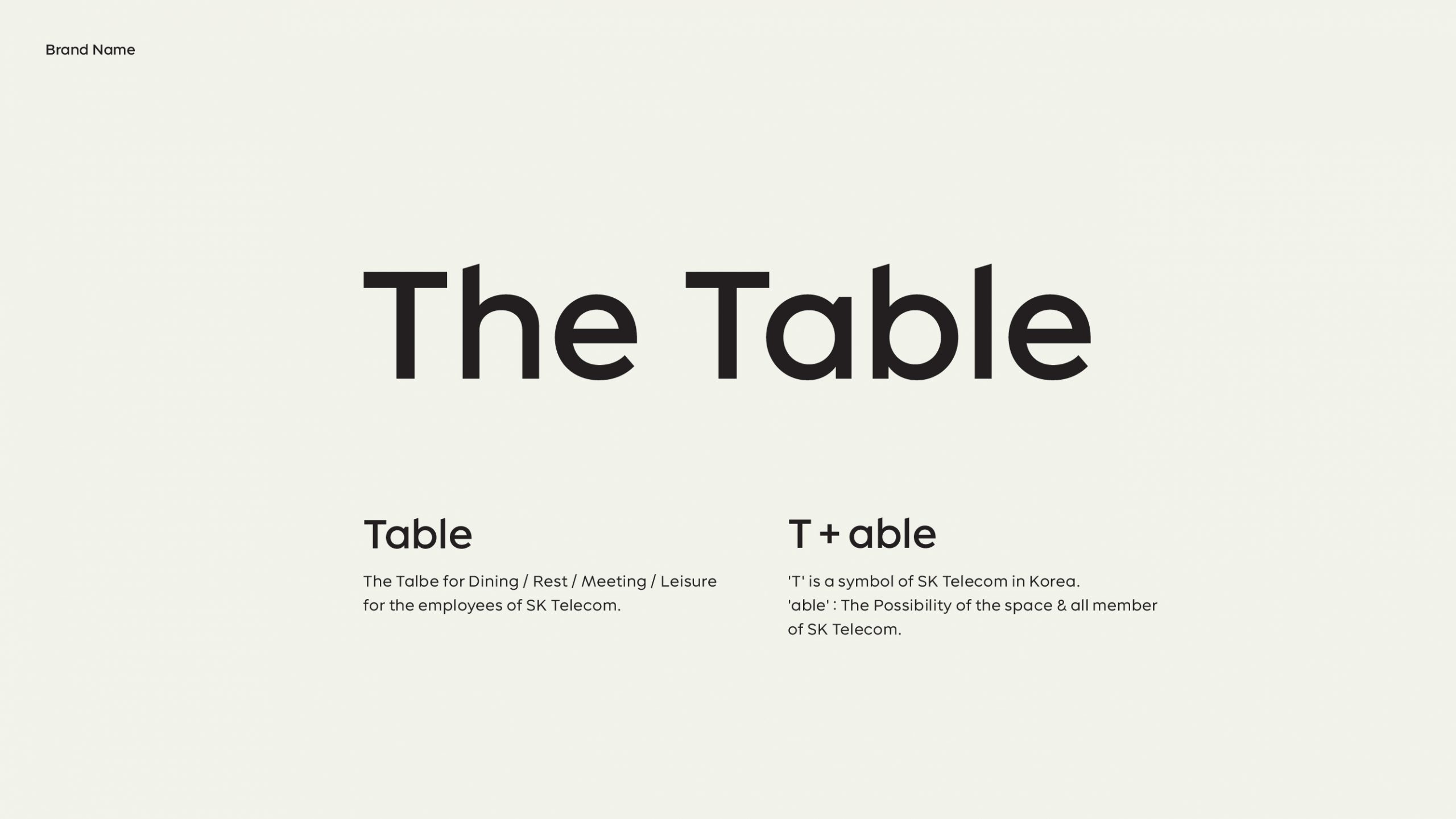
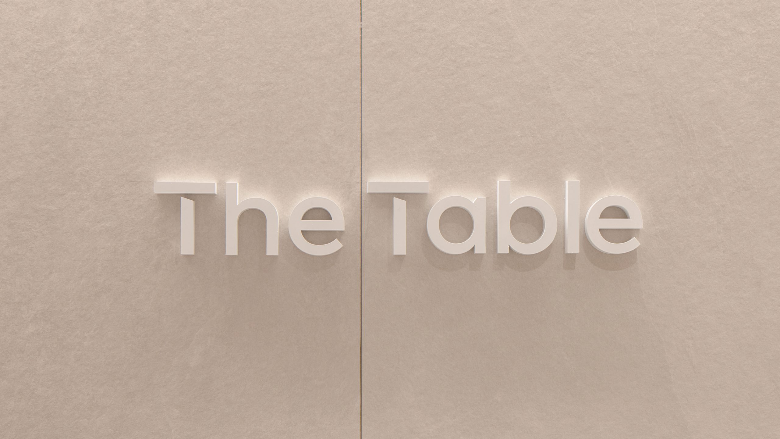
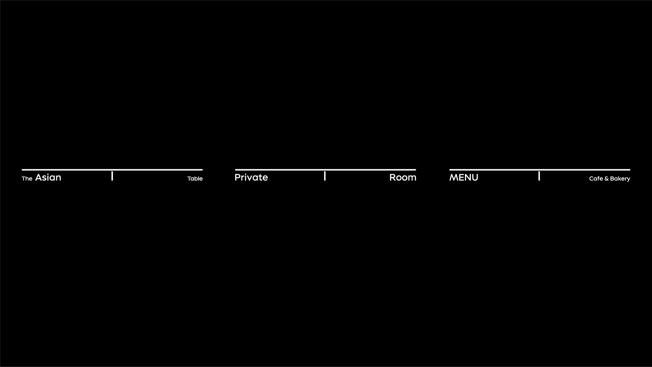
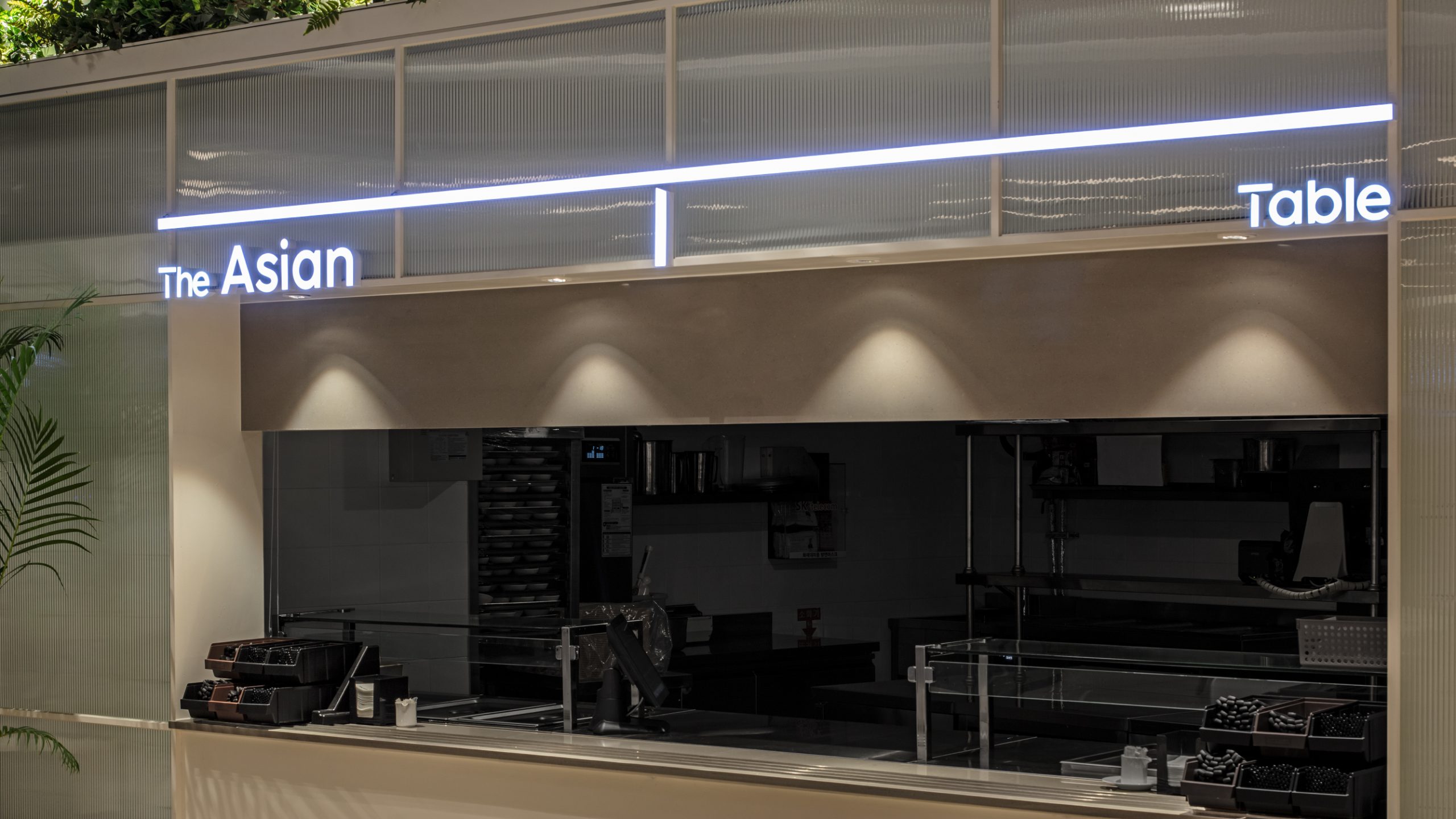
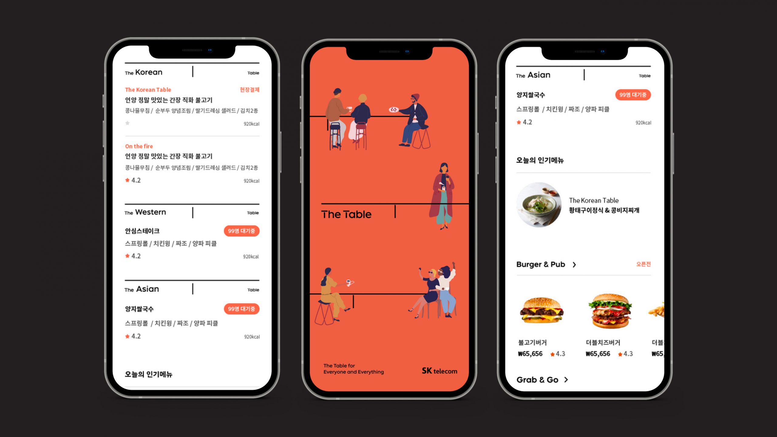
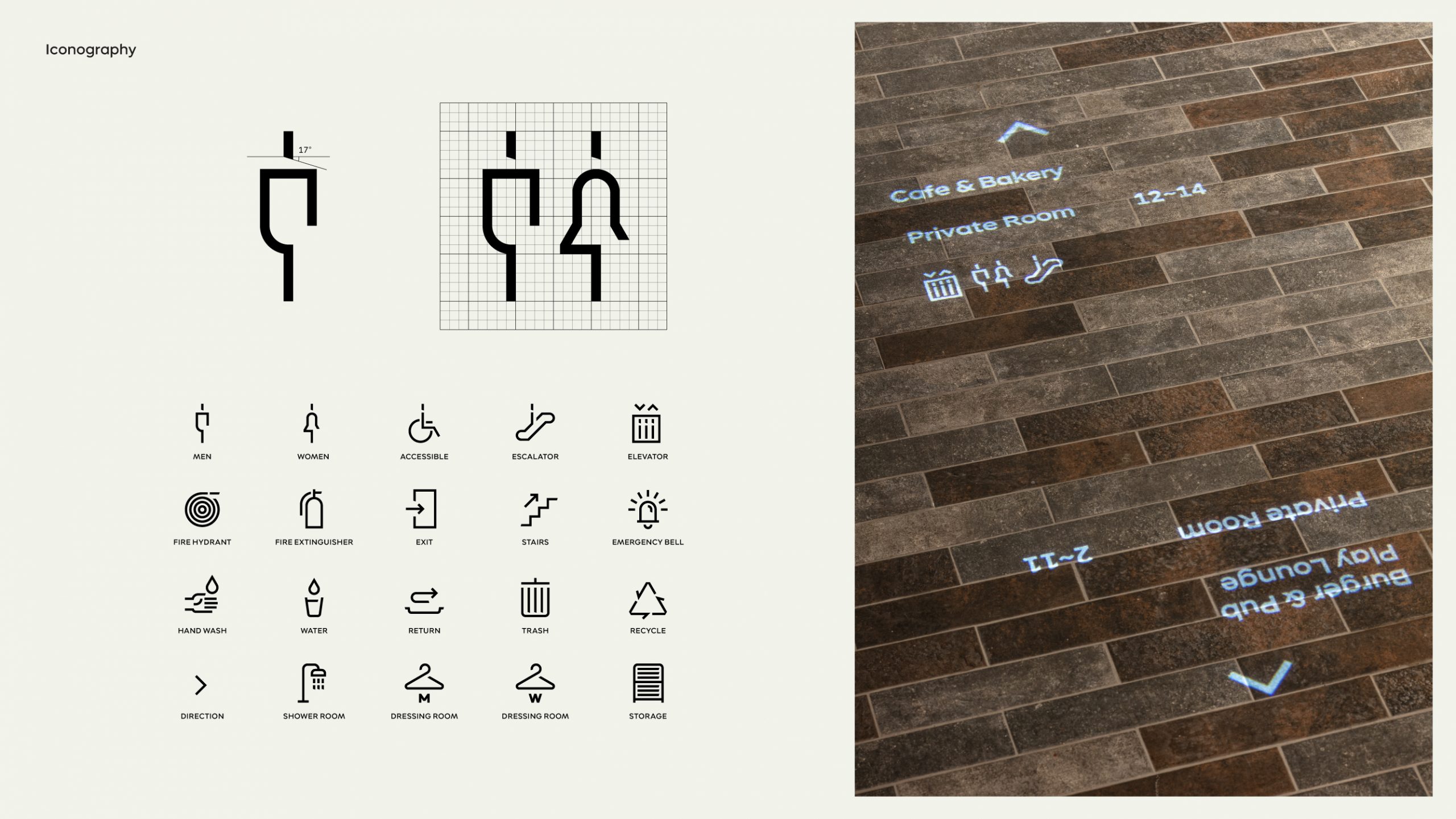
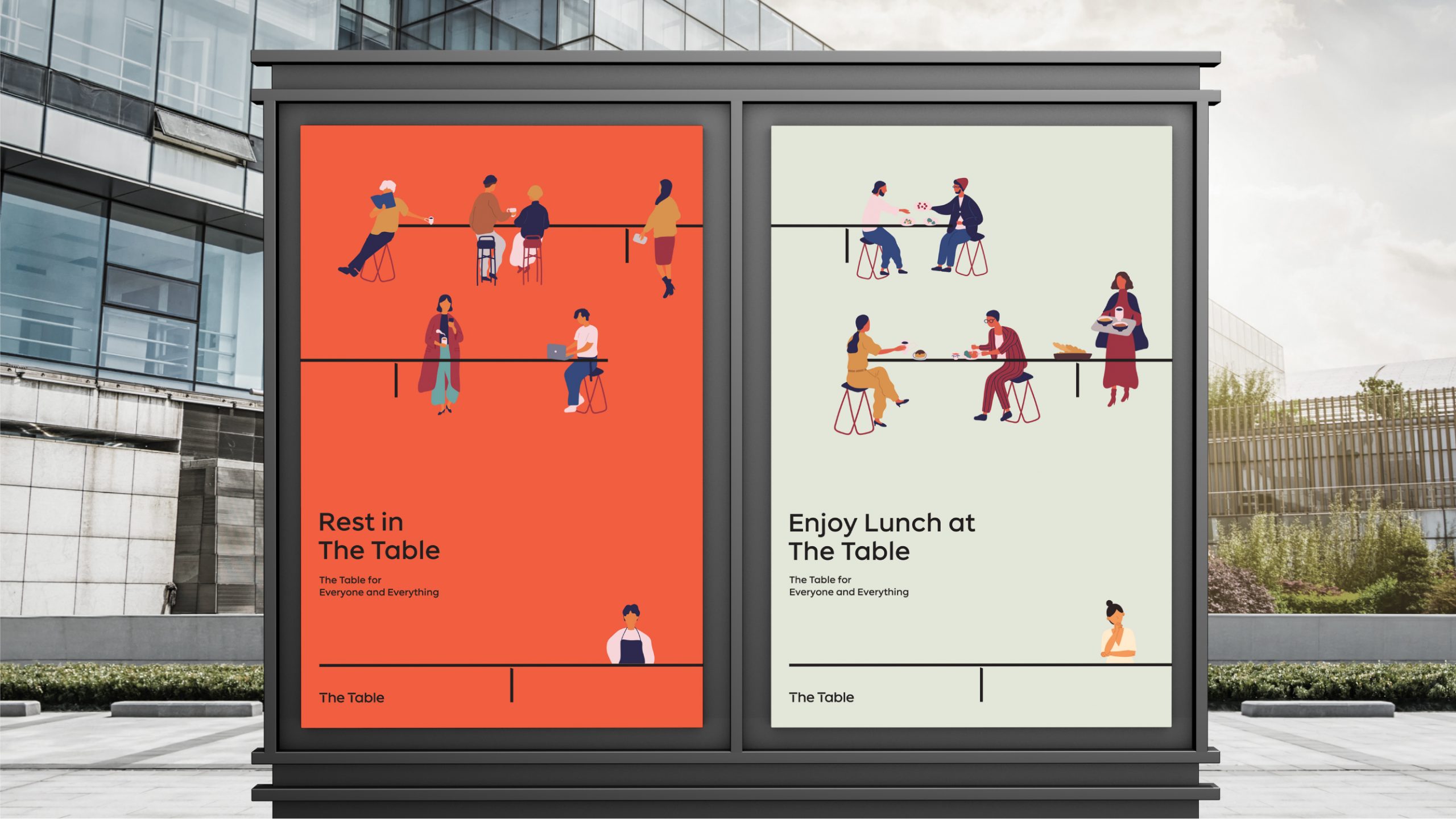
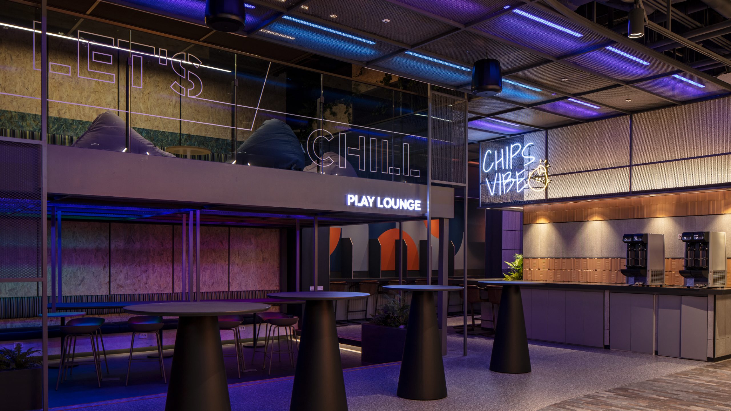
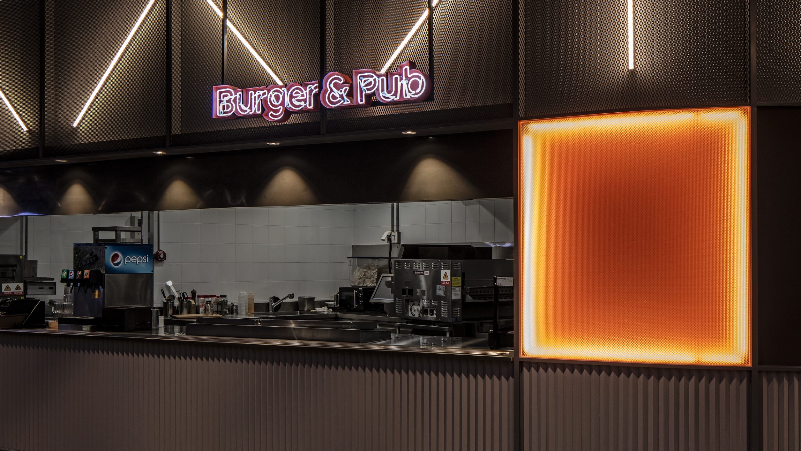
The Horizontal Table for Everything & Everyone
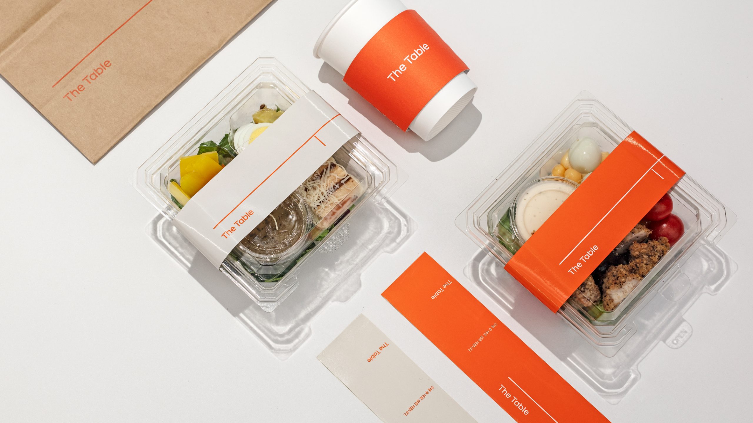
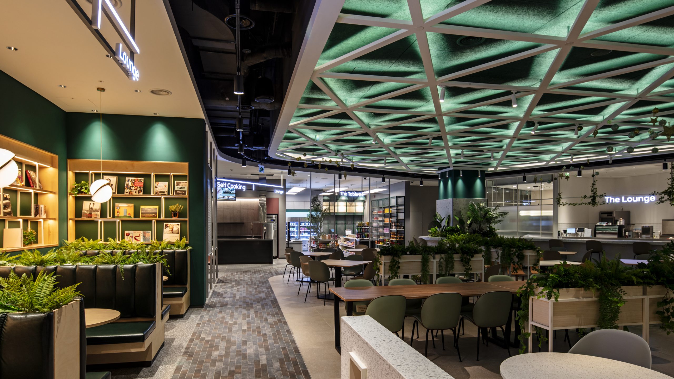
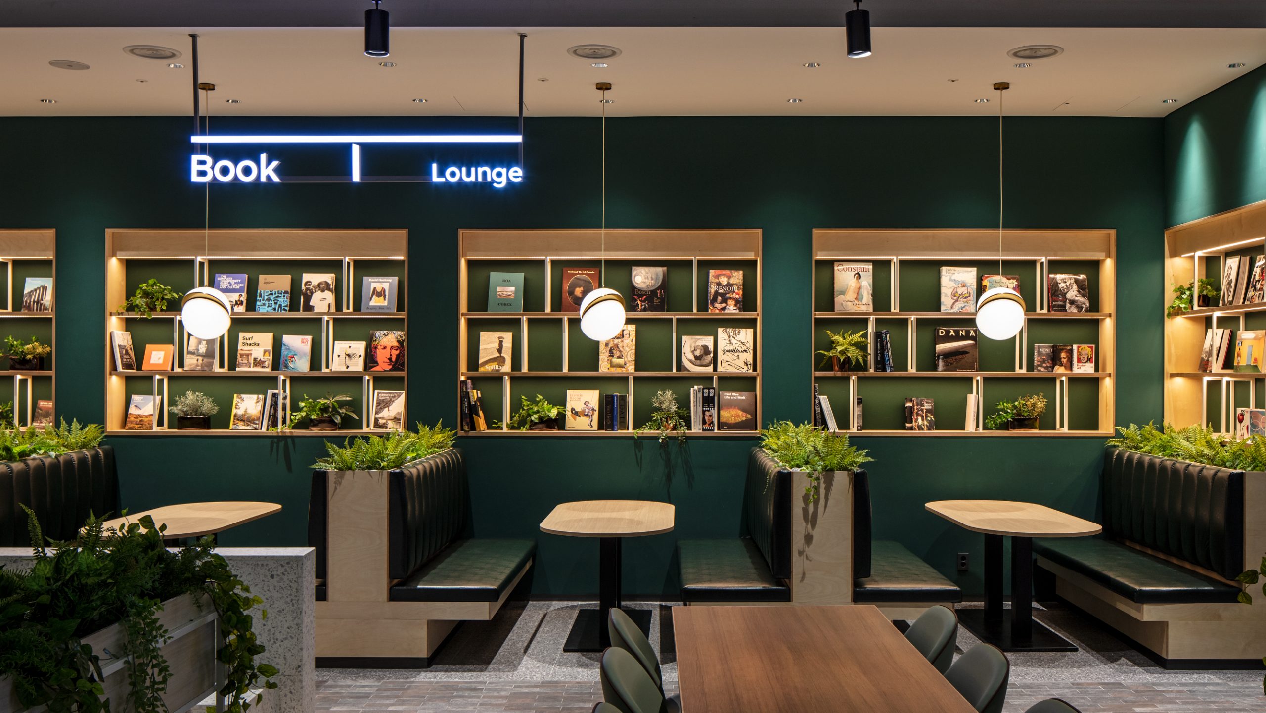
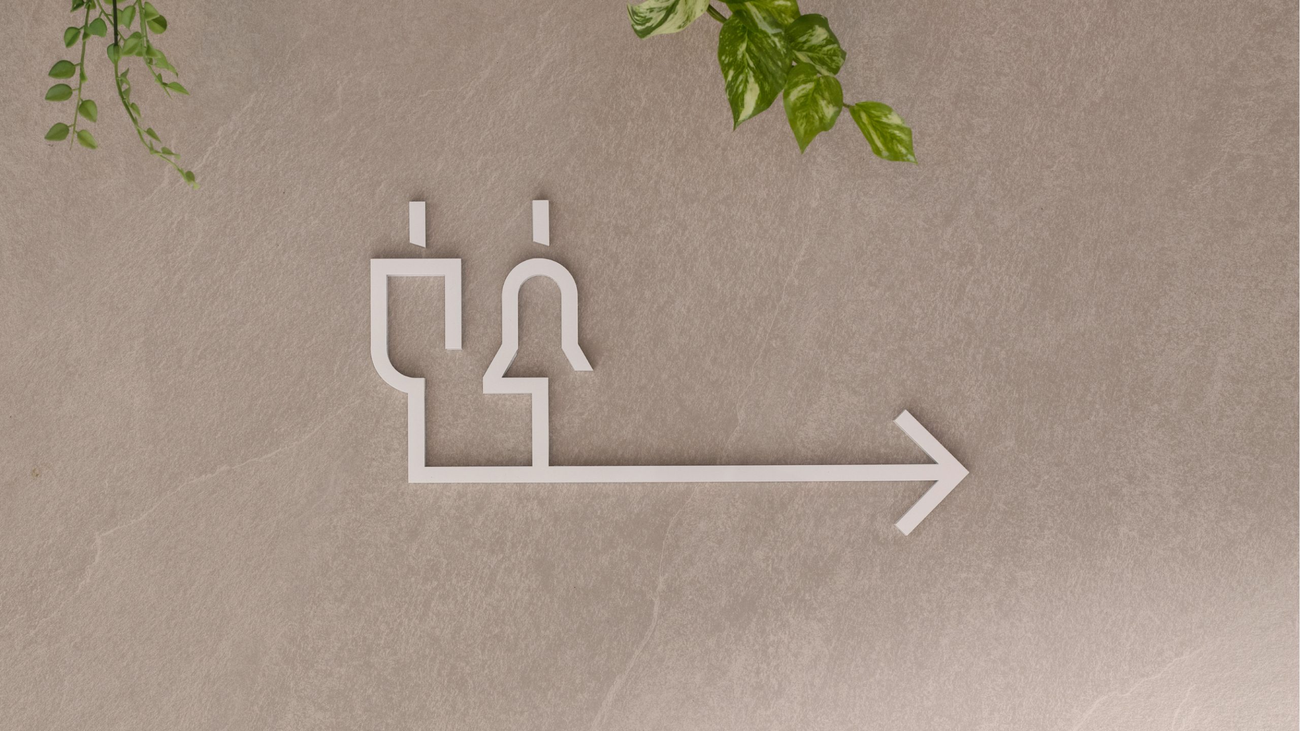
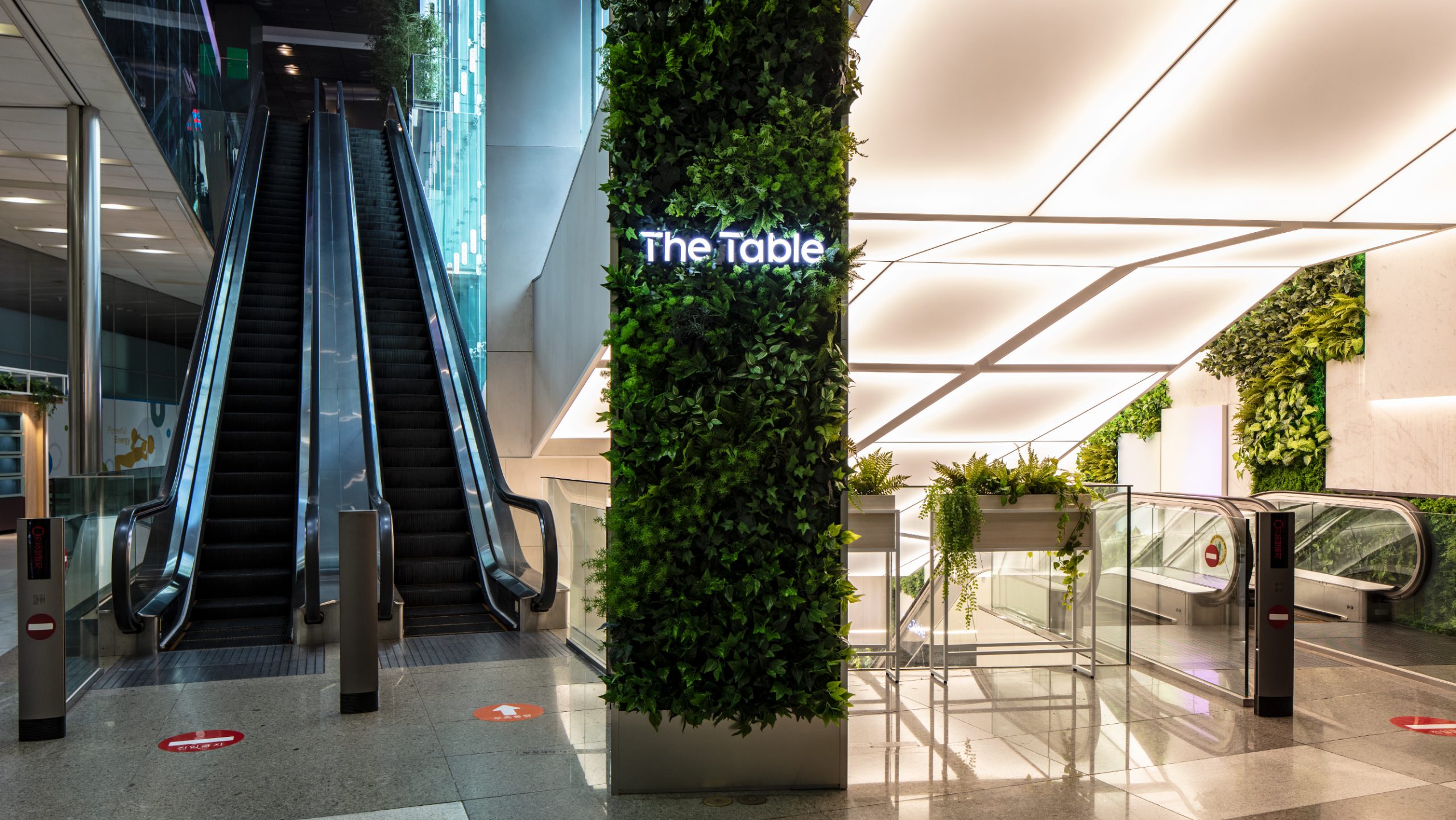
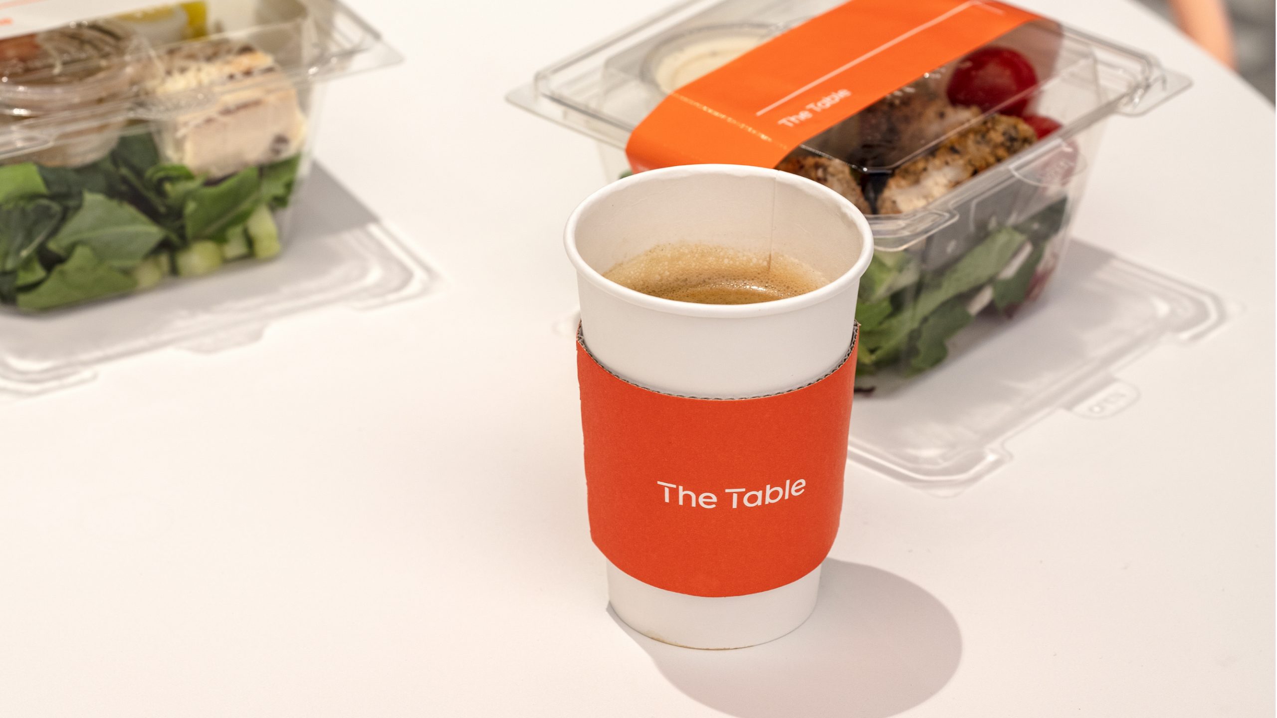
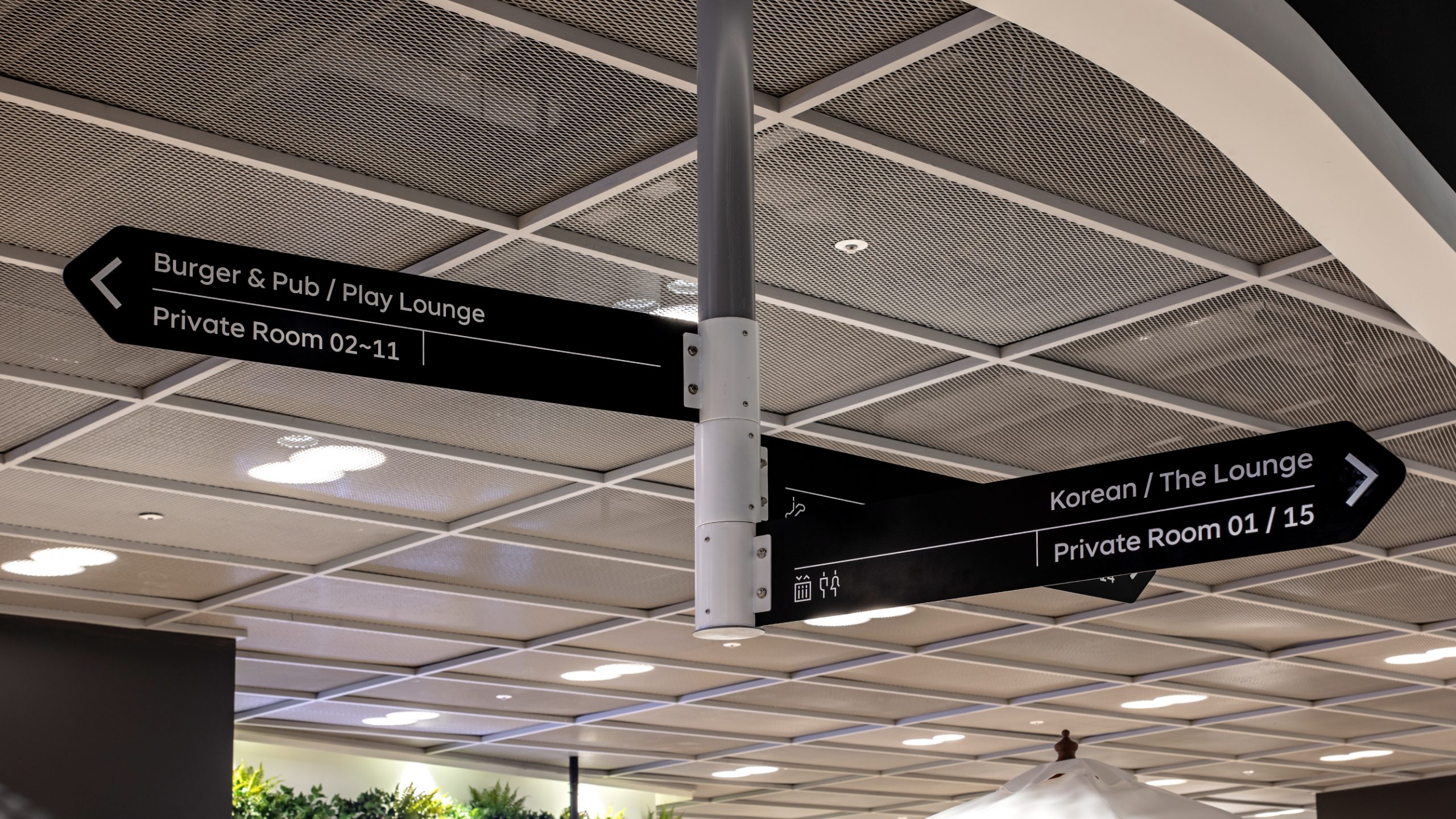
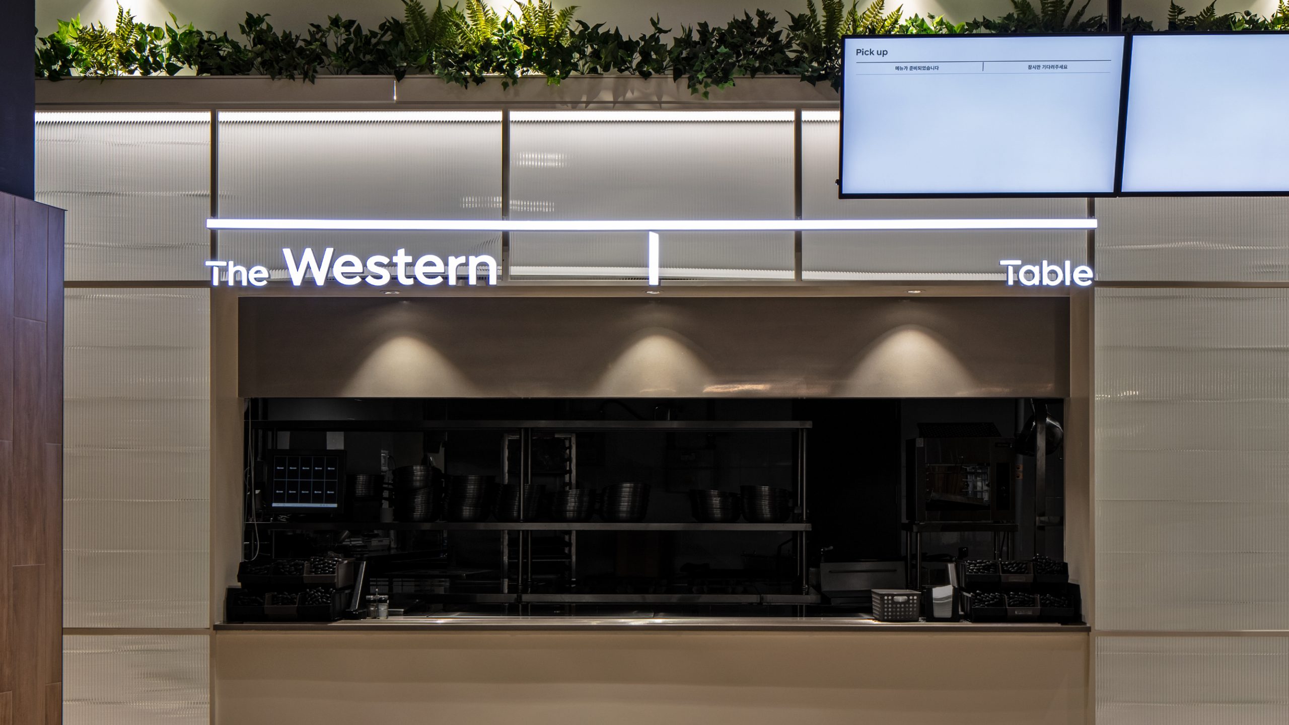
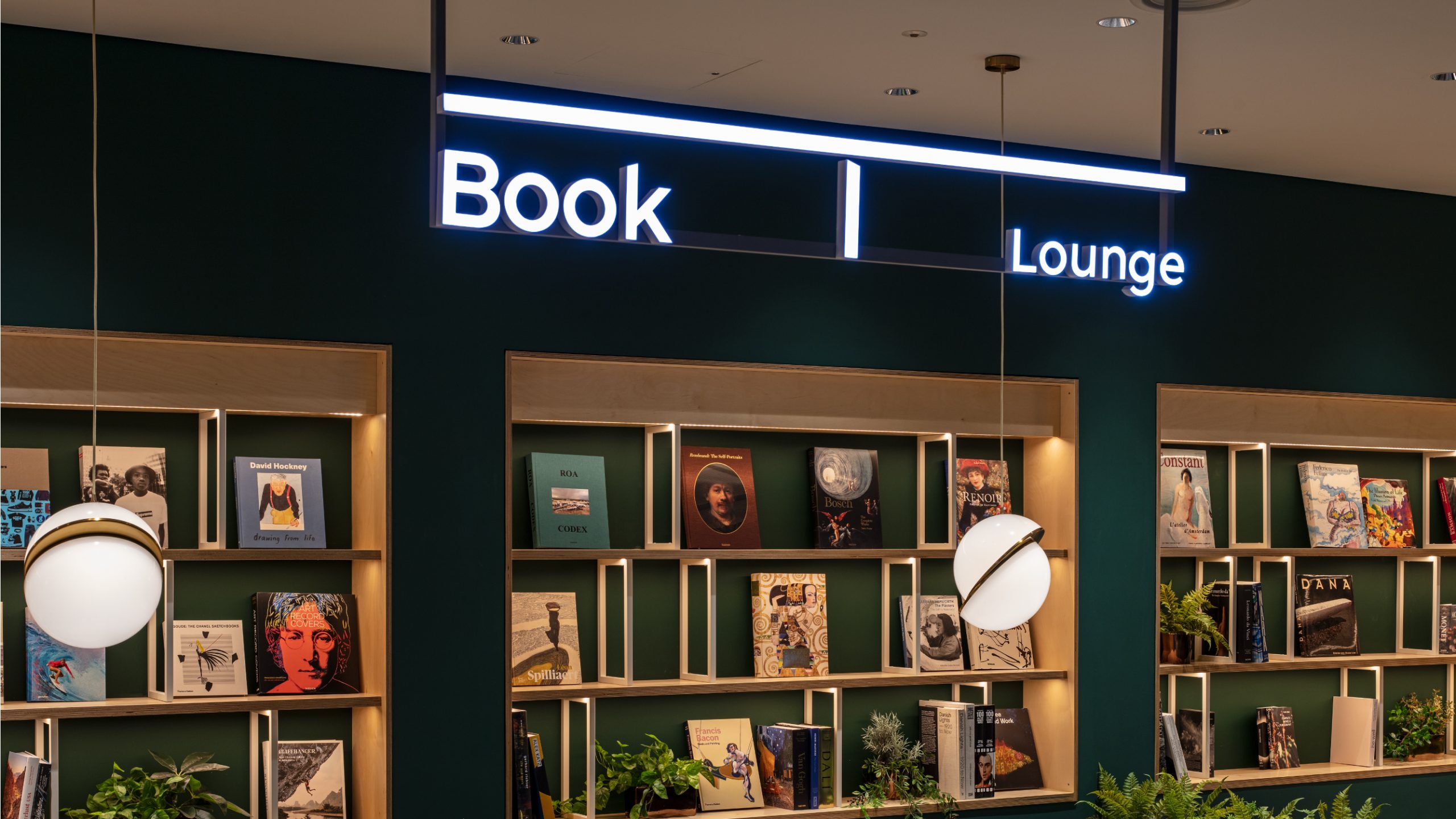
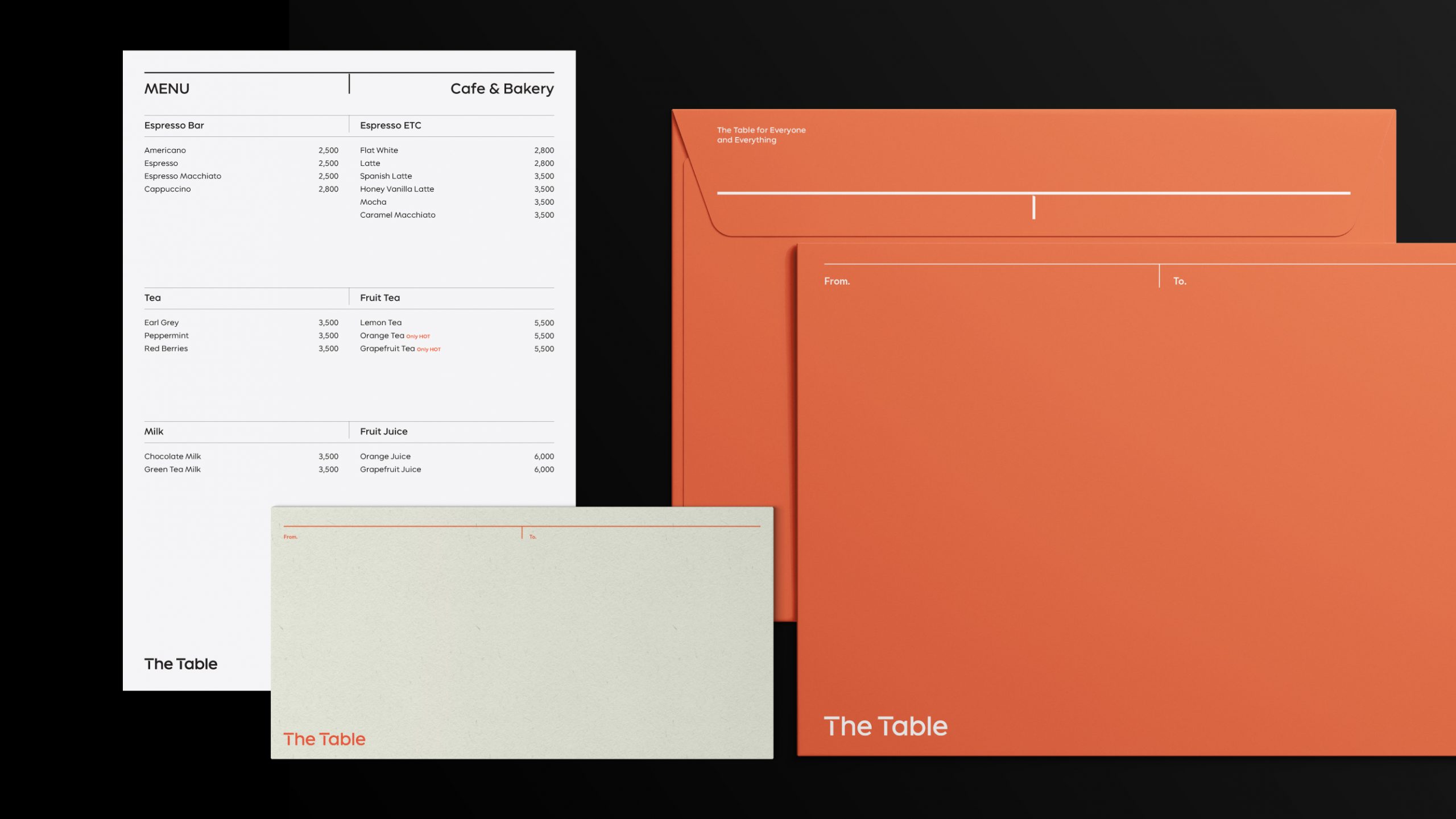
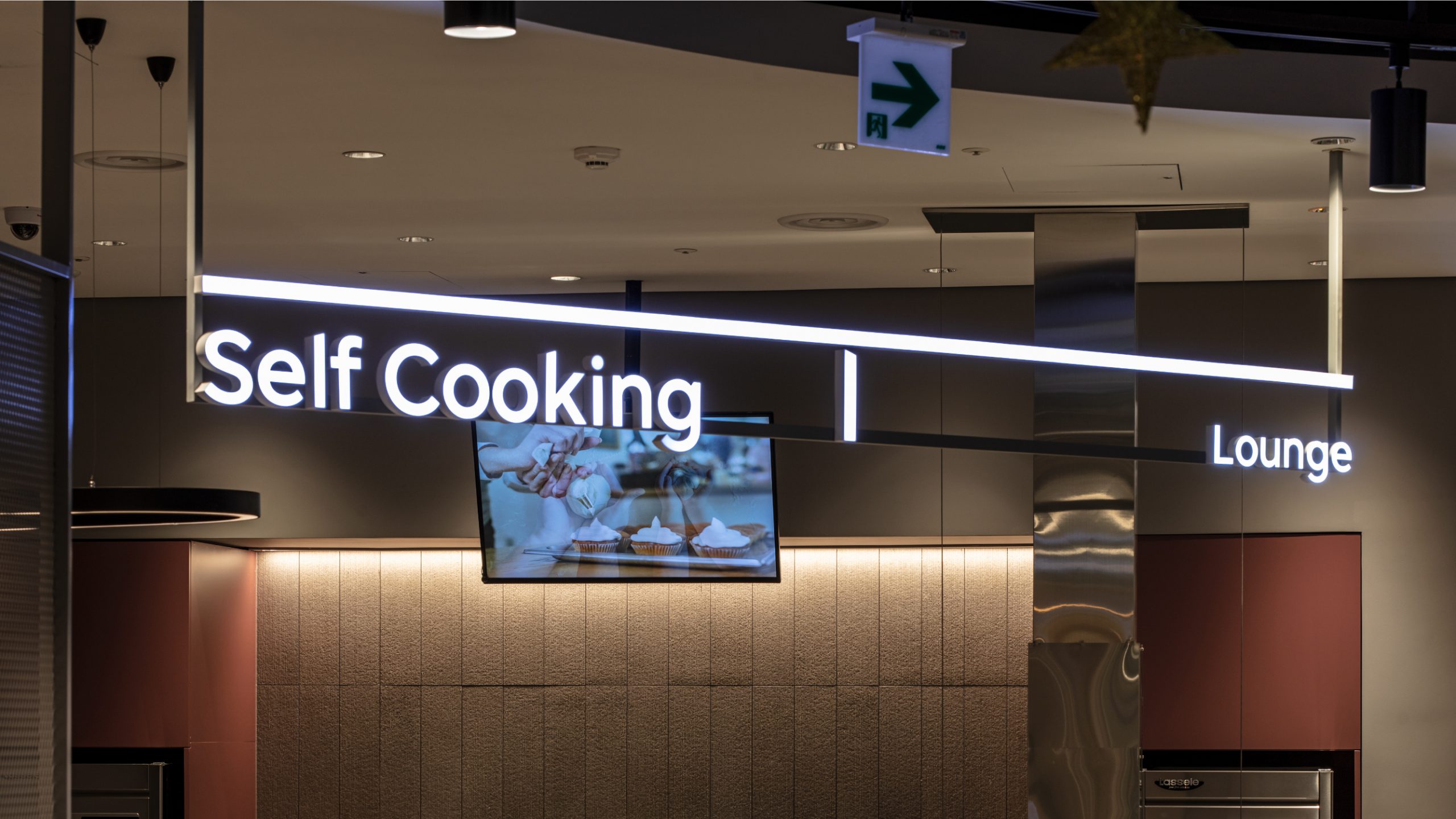
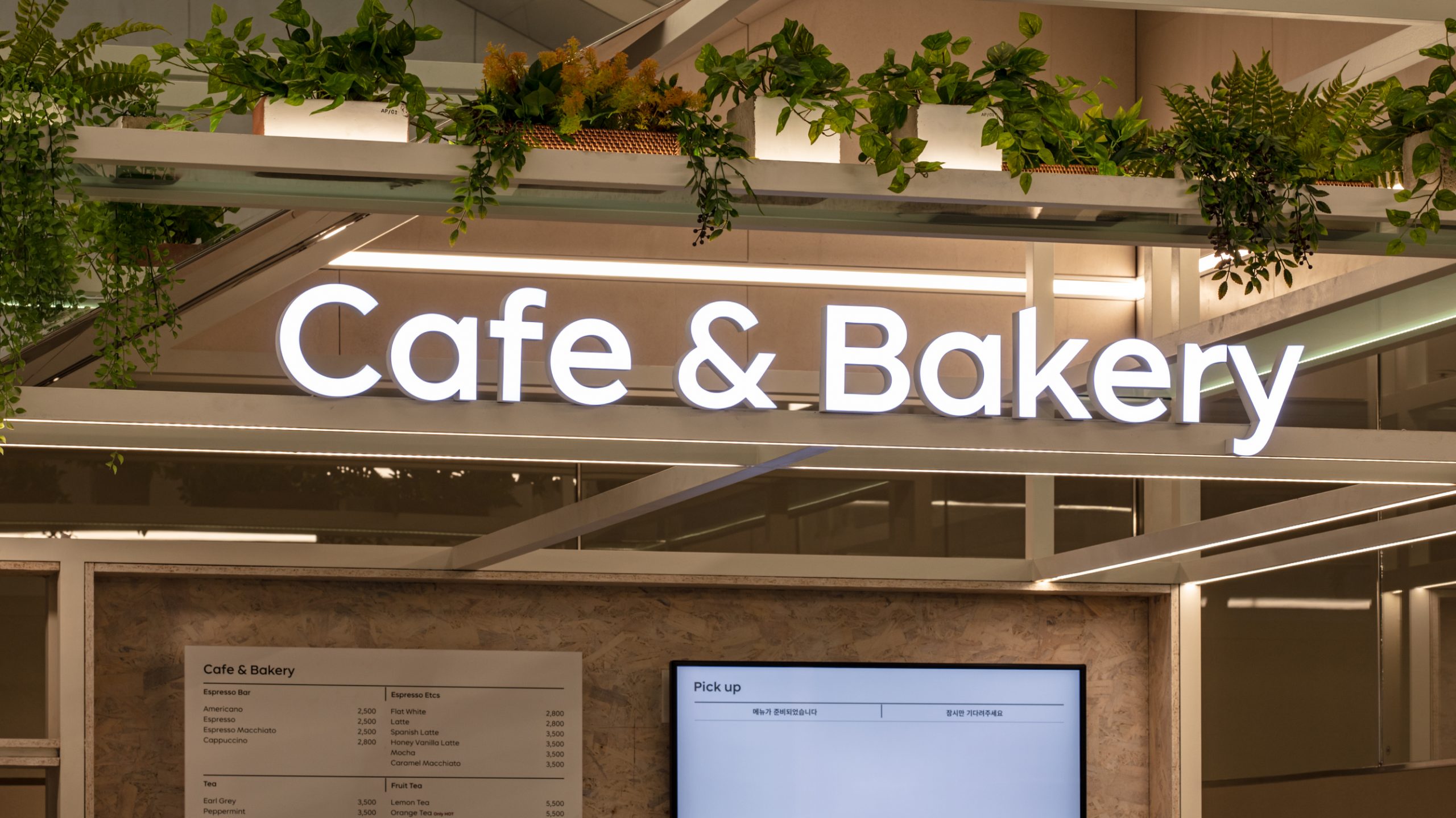
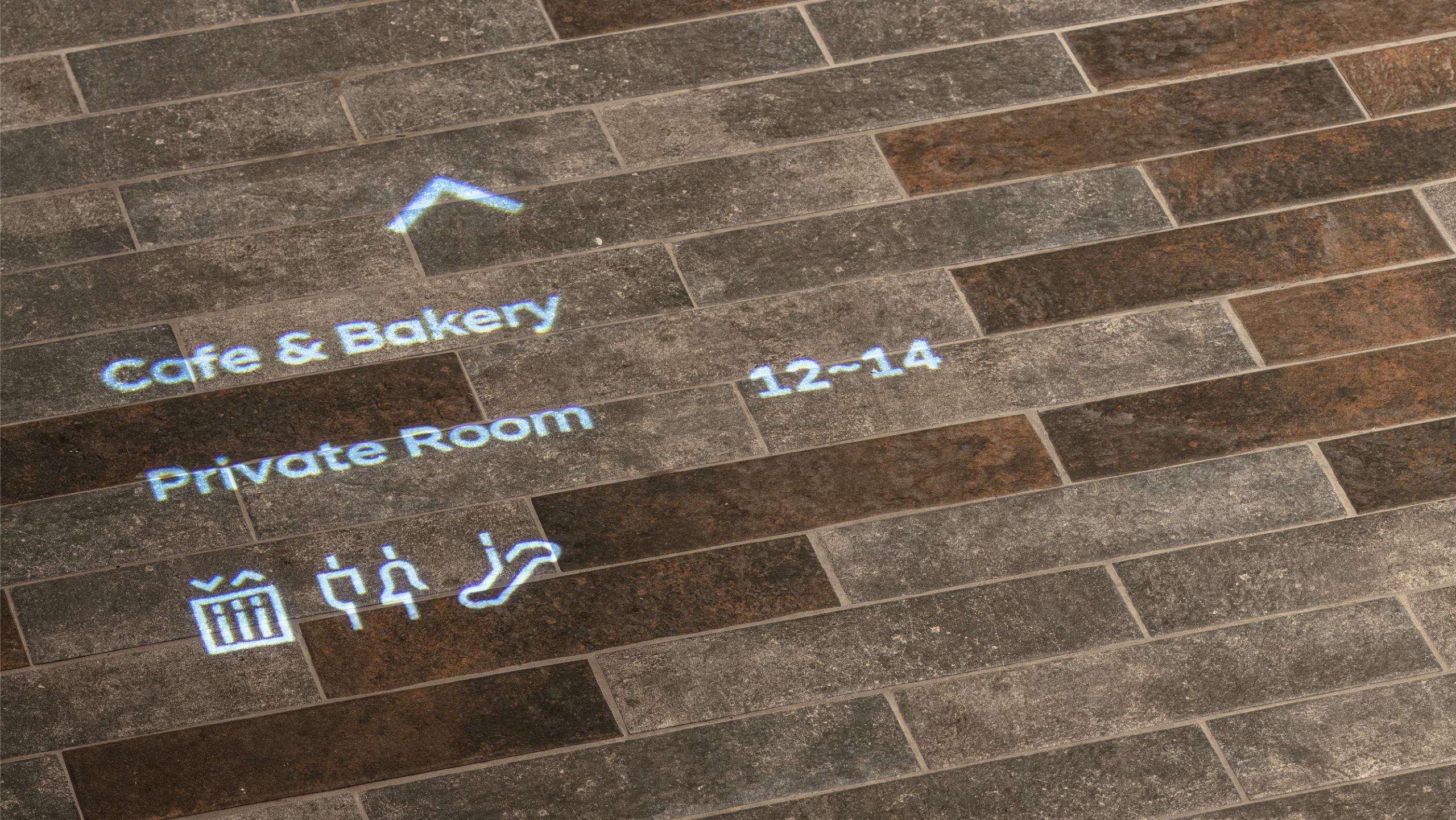
긴 수평선 ‘T’는 ‘The Table’의 브랜드 철학을 담고 있습니다. 수평적 관계와 다양한 용도로 자유롭게 활용될 수 있도록 디자인되었으며, 가장 단순한 시각 요소인 수평선과 수직선만으로 전체 공간을 표현하는 효과적인 디자인 시스템을 구축했습니다. 여기에 SK텔레콤의 브랜드 컬러인 'Synergy Red' 만을 사용하여, 사용자가 접하는 모든 터치포인트에 일관된 정보와 경험을 전달합니다.
The long horizontal line 'T' reflects the brand philosophy of 'The Table', which is designed to be used freely for horizontal relationships and various purposes. We have developed an effective design system that represents the entire space with only the simplest visual elements, horizontal and vertical lines, and only ’Synergy Red’, the brand color of SK Telecom, simultaneously conveying information to touch points used by users.
Brand Design
form & function
Chung Jinsuh, Park Juyoung
Photography
Hong Kiwoong
Project Owner
SK Telecom
Cha Jongwhi, Lee Sangeun, Chae Jungah,
Noh Sejin, Won Jongwon, Han Bumhee