


BRAND LOGO
반복되며 회전하고, 교차하며 연결되는 스트라이프 형태로 이루어진 브랜드 마크는 프라디움이 추구하는 변하지 않는 주거의 본질적 가치와 동시대적인 라이프 스타일의 조화를 상징합니다. 워드마크와 모노그램의 상단부에서 교차하는 형태는 기둥의 이미지를 나타냄으로써 프라디움 속에 담긴 입주민의 삶이 곧 자부심이 되는 모습을 암시적으로 전달합니다.
The brand mark, in the form of repeated, rotating, intersecting and connecting stripes, symbolizes the harmony of the unchanging values of housing and contemporary lifestyles that Pradium seeks. The intersecting shape at the top of the word mark and monogram is a design that implicitly conveys the image of a pillar, in which the life of the residents contained in the pradium becomes pride.


BRAND DESIGN CONCEPT
Life Narrative는 개개인의 고유한 삶의 방식과 취향이 쌓여 만들어진 태도를 뜻하며, 일상의 순간순간을 쌓아올려 삶 그 자체가 자부심이 된다는 메시지를 전달하는 프라디움의 디자인을 아우르는 컨셉이 됩니다. 이러한 컨셉이 보다 효과적으로 전달될 수 있도록 'Narrative'가 주는 Layer의 이미지를 적극적으로 표현해 활용했습니다.
The concept of "Life Narrative" encompasses an individual's unique way of life and preferences, culminating in an attitude shaped by accumulating everyday moments, where life itself becomes a source of pride, encapsulating the essence of Pradium's design philosophy. To effectively convey this concept, utilize and emphasize the imagery provided by the layer that "Narrative" offers.


BRAND COLOR
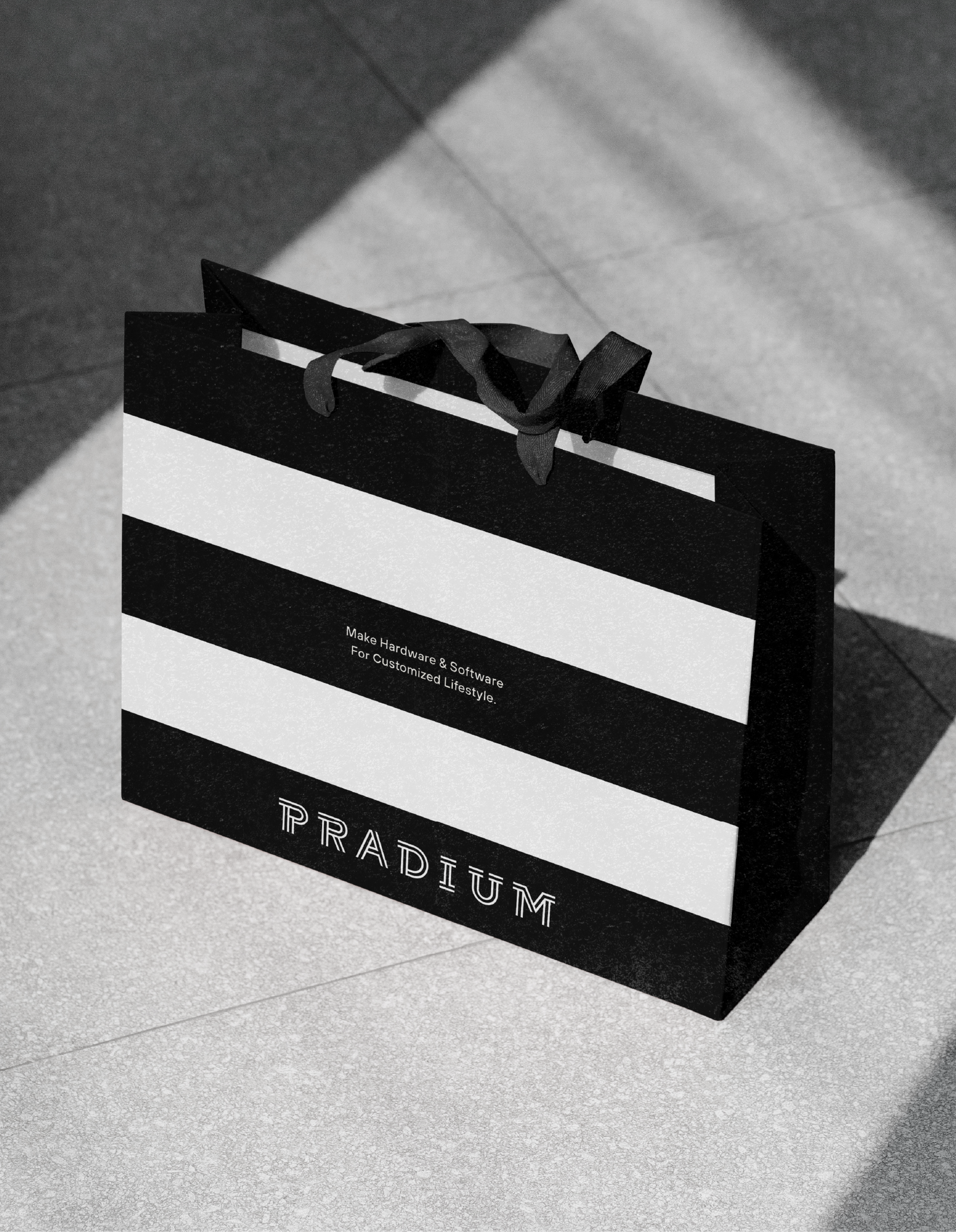
프라디움의 주요 색상인 오렌지는 현대 주거 문화에 가장 적합한 세련된 주거 트렌드를 항상 제안하는 주거 브랜드의 활기찬 속성을 상징합니다. 블랙, 화이트, 그레이와 함께 사용해 프라디움의 새로운 이미지를 세심함과 감성으로 전달합니다.
Pradium's primary color, Orange, symbolizes the vibrant attributes of residential brands that always suggest sophisticated residential trends that are best suited to contemporary residential culture. It is used in conjunction with Black, White and Gray to deliver new images of Pradium with care and sensitivity.


BRAND TYPEFACE
프라디움의 지정 폰트는 프라디움 브랜드 마크의 형태학적 특성을 반영해 시각적으로 조화를 이루고, TT Hoves Pro를 사용해 세련된 인상을 전달할 수 있습니다.
Pradium's designated font is visually harmonious, reflecting the morphological characteristics of Pradium's brand mark,
and uses TT Hoves Pro, which can deliver a sophisticated impression.


BRAND DESIGN APPLICATION
프라디움의 어플리케이션은 프라디움만의 브랜드 이미지를 가장 직접적으로 고객들에게 전달할 수 있는 디자인 접점의 총칭입니다. 간결하고 집중도 높은 포맷부터, 기능적으로 활용 가능한 포맷까지 다양한 방식을 활용하여 프라디움다운 메시지를 충실히 전달하는 것을 우선으로 생각하여 디자인을 전개합니다.
Pradium's application serves as the overarching design interface to most directly communicate Pradium's unique brand image to customers. We prioritize developing designs that faithfully convey Pradium's message in various formats, ranging from concise and highly focused formats to functionally versatile ones.


