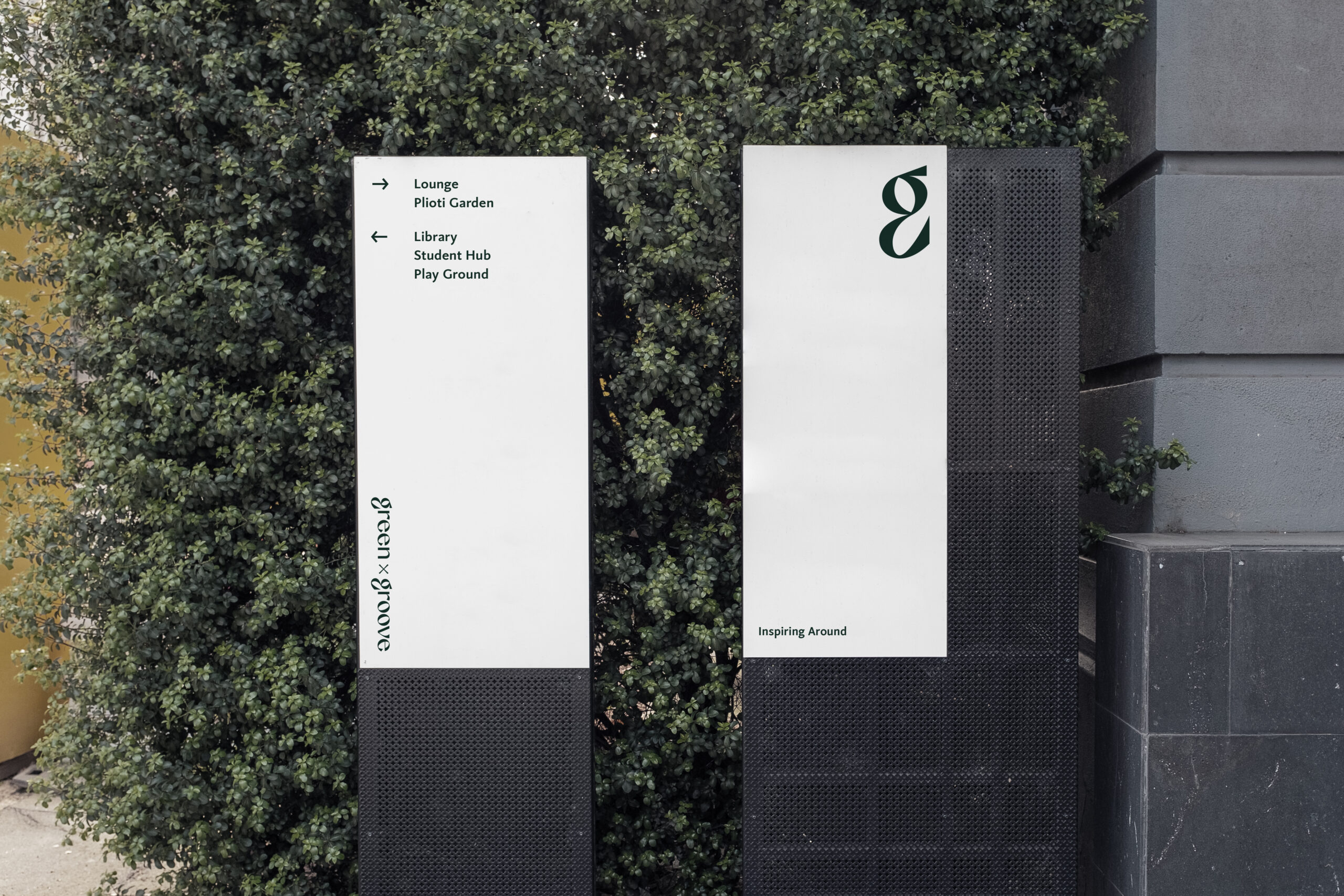
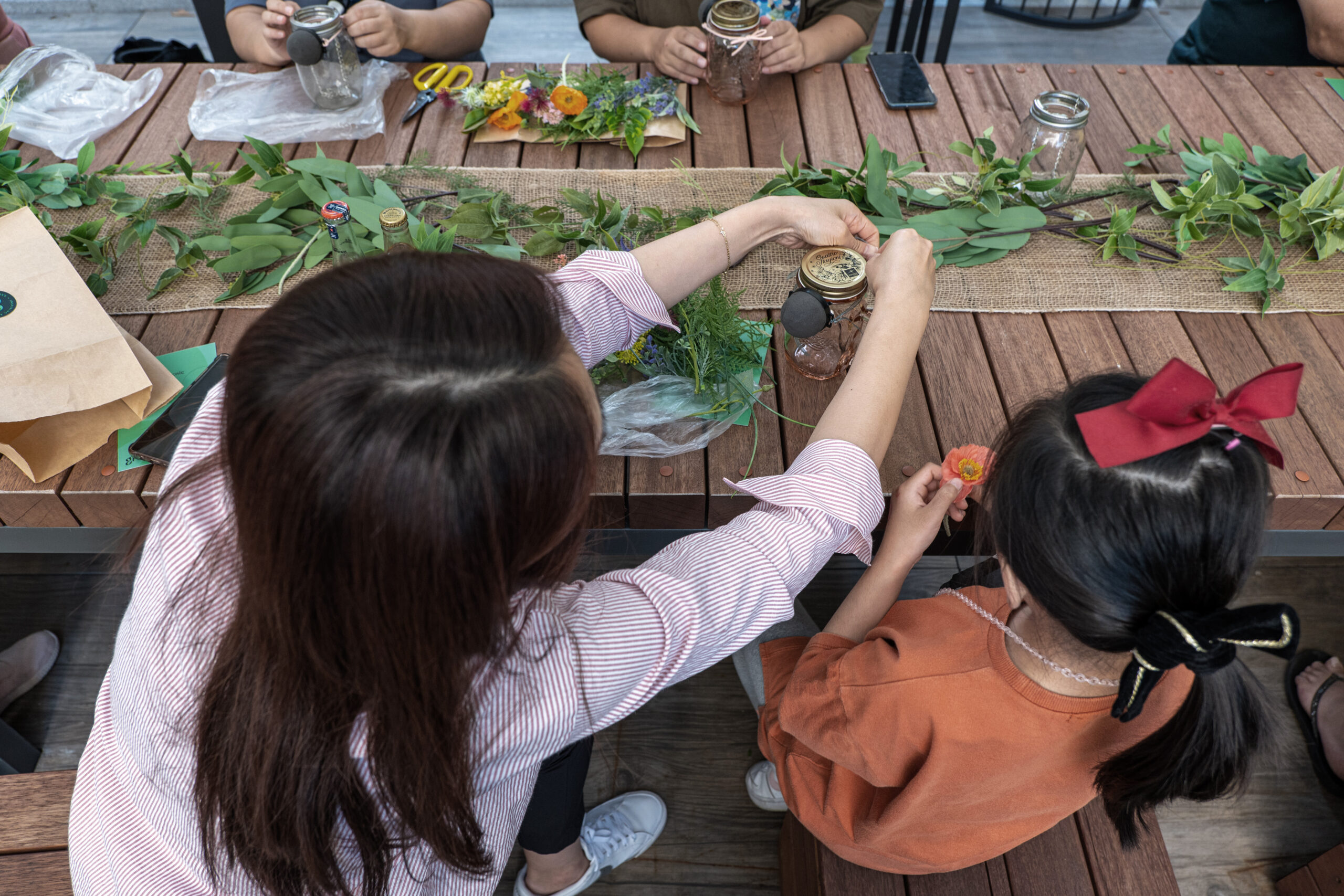
그린바이그루브는 휴식과 치유라는 조경의 근본적인 기능과 함께 다양한 브랜드와의 콜라보레이션을 통하여 아파트라는 공동주거 속에서 개개인의 취향을 반영하는 경험을 제공함으로써 입주민의 일상 속에서 삶의 영감을 전달하는 브랜드입니다. 그린바이그루브의 브랜드 컨셉인 'Inspiring Around'는 기존의 조망하는 공간이었던 아파트의 조경을 경험의 공간으로 재해석하는 것입니다.
Green ✕ Groove is a brand that delivers inspiration for life in the daily lives of residents by providing an experience that reflects individual tastes in apartment buildings through collaboration with various brands along with the fundamental functions of landscaping such as rest and healing. Inspiring Around, the brand concept of Green ✕ Groove, reinterprets the landscape of the apartment, which was the existing viewing space, as a space of experience.


심벌마크를 이루는 이니셜 'g' 내부의 나뭇잎은 조경을 상징합니다. 나뭇잎을 감싸는 라인은 휴식과 치유라는 조경의 근본적인 기능을 상징하며, 리드미컬한 형태로 브랜드가 제공하는 경험을 통해 느낄 수 있는 삶의 영감의 이미지를 나타냅니다.
The green leaf inside the initial 'g' that forms the symbol mark symbolize the landscape. The lines surrounding the leaf symbolize the fundamental function of landscaping: relaxation and healing, and in a rhythmic form represents the image of life inspiration that the brand can feel through the experience it offers.


워드마크를 이루는 형태의 마무리 부분과 글자의 기울기, 획 굵기의 선명한 대비는 캘리그래피적인 특성을 반영하여, 그린바이그루브에서 경험할 수 있는 삶의 활기와 개개인의 섬세한 취향을 감각적으로 표현합니다. 세리프와 산세리프 서체의 특성을 동시에 나타내는 워드마크의 형태는 불변하는 전통적 가치에 대한 존중과 그 가치를 현대적으로 재해석하여 입주민들에게 제공하는 롯데건설의 디자인 철학인 Modern Legacy를 반영합니다.
The sharp contrast between the finish part of the wordmark, the slope of the letter, and the thickness of the stroke reflects the calligraphic characteristics, sensibly expressing the vitality of life and the delicate taste of each person in the Green ✕ Groove. The word mark, which represents the characteristics of serif and sans serif typeface at the same time, reflects LOTTE E&C's modern design philosophy, which modernizes and reinterprets the unchanging traditional values.