
ARIRANG PUBLIC LIBRARY FOR CHILDREN
Library for Children's Smile
Project Owner
Arirang Public Library for Children
Date
2017. 12
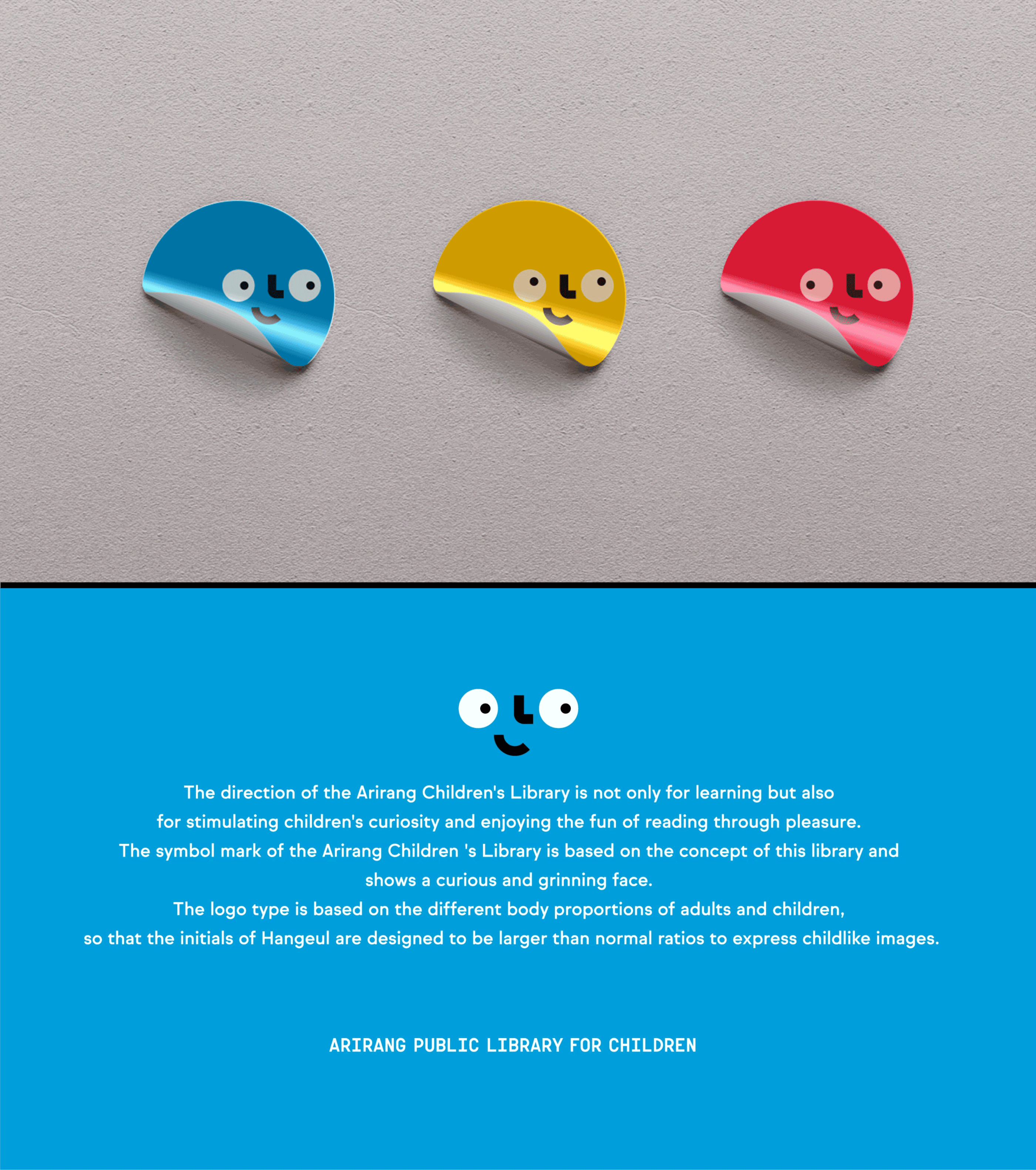
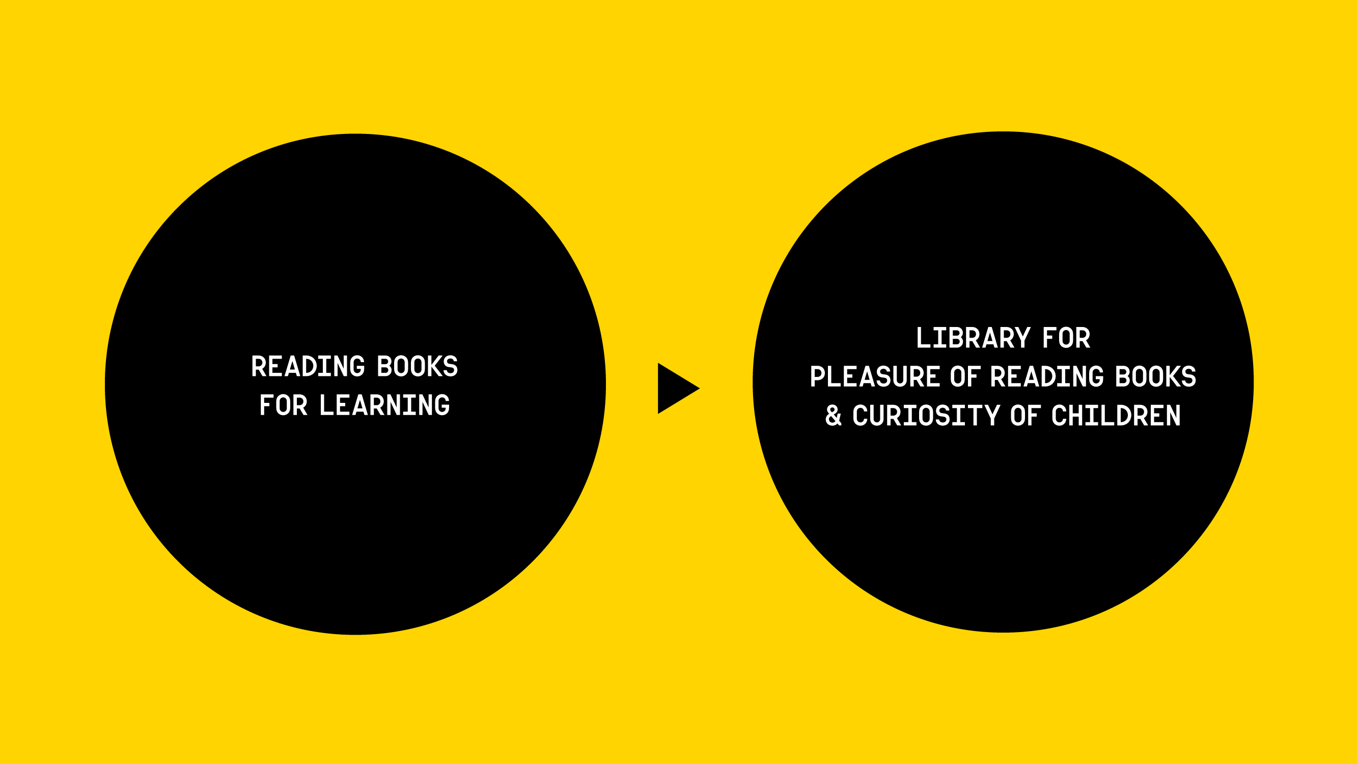
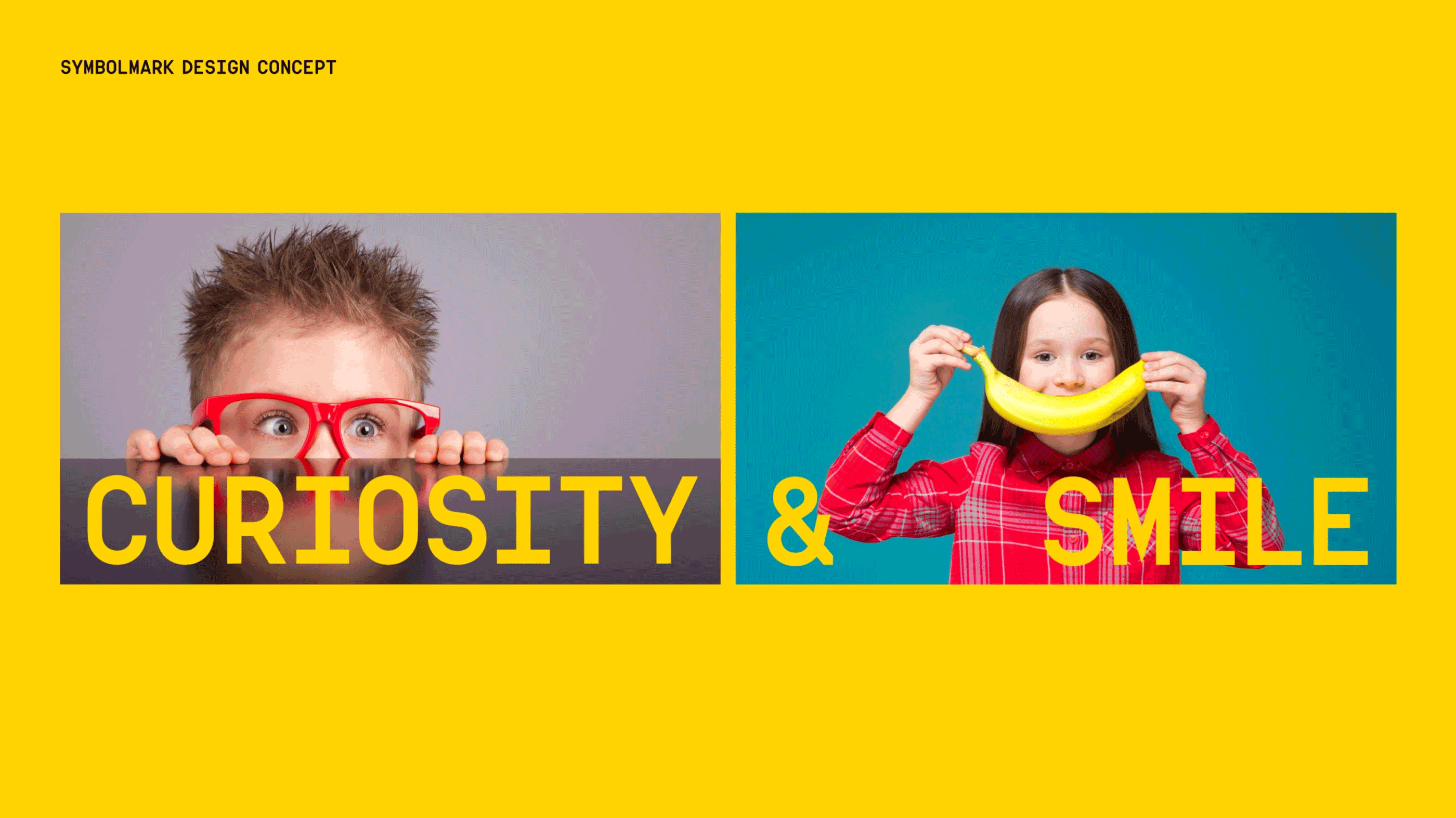
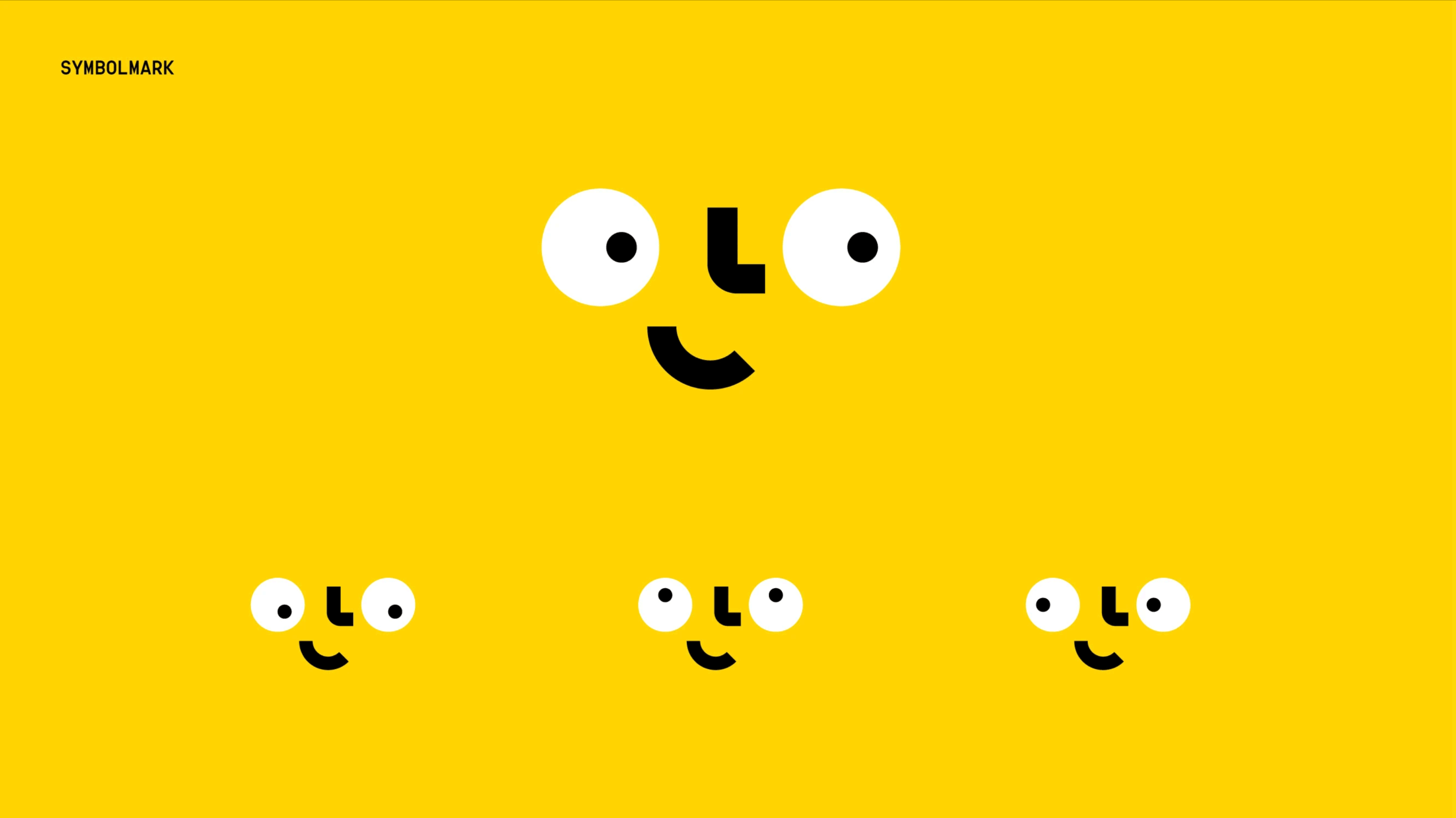
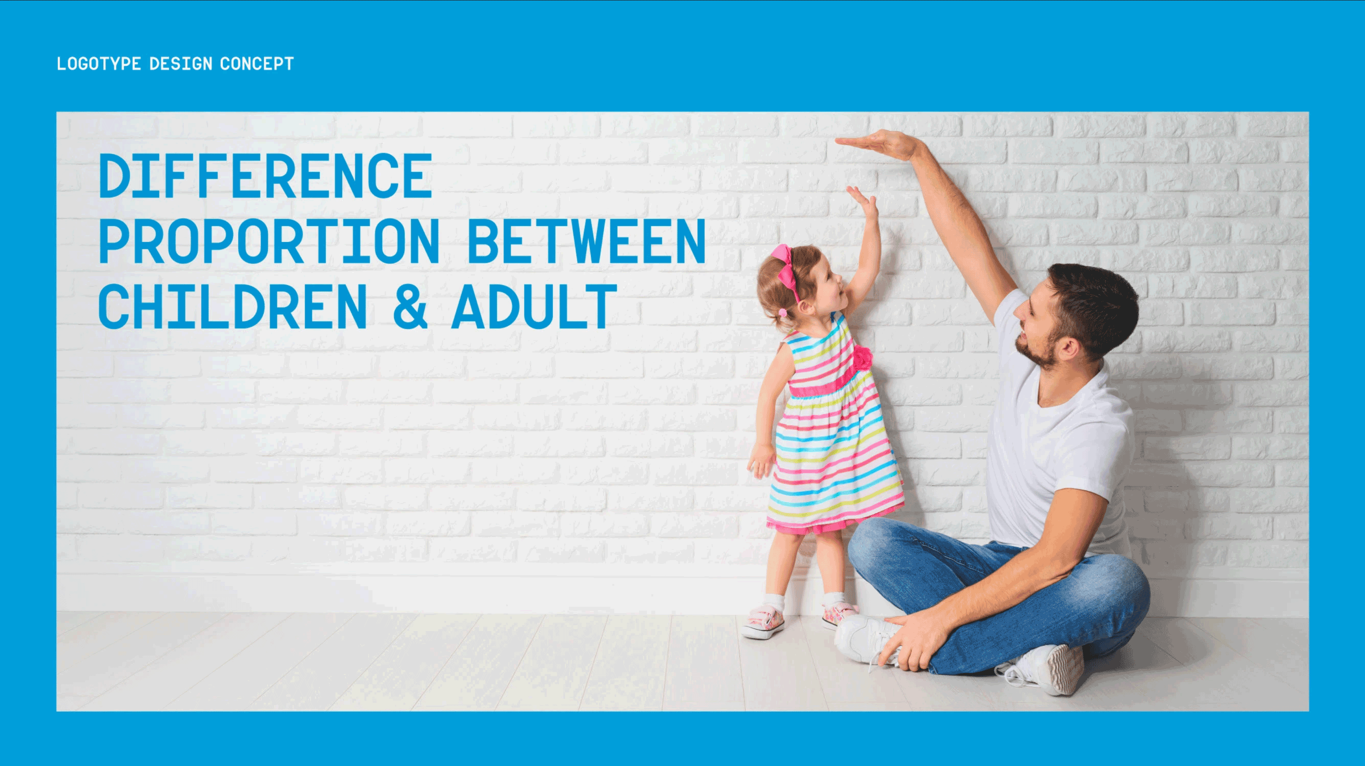
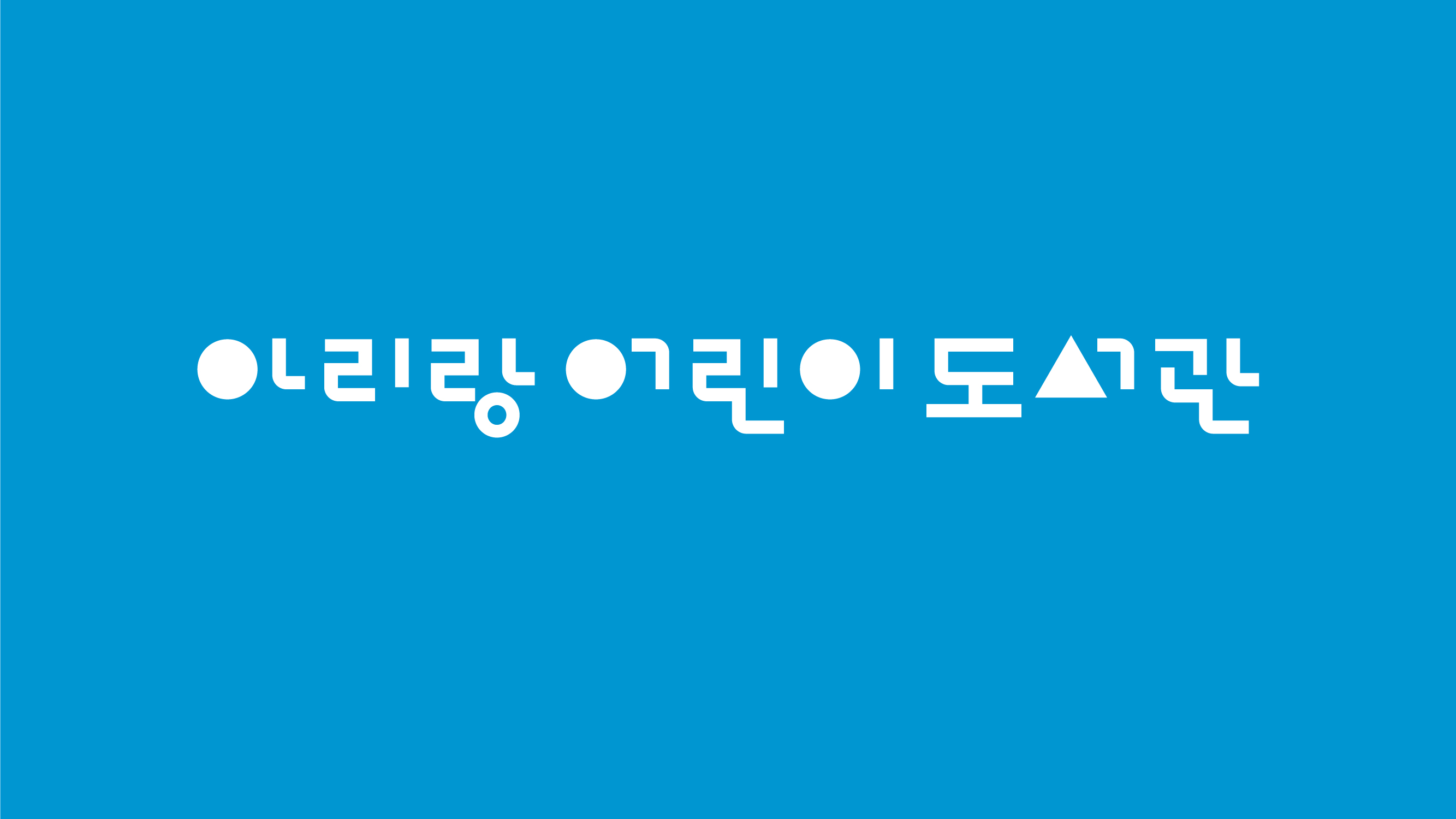
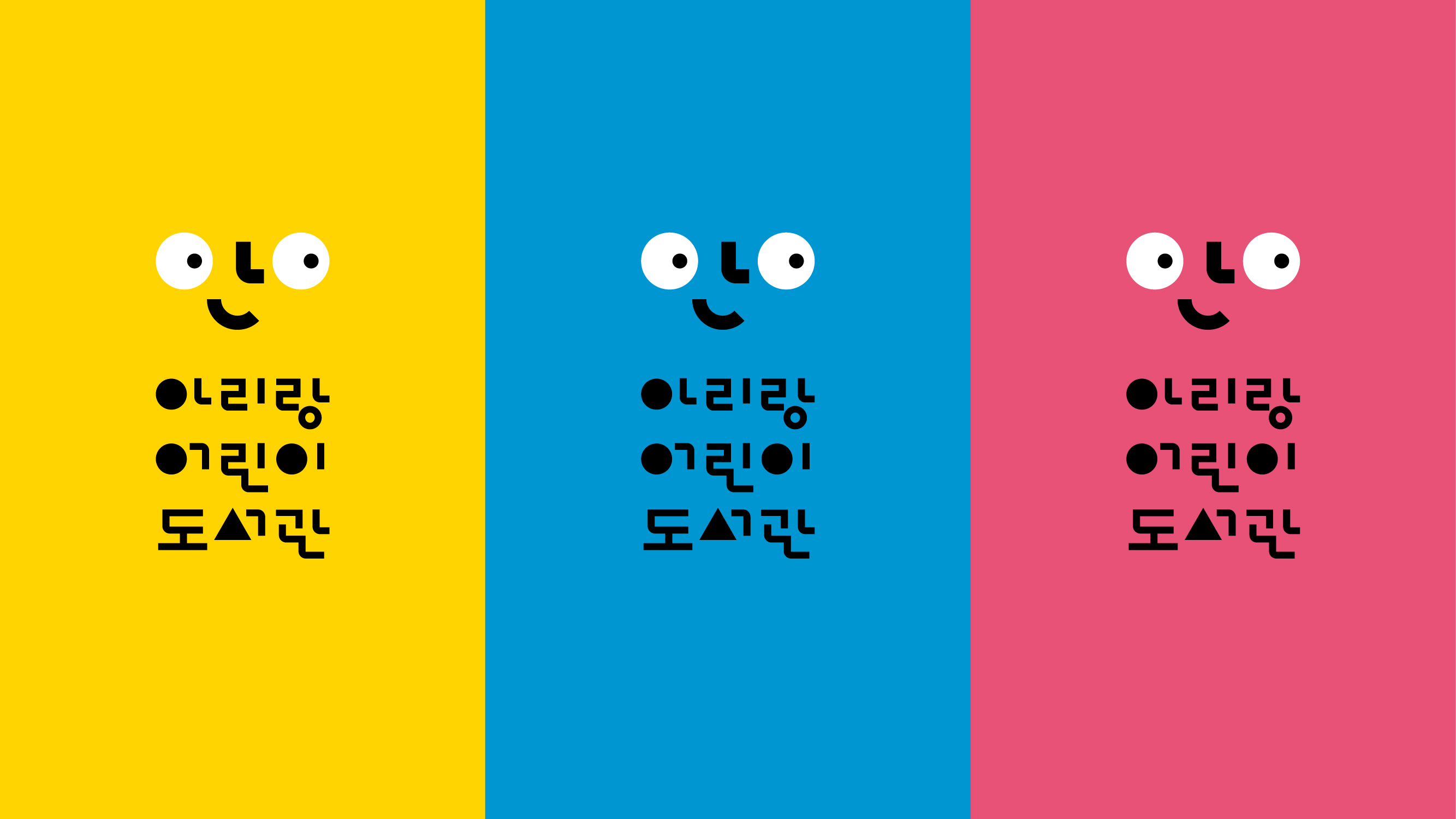
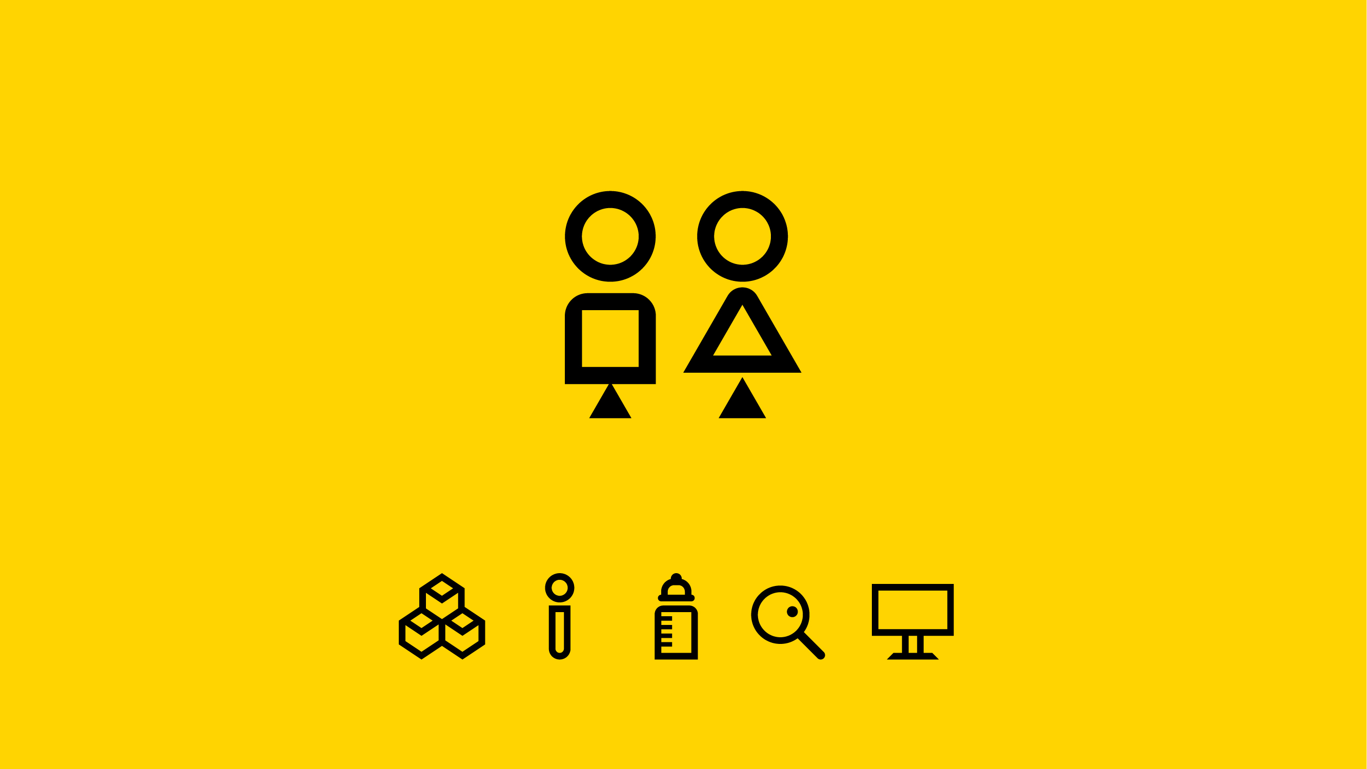
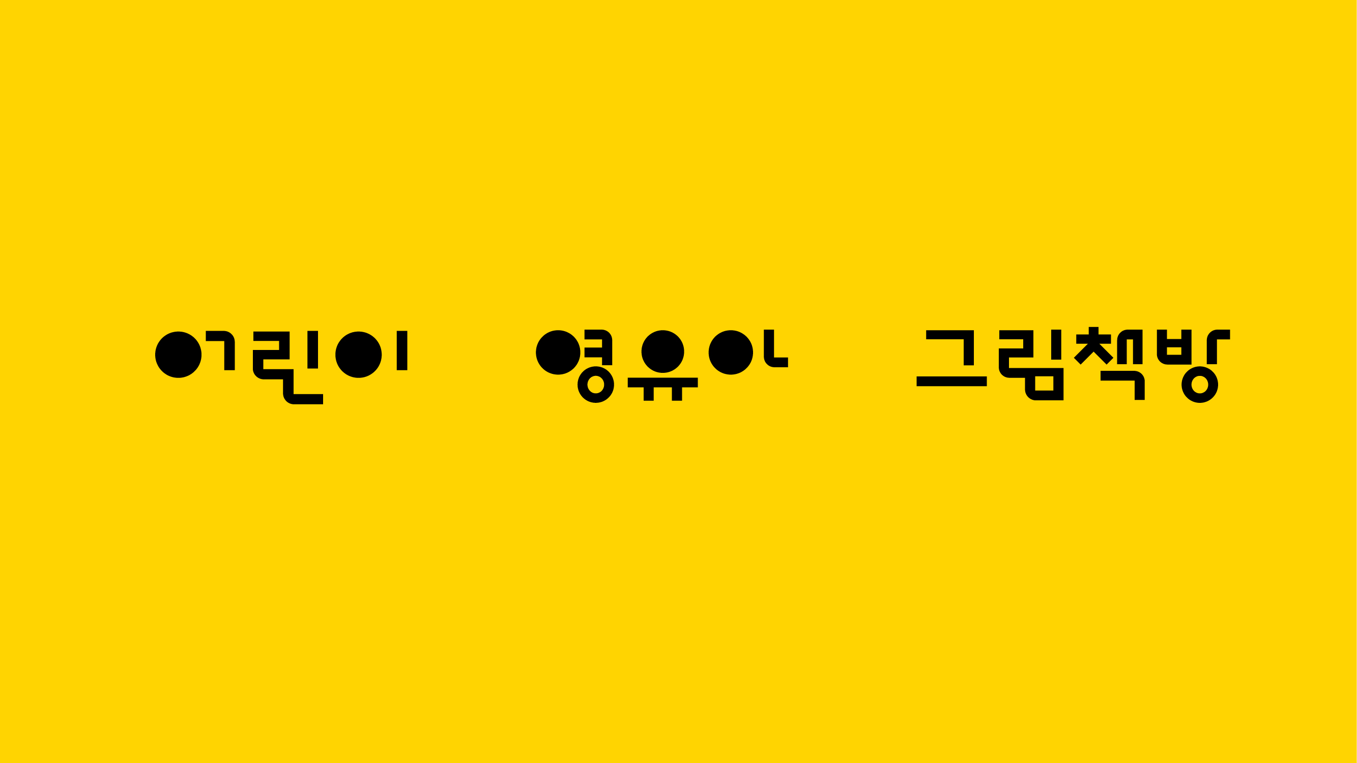
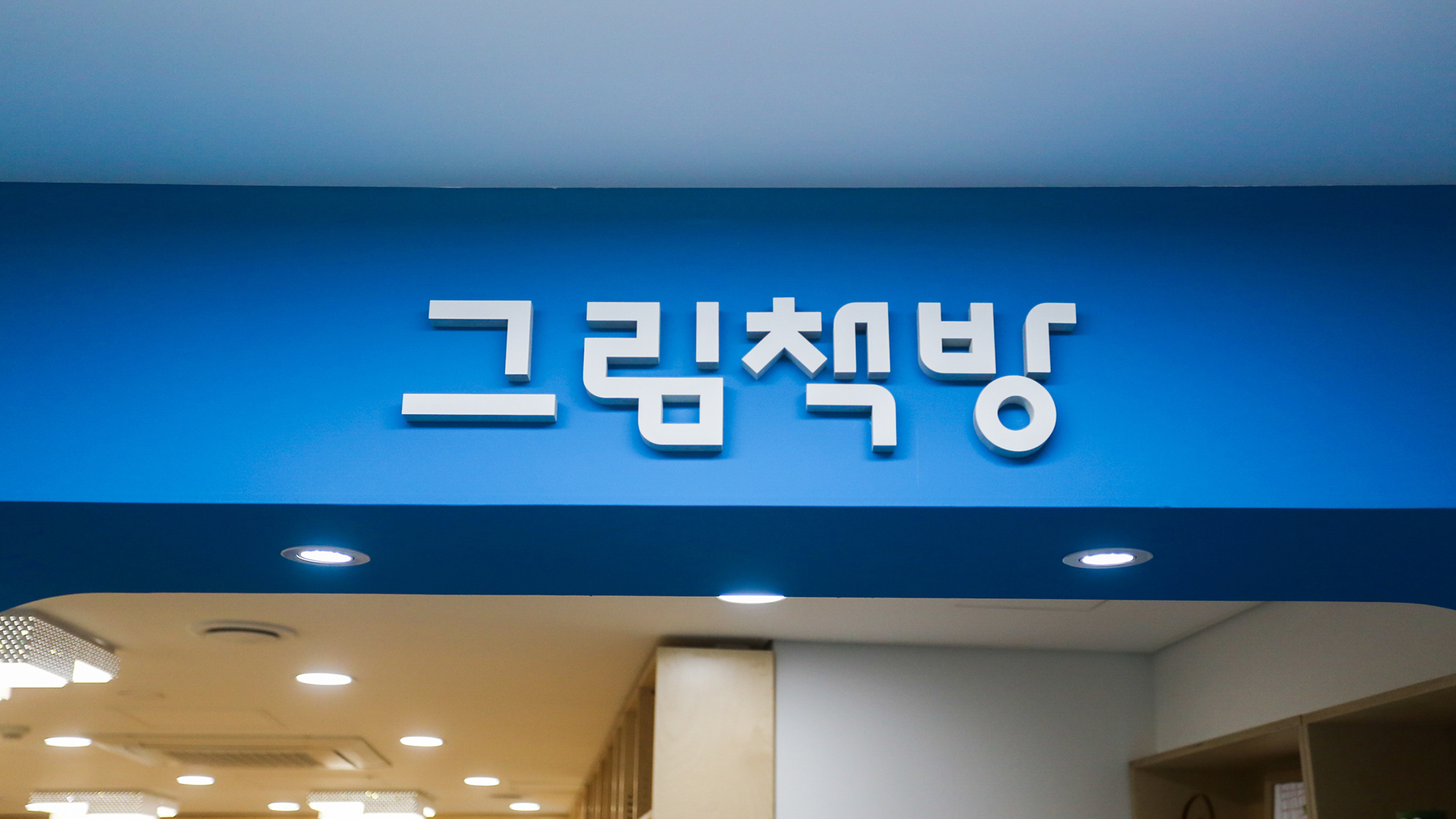
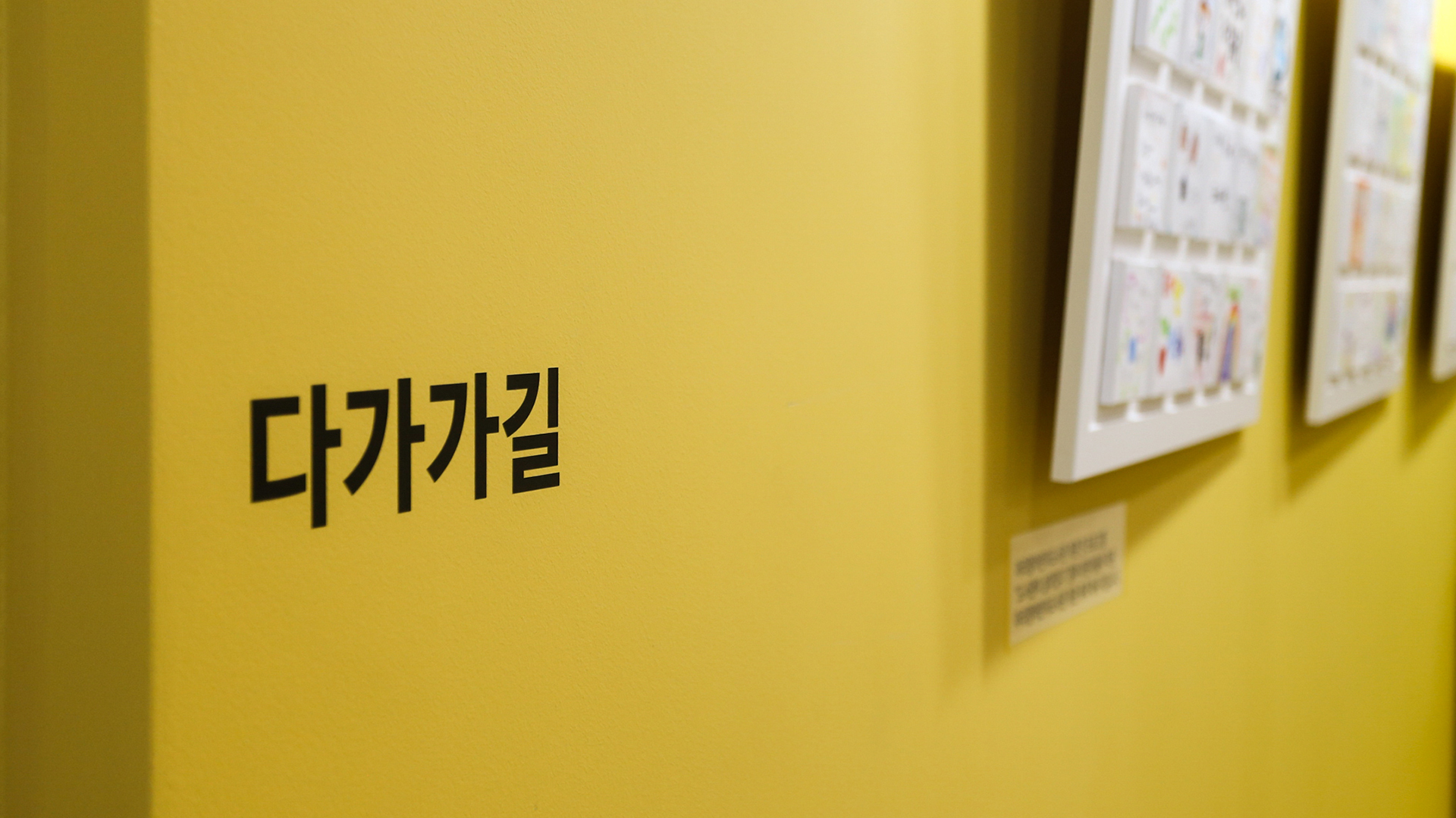
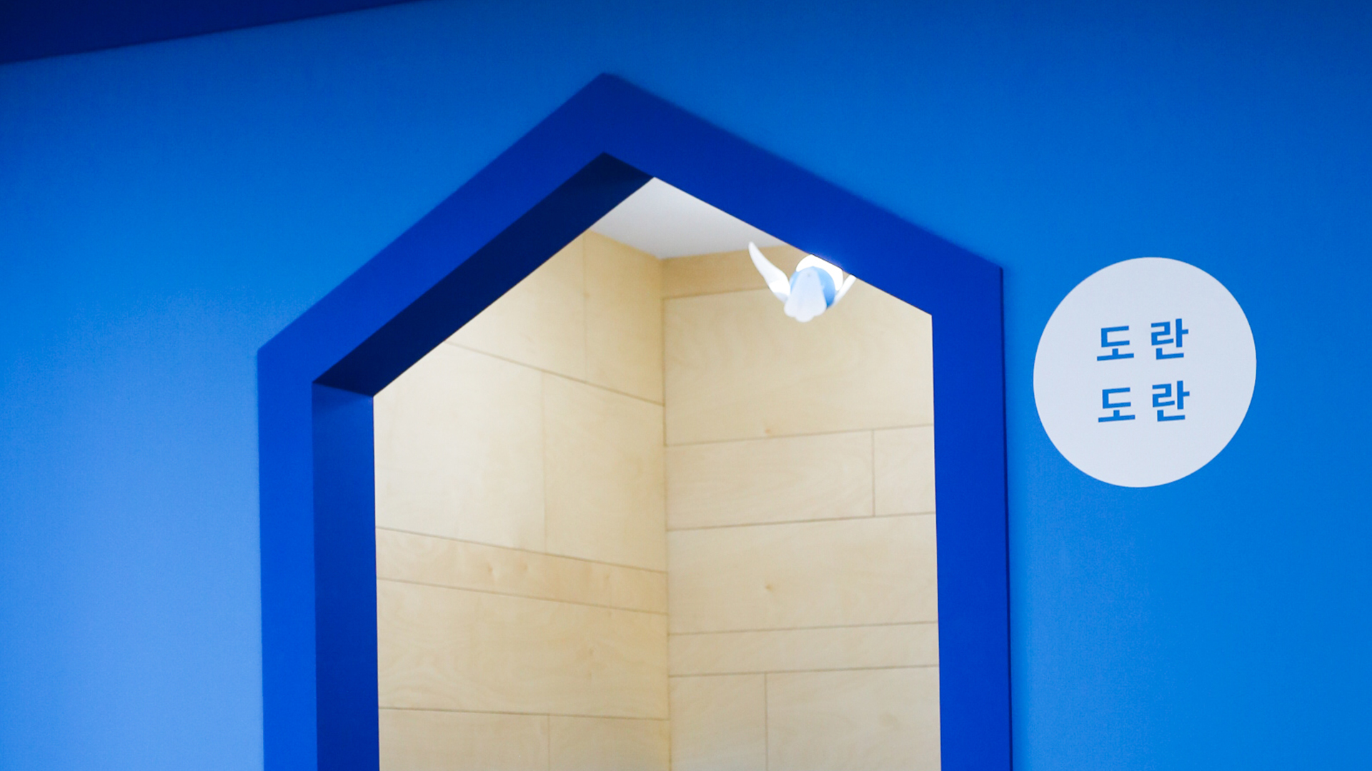
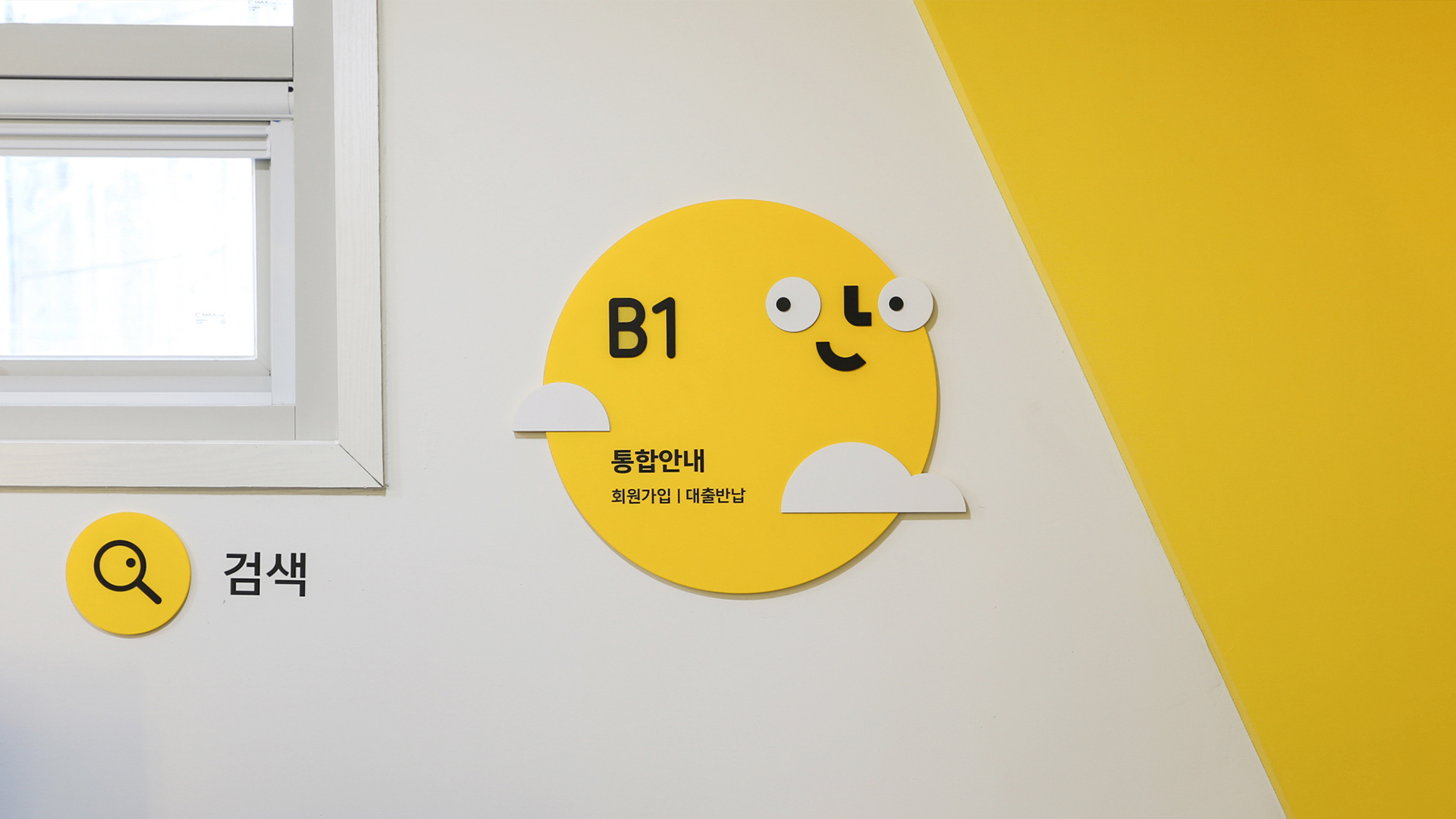
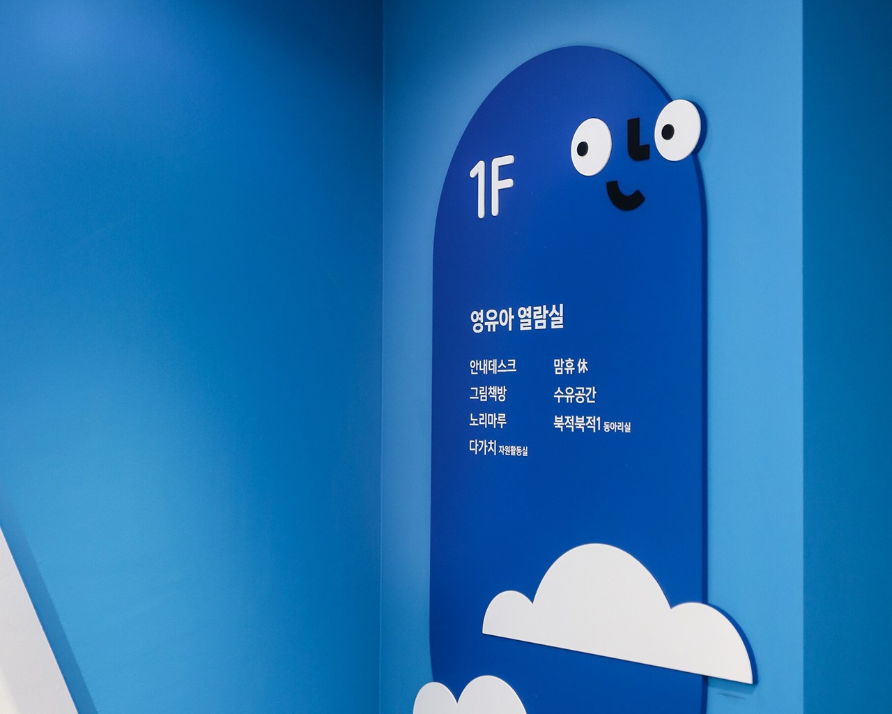
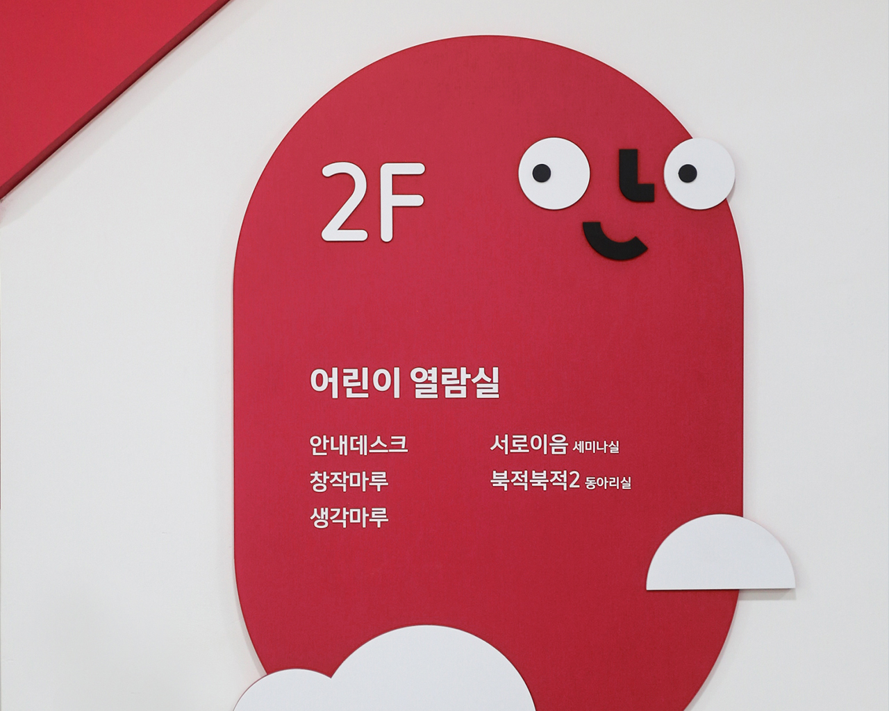
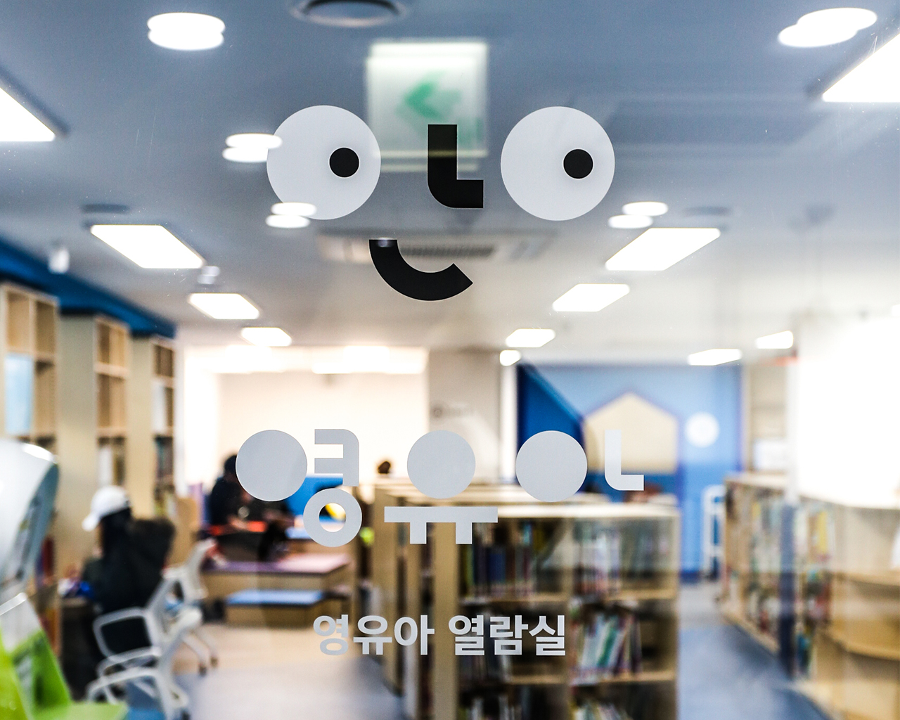
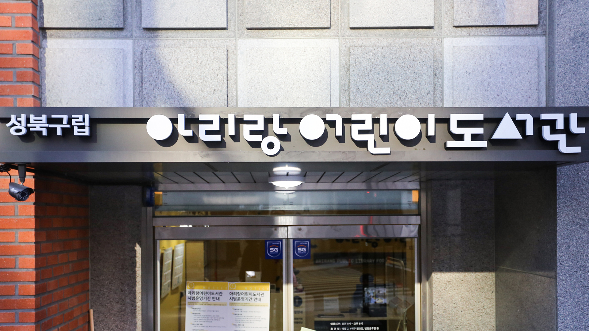
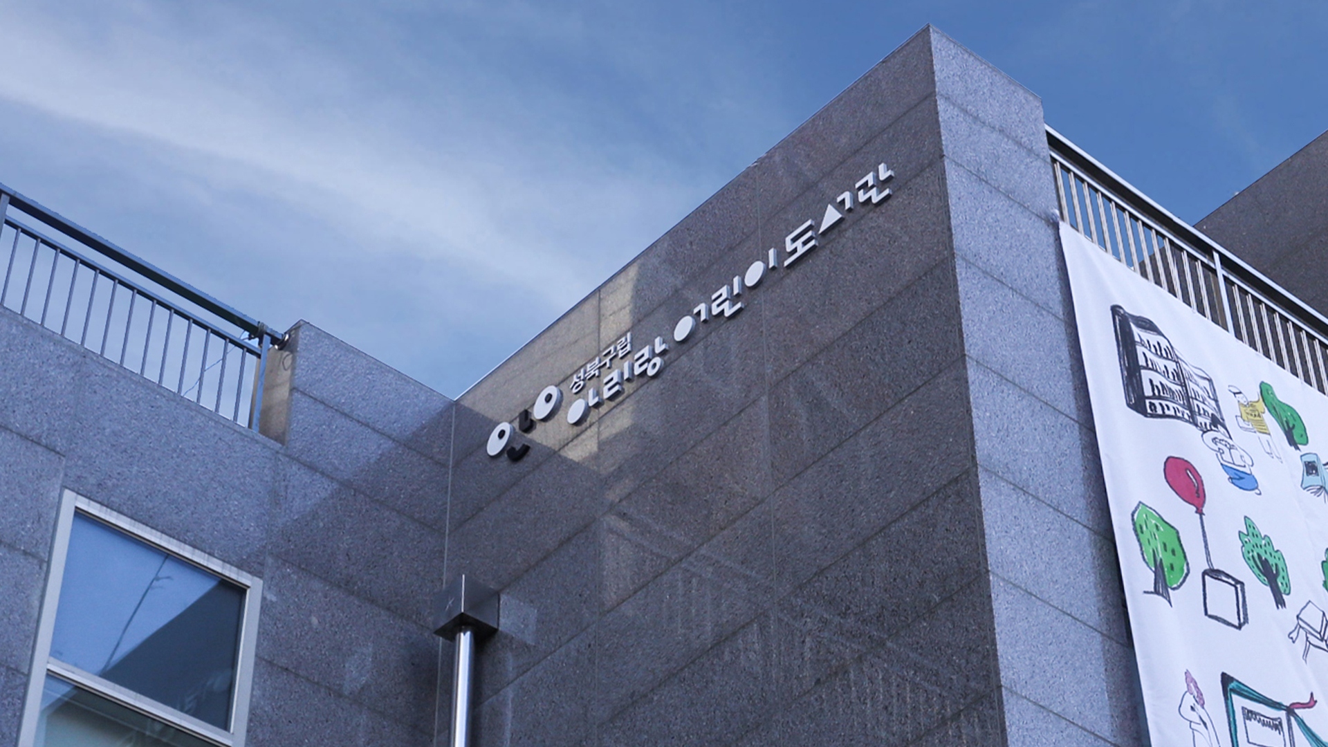
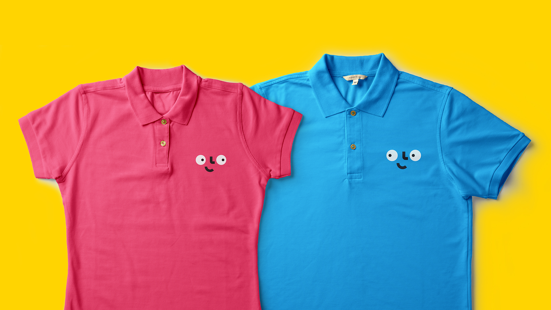
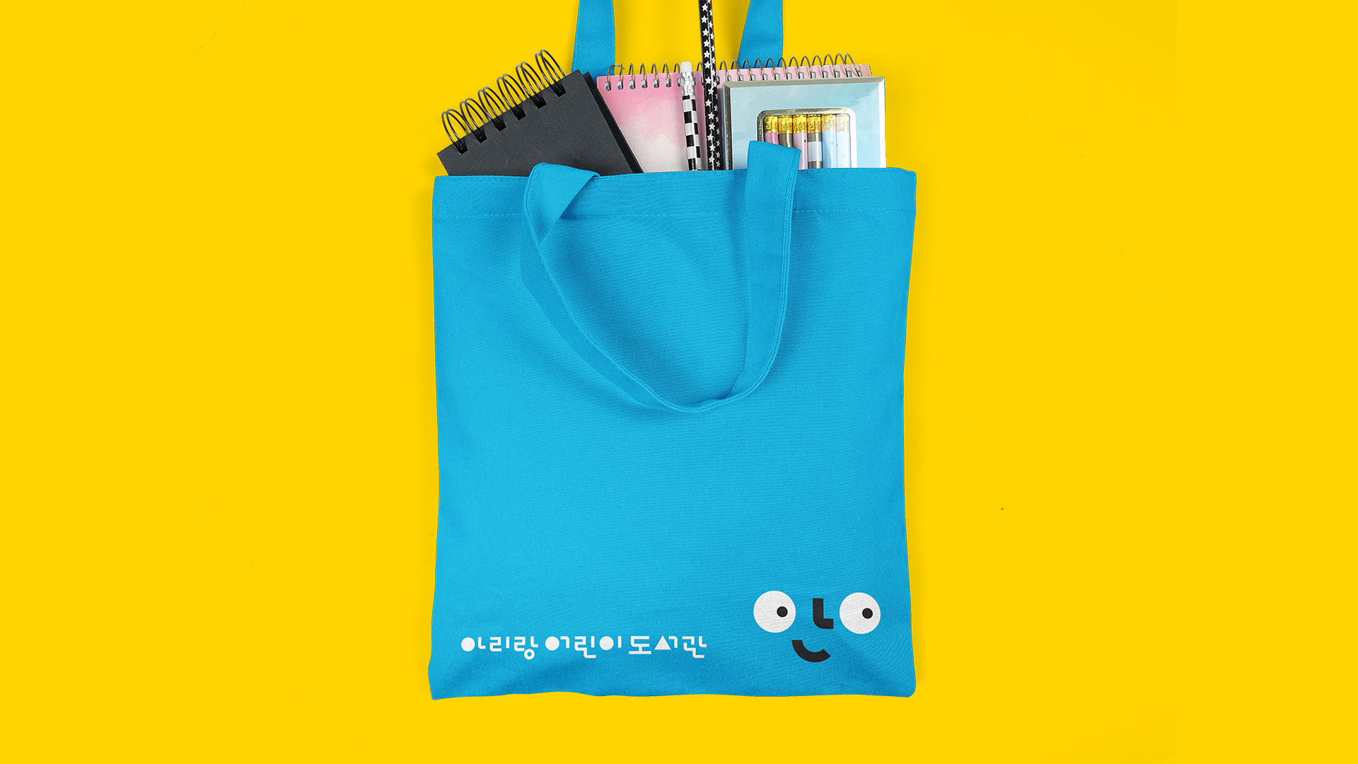
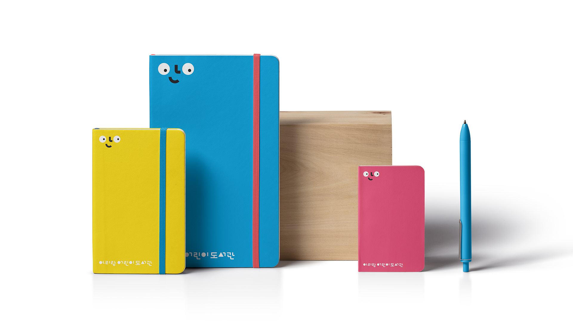
아리랑 어린이 도서관은 성북문화재단과 아리랑 정보도서관이 위치한 아리랑 고개에 새롭게 개관한 공공 어린이 도서관입니다. 폼앤펑션은 아리랑 어린이 도서관을 위한 아이덴티티 디자인과 내·외부 사인물을 디자인하였습니다. 아리랑 어린이 도서관의 방향성은 단순히 배움을 위한 독서가 아니라, 어린이들의 특징인 “왜?”라는 질문에서 비롯되는 호기심을 자극하고, 도서관 안에서 즐거움을 통해 독서의 재미를 느낄 수 있도록 하는 데 있습니다. 심벌마크는 이러한 도서관의 컨셉을 바탕으로 호기심 어린 눈망울과 미소 짓는 얼굴을 표현하였습니다. 또한 로고타입은 어른과 아이의 신체 비율 차이에 착안하여 한글 초성을 일반적인 비율보다 크게 디자인함으로써, 어린이다운 이미지를 담아내고자 하였습니다.
Arirang Children’s Library is a newly opened public library for children, located at Arirang Hill alongside the Seongbuk Cultural Foundation and Arirang Information Library. Form&Function was responsible for designing the library’s identity as well as its interior and exterior signage. The vision of Arirang Children’s Library goes beyond reading as a means of learning. It seeks to spark children’s natural curiosity—often expressed through their constant “Why?”—and to help them experience the joy of reading through playful exploration within the library. The symbol mark reflects this concept, portraying curious eyes and a smiling face. The logotype was inspired by the difference in body proportions between adults and children; by enlarging the initial consonants of Hangul beyond typical ratios, it conveys a playful and childlike image.
No items found.
No items found.

No items found.
No items found.
No items found.
No items found.
No items found.
No items found.

No items found.
No items found.
No items found.
No items found.
ARIRANG PUBLIC LIBRARY FOR CHILDREN
Workscope
Brand Strategy, Brand Identity Design, Brand Design
Brand Design
form & function
Project Owner
Arirang Public Library for Children