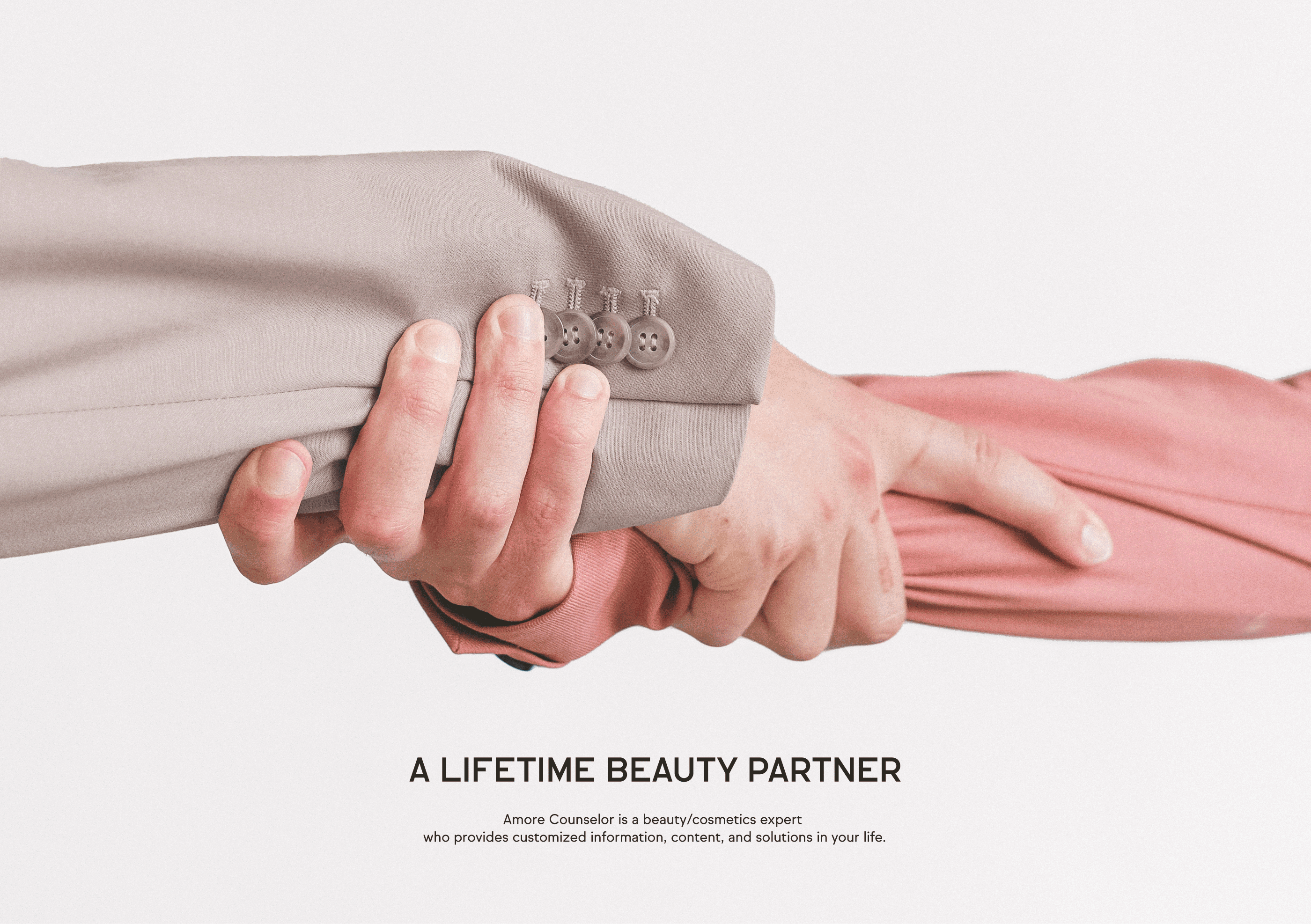
BRAND ESSENCE
아모레 카운셀러는 고객의 전 생애에 함께하며, 각자의 고유한 아름다움을 실현할 수 있도록 돕는 동반자입니다.
단순히 제품을 판매하는 것을 넘어, 세대를 아우르는 관계를 통해 고객의 일상 속에서 저마다의 아름다움을 만들어갑니다.
Amore Counselor is a partner that joins customers throughout their lives and helps them realize their unique beauty.
Create the beauty of each customer in your daily life by building a relationship with the customer,
not just selling products across generation by generation.
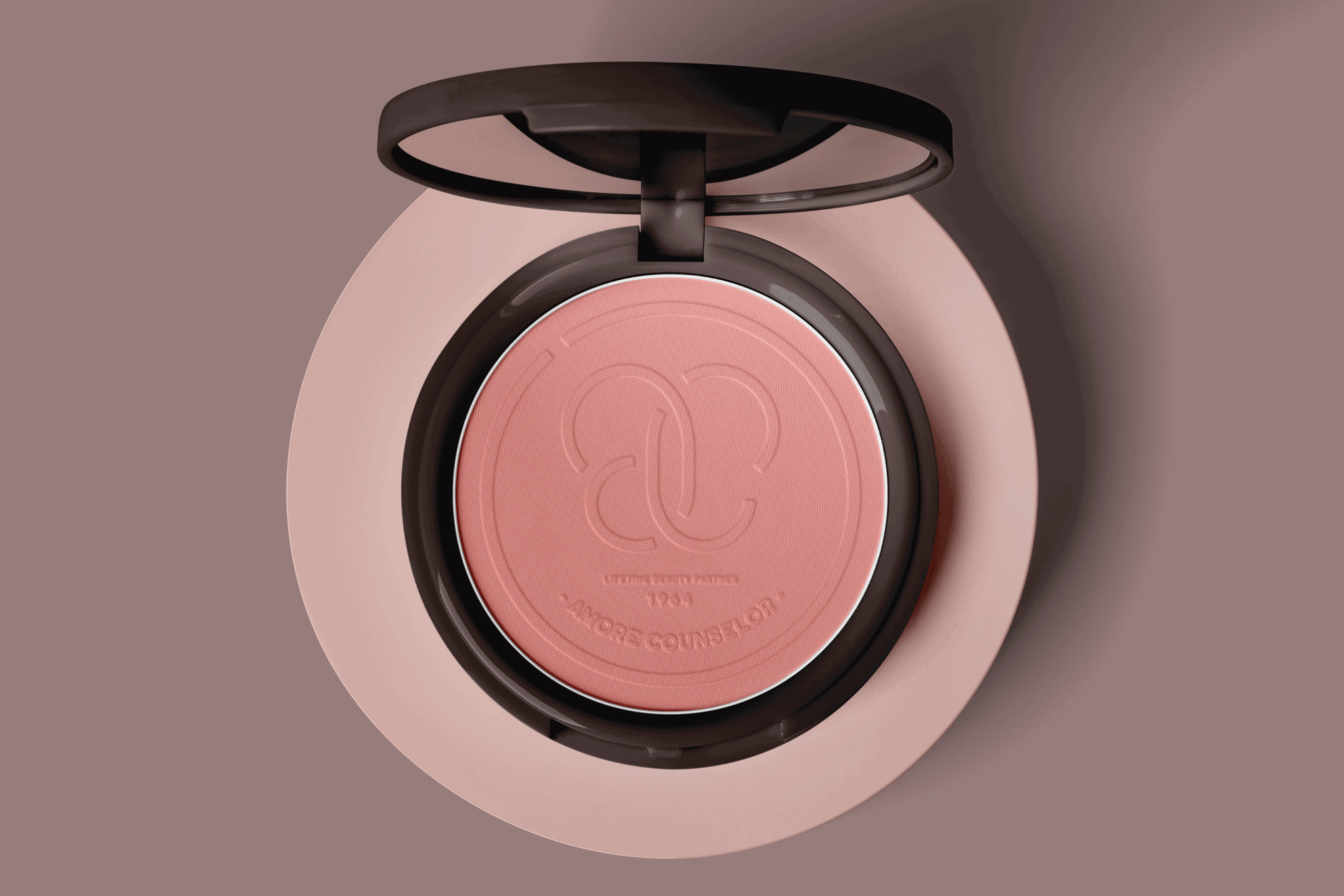
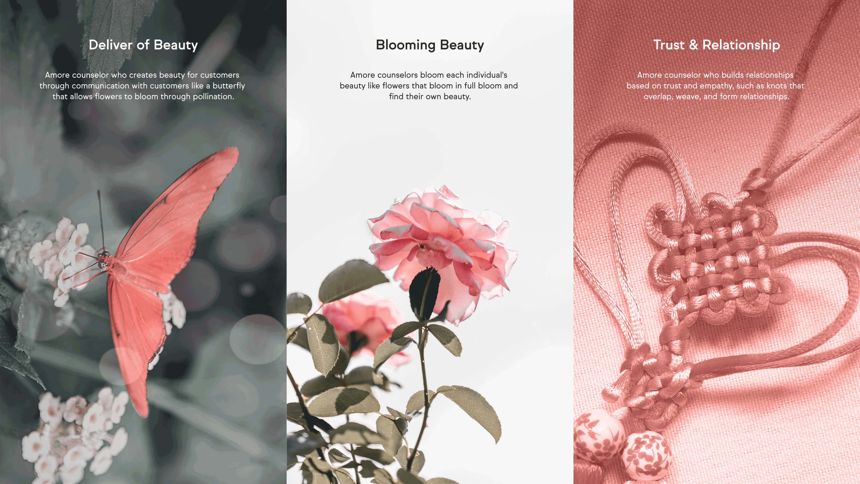
DESIGN CONCEPT
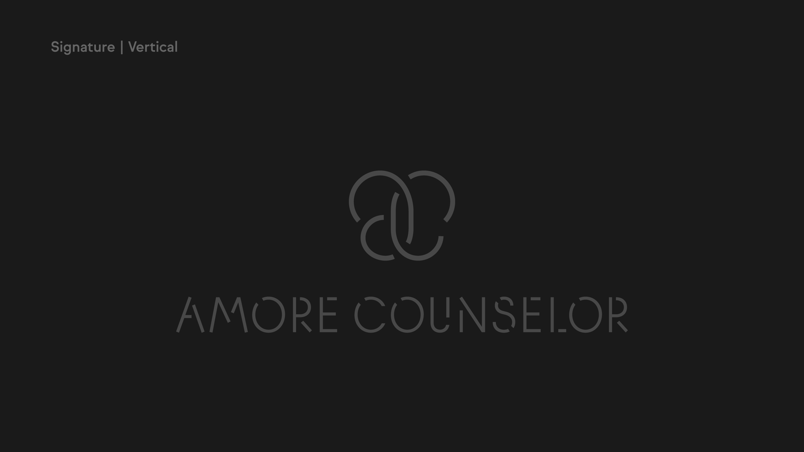
아모레 카운셀러의 심볼마크는 아모레퍼시픽을 상징하는 ‘a’와 고객을 상징하는 ‘c’를 연결하여,
신뢰와 공감을 바탕으로 고객과 관계를 맺는 아모레 카운셀러(a/c)를 표현한 디자인입니다.
서로 연결된 ‘a’와 ‘c’는 겹쳐지며 진정성을 통한 고객과의 소통을 상징하고, 동시에 나비와 피어나는 꽃의 형상으로
아름다움을 표현하여 고객의 아름다움을 만들어 간다는 의미를 담고 있습니다.
Amore Counselor's symbol mark is a design that expresses Amore Counselor (a/c),
which forms a relationship based on trust and empathy with customers
by connecting "a" symbolizing Amore Pacific and "c" symbolizing customers.
The connected “a” and “c” overlap each other to express communication with customers through sincerity,
while representing and conveying beauty in the form of butterflies and blooming flowers to create beauty for customers.
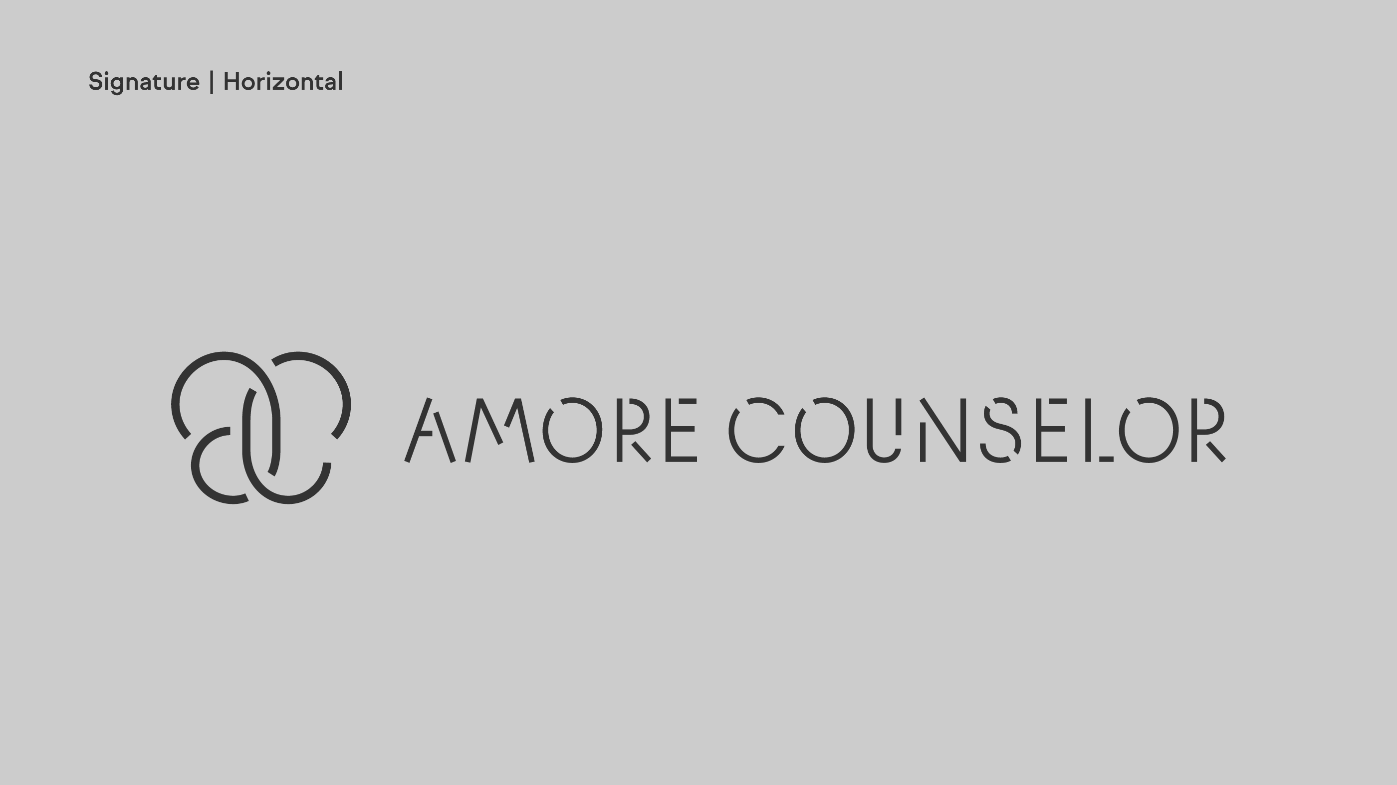
BRAND LOGO
아모레 카운셀러의 심볼마크는 아모레퍼시픽을 상징하는 ‘a’와 고객을 상징하는 ‘c’를 연결하여,
신뢰와 공감을 바탕으로 고객과 관계를 맺는 아모레 카운셀러(a/c)를 표현한 디자인입니다.
서로 연결된 ‘a’와 ‘c’는 겹쳐지며 진정성을 통한 고객과의 소통을 상징하고, 동시에 나비와 피어나는 꽃의 형상으로
아름다움을 표현하여 고객의 아름다움을 만들어 간다는 의미를 담고 있습니다.
Amore Counselor's symbol mark is a design that expresses Amore Counselor (a/c),
which forms a relationship based on trust and empathy with customers by connecting "a" symbolizing Amore Pacific
and "c" symbolizing customers. The connected “a” and “c” overlap each other to express communication
with customers through sincerity, while representing and conveying beauty in the form of butterflies
and blooming flowers to create beauty for customers.

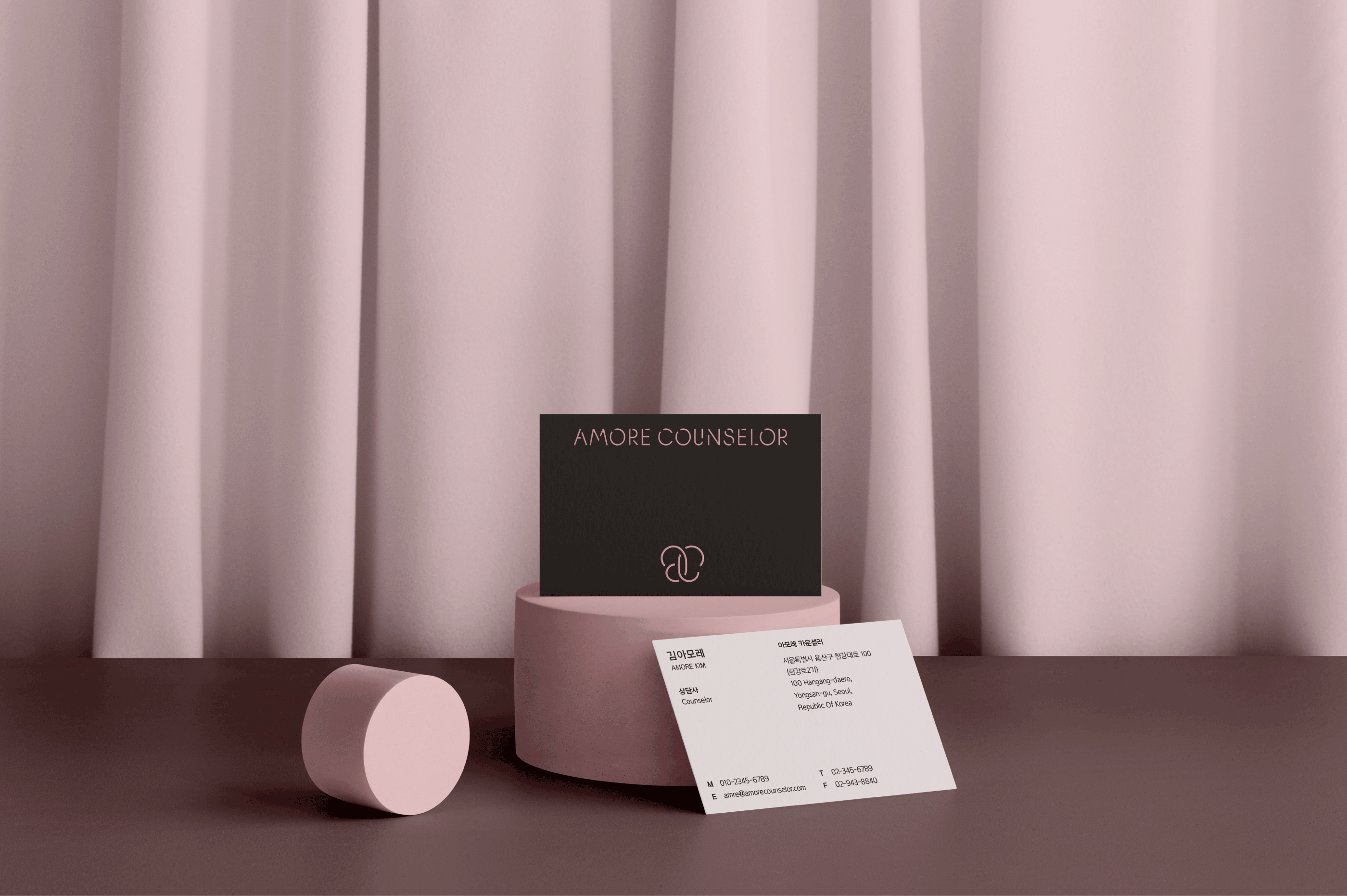
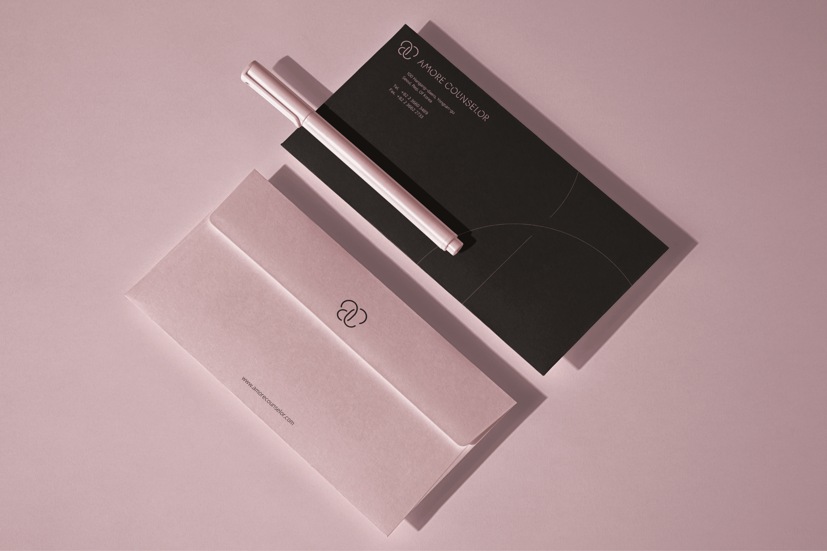
BRAND COLOR & TYPEFACE
아모레 카운셀러의 컬러는 기존 브랜드 컬러인 ‘핑크’를 계승하며, 다크 브라운 컬러를 함께 사용해
개인의 고유한 아름다움을 실현하도록 돕는 파트너로서 아모레 카운셀러의 편안하고 부드러운 이미지를 전달합니다.
또한, 아모레 카운셀러의 서체는 아모레퍼시픽 본사에서 적용하는 APHQ 서체를 사용하여 브랜드 이미지를 일관되게 구축합니다.
Amore Counselor's color inherits the existing brand color "Pink," and by using dark brown colors together,
it conveys a comfortable and soft image of Amore Counselor as a partner to help each person realize their unique beauty
in their lives. In addition, the typeface of the Amore Counselor uses the APHQ typeface applied
to the Amore Pacific headquarters to consistently build the image of the Amore Counselor.

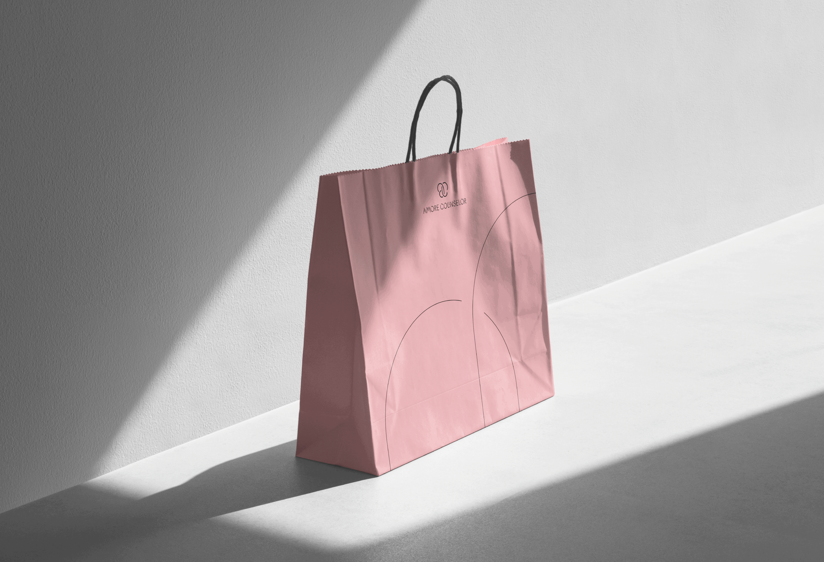
APPLICATION
아모레 카운셀러의 브랜드 어플리케이션 디자인은 로고타입, 컬러, 그래픽 디자인 요소를 활용하여
아모레 카운셀러만의 섬세하고 리드미컬한 감각을 발전시킵니다. 베이지 핑크와 딥 브라운 컬러를 적극적으로 사용하고,
관계성을 형상화한 키 비주얼에 적용하여 모든 고객 접점에서 일관되게 아모레 카운셀러의 이미지를 느낄 수 있도록 합니다.
Amore Counselor's brand application design utilizes the logo type, color, and graphic design elements
to develop Amore Counselor's unique delicate and rhythmical sense. Actively use Amore counselor beige pink
and deep brown, and apply them to brand applications so that you can consistently feel
the Amore counselor's image from all customer contacts through a relationship-like Key Visual.