

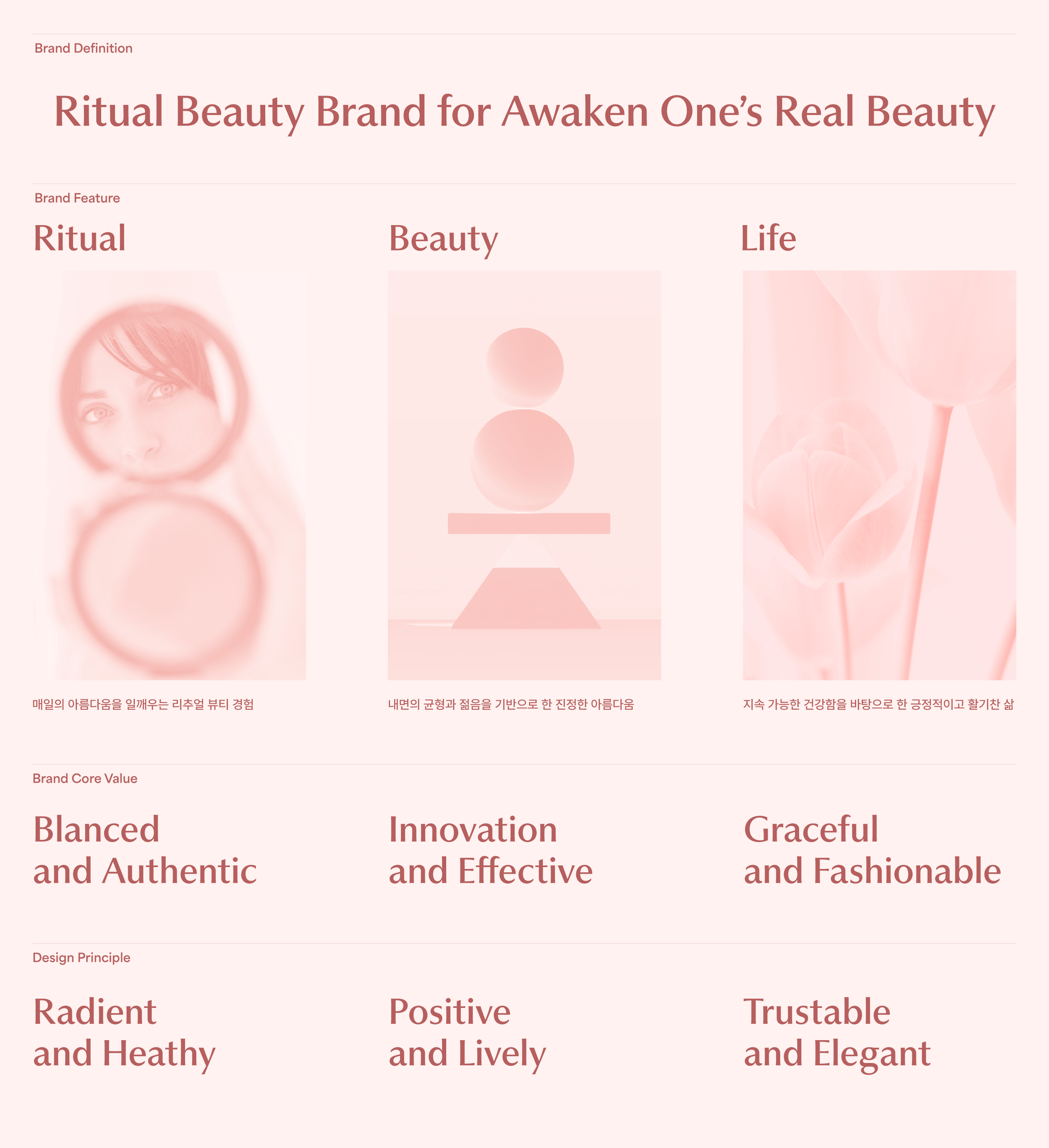
BRAND PLATFORM
AGE20’S는 매일의 루틴을 통해 몸과 마음의 생기를 깨우는 리추얼 뷰티 브랜드입니다.
진정한 아름다움은 내면의 균형 잡힌 에너지와 젊음에서 비롯된다고 믿으며, 사용자의 일상 속 정서적 안정과 자아 회복의 여정을 함께합니다.
브랜드는 Ritual, Beauty, Life의 세 가지 축을 중심으로, 지속 가능한 웰니스 라이프를 제안합니다.
AGE20’S is a ritual beauty brand that awakens vitality in both body and mind through everyday routines.
We believe true beauty comes from inner balance and youthful energy,
and we accompany users on a journey of emotional well-being and self-restoration.
Centered around the three pillars of Ritual, Beauty, and Life, the brand proposes a sustainable wellness lifestyle.
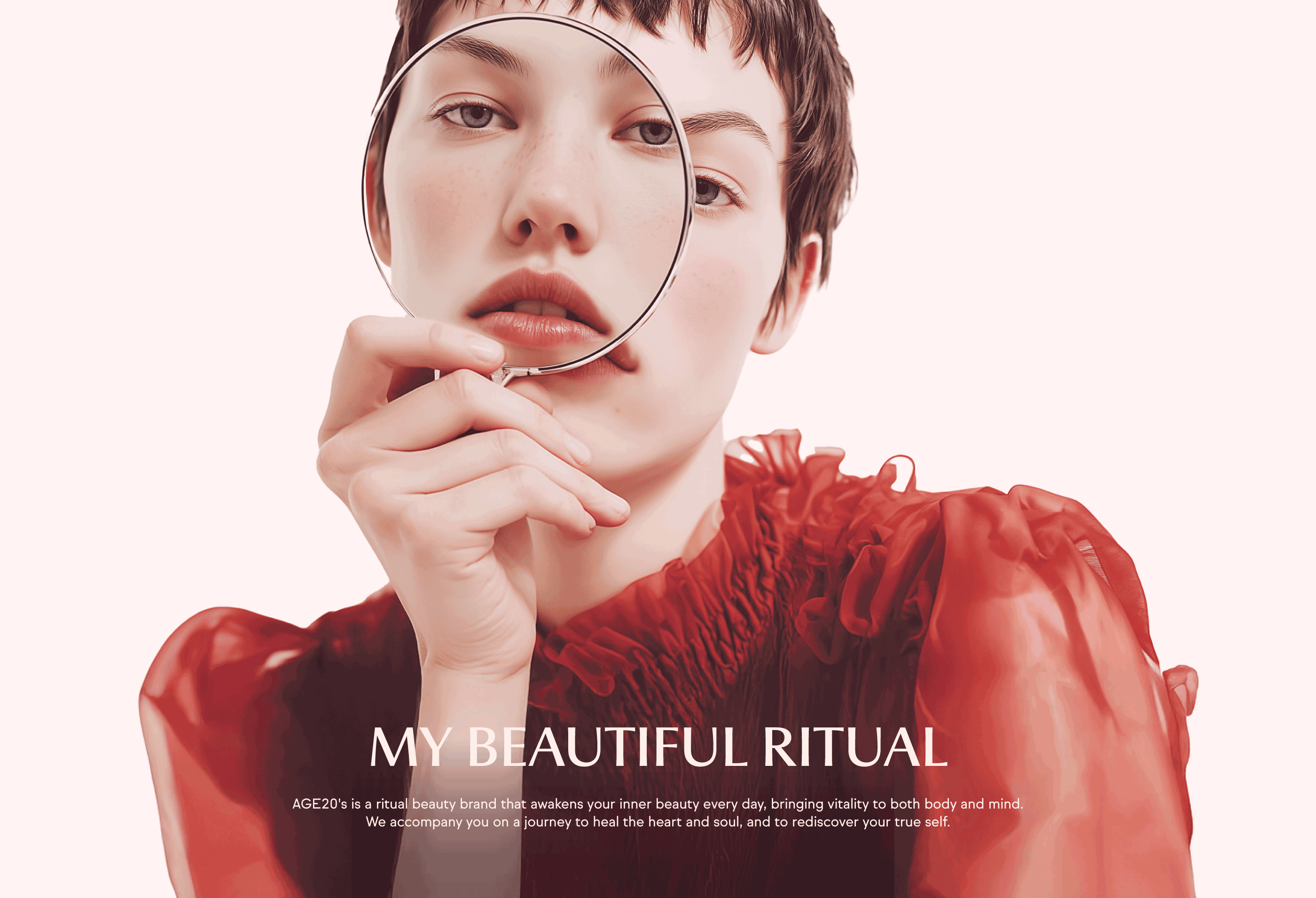
BRAND SLOGAN
“My Beautiful Ritual”은 단순한 슬로건을 넘어, AGE20’S가 지향하는 철학을 담고 있습니다.
아름다움은 특별한 순간에만 존재하는 것이 아니라, 매일 나를 돌보는 사소한 습관과 루틴 속에서 피어난다는 믿음에서 출발합니다.
이 슬로건은 내면의 균형과 생기를 깨우는 일상 속 리추얼을 통해, 진정한 나의 아름다움을 발견하고 가꾸어가는 여정을 상징합니다.
“My Beautiful Ritual” is more than just a slogan—it embodies the philosophy that AGE20’S pursues.
It stems from the belief that beauty does not exist only in special moments, but blossoms through the small habits
and rituals of daily self-care. This slogan symbolizes a journey of discovering and nurturing one’s true beauty
through balanced, energizing rituals woven into everyday life.
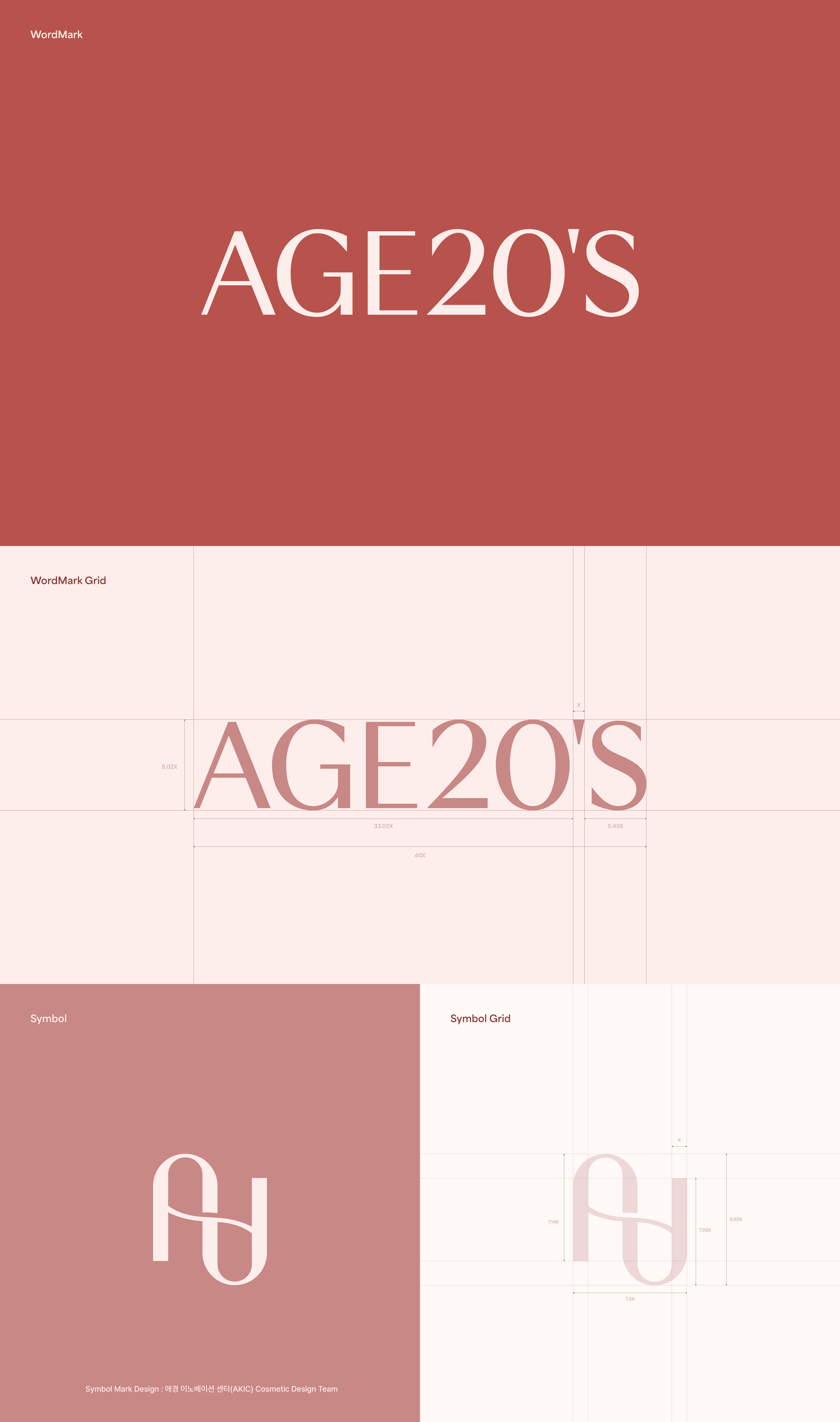
BRAND LOGO
AGE20’S의 워드마크는 브랜드의 일관성을 유지하면서도 시대성과 섬세함을 반영해 발전해왔습니다.
휴머니스트 산스 계열의 서체를 기반으로 글자 폭과 획의 굵기를 정교하게 다듬어,
내면의 건강함과 균형 잡힌 아름다움을 담은 브랜드 에센스를 시각적으로 표현합니다.
The AGE20’S wordmark has evolved with a consistent form while delicately reflecting the spirit of the times.
Based on a humanist sans-serif typeface, its proportions and stroke weights have been precisely refined
to visually express the brand’s essence of inner vitality and balanced beauty.
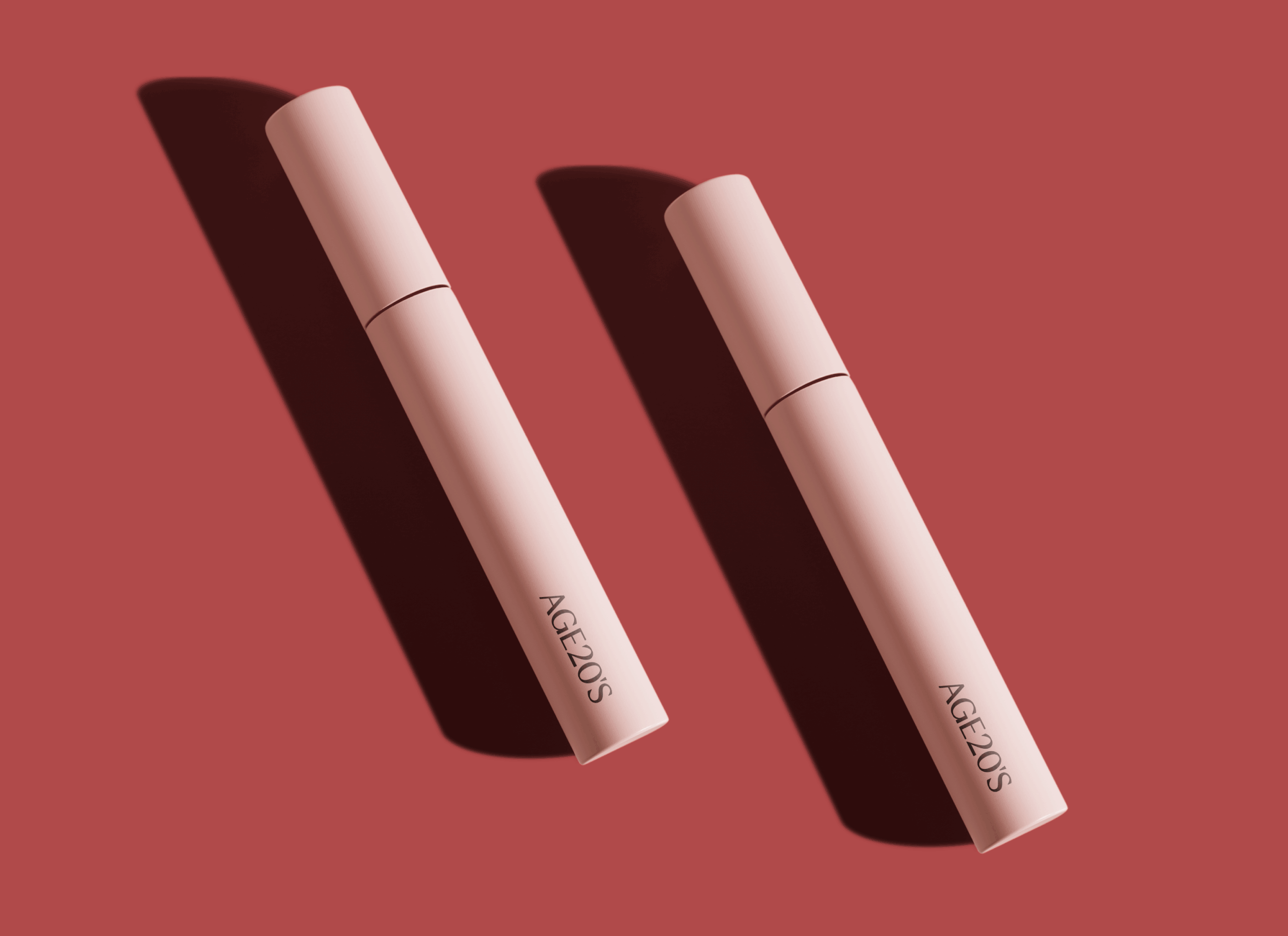
BRAND COLOR
AGE20’S의 브랜드 컬러는 자연의 빛을 모티프로 한 젊음의 밝음과 생동감이 느껴지는 Yellow 색상과
인간적인 따듯함을 만들어가는 내면의 의식을 상징하는 Red 색상의 조합으로 만들어지는 Coral 색상으로,
내면의 아름다움에서 시작되는 조화로운 아름다움이란 브랜드 컨셉을 담고 있습니다.
서브컬러는 Glassy White로 Coral 색상과 함께 사용하여 내면과 외면의 조화로 이루어지는 차분하고 따듯한 이미지를 전달합니다.
The brand color of AGE20’S is inspired by the light of nature—combining the brightness and vitality of Yellow,
symbolizing youthful energy, with Red, representing inner warmth and emotional depth.
Together, they form a signature Coral shade that reflects the brand’s concept of harmonious beauty born from within.
The sub-color, Glassy White, is used alongside Coral to express a calm and gentle image,
conveying the balance between inner and outer beauty.

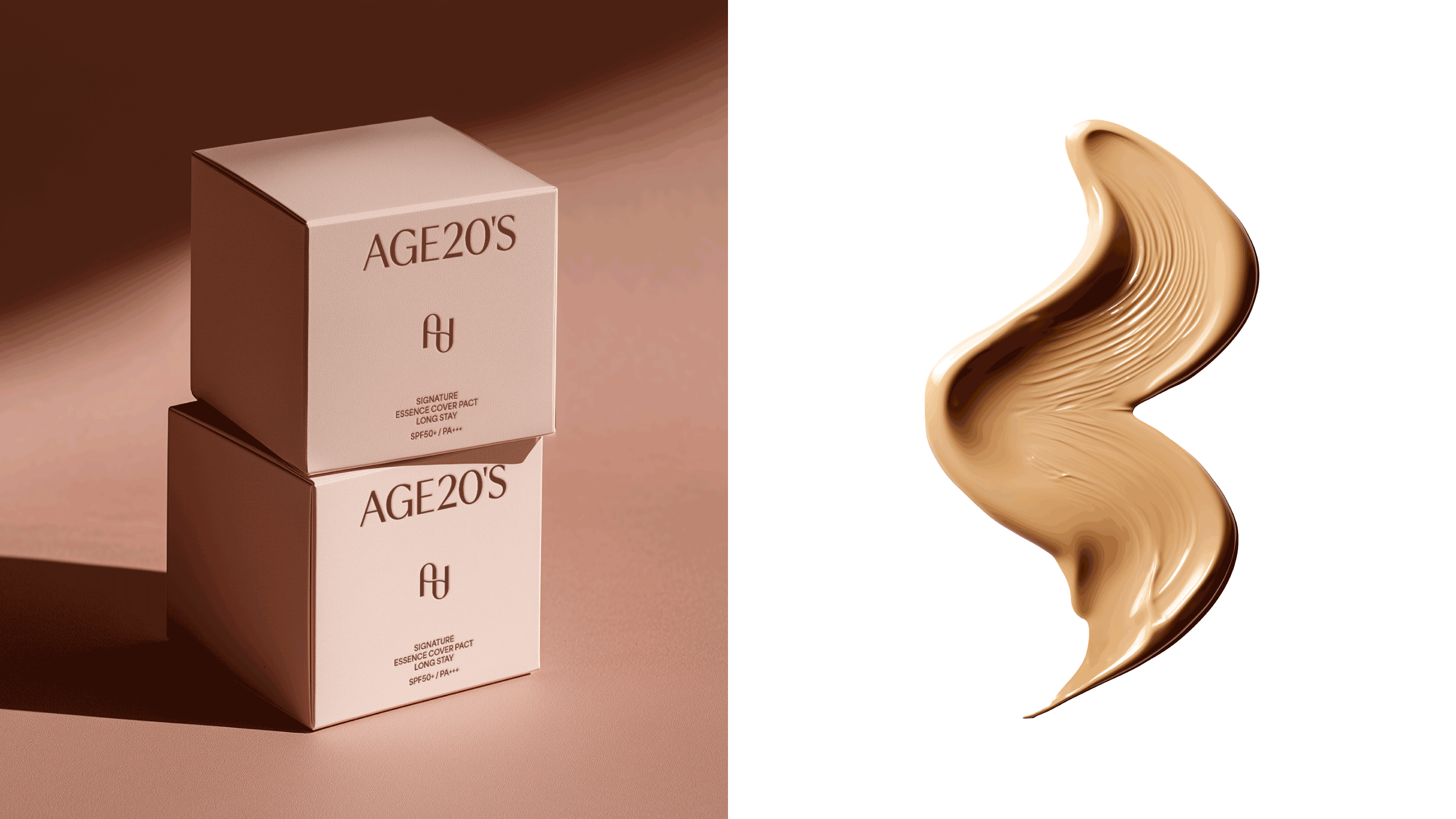
APPLICATION DESIGN
AGE20’S의 브랜드 디자인 어플리케이션은 ‘My Beautiful Ritual’이라는 슬로건 아래, 일상 속 리추얼 뷰티의 경험을 시각적으로 확장합니다.
내면의 아름다움에서 비롯되는 균형 잡힌 생기를 표현하기 위해, 부드럽고 투명한 컬러 팔레트와 곡선형의 형태 언어를 브랜드 전반에 적용합니다.
AGE20’s brand design application expands the experience of everyday beauty rituals
under the slogan “My Beautiful Ritual.” To express the balanced vitality that stems from inner beauty,
the brand applies soft, transparent color palettes and curved visual language across all touchpoints.


Brand Design
form & function
Creative Director
Chung Jinsuh, Park Juyoung
Brand Design
Hwangbo Sanghyun, Lee Dahee
Project Owner
AEKYUNG Industrial